Very few of us have ever felt it. There have always been bounds. Some would argue that it doesn't exist while just as many would say it shouldn't exist. What I'm talking about is total freedom. In life, it's the freedom to do anything with no negative repercussions to restrict ones actions, no outside rules to stifle urges or whims. In art, it's the liberty to create anything in any way, any size, any shape, any form, in any medium. In life, those who object to total freedom (or claim it doesn't exist) are probably well grounded (though it's said, that with enough money and the will to defy social bounds one might come close). In art, in the early beginnings of the 20th century, practitioners aligned with the Avant-garde movement were beginning to taste the heady thrills of total creative freedom, wading like children into the ocean, learning to swim as they went, unsure of where they were going, how they would get there, and what they'd do if and when they did. It was an experience as exhilarating as it was frightening. In an age when man was just learning to fly with wings, it was like soaring without them.
Picasso was, perhaps, the chief pilot, but the "flight crew" had dozens of notable members including Matisse, Duchamp, Kandinsky, Mondrian, Delaunay--all testing the waters of abstract, non-representational art--each daring one another to go further afield, floating further from shore, drinking deeper and deeper of the intoxicating ale of "freedom of expression." It went far beyond that mischievous stepchild called Dada. There was a strong disdain for the past and in general the word "can't." The art world was thrilling, if somewhat contentious. The rest of the world was dismayed, even horrified at what they were seeing in galleries and exhibitions. Those who had only recently grown accustomed to Impressionism looked upon this "new art" wondering first of all if it was art, and if so, regardless of whether they personally liked it or not, they wondered if it was any good, or merely a fraud perpetrated by a few artists and gallery owners in search of a free lunch. There seemed to be no cognitive standards against which to measure it qualitatively, and indeed, that was often entire the point of its existence.
There is always a "next generation" of artists waiting and watching in the wings, and the post-WW I generation of artists coming of age in Europe was scared. Avant-garde was going too far. Art seemed to be disintegrating. If not actually losing respect for itself, it certainly was losing the respect of everyone else. There was a backlash. It had several names. In Italy it was called Metaphysical and Novecento. In Germany it was called New Objectivity, and Magic Realism. In France, after the war, the Avant-garde continued to plow ahead, devil be damned, while in the U.S., there was so little in the way of Avant-garde in the first place there was thus little in the way of reaction against it (regionalism largely continued to hold sway). Therefore, it was left to Italian artists such as Georgio de Chirico, Georgio Morandi, Alberto Savino, Carlo Carra, and in Germany, George Grosz, Otto Dix, and Marc Chagall, among others, to insist that art have some type of firm grounding in the past; that it have at least some identifiable subject matter; and that, most of all, it have a set of concrete standards against which to judge its viability but also its sensibility.
Friday, September 30, 2011
Thursday, September 29, 2011
David L. Hostetler
 |
| Jazz Woman, 2001, David L. Hostetler |
 |
| Homage to Woman I, 1997, David L. Hostetler |
 |
| Hostetler poses next to his figural group, Duo, near the Trump Tower in New York. |
Born in Beach, Ohio, in 1926, Hostetler comes from Amish roots, though he has also taken up the study of Judaism with an eye toward converting. He came out of Indiana University to O. U. where he received his masters degree, graduating from student to instructor. Among his more well-known students are Jim Dine, David True, and Harvey Breverman. Art teachers have lists too you know. Hostetler discovered art as a result of having been wounded in W.W.II. Recovering, he was given a Red Cross packet of art supplies through which he discovered his love of drawing by sketching the female nurses in the hospital. He's been sketching them ever since, though more diversely in the guise of wives, mothers, goddesses, temptresses and queens. Today, retired after some sixty years of chipping and chopping, Hostetler and his wife live on a 40-acre farm not far from Athens. His work can be found in over 25 major museums around the country and hundreds of private collections. In New York City there rests a bronze figural group called "Duo" in a small park next to the Trump Tower. He knows Donald Trump personally. I could use a commission like that. Wonder if I could get him to introduce me? Wonder if he remembers me? Wonder if he even remembers the Nasturtium?
Wednesday, September 28, 2011
Constantino Brumidi
He was cut from the same cloth as Michelangelo Buonarroti, indeed, the same nationality, and much the same temperament as well. He was born in 1805, some 241 years after the death of the Florentine master but he knew much of the same territory. As a young man, he studied at the Academy of Arts in Rome, and spent the early years of his artistic life haunting the halls and habitats of the Vatican, restoring many of the same Frescoes that may have inspired Michelangelo. They certainly inspired Constantino Brumidi. Who? If you've never heard the name before, don't feel bad, most Americans haven't either. Yet his magnificent frescoes, no doubt inspired by Michelangelo's, have looked down on some of the most historic occasions in U.S. history. Next time you're in the Capitol Rotunda in Washington, DC, look up. Look up 180 feet. That's where you'll see his work.
Like many immigrants who came to the United States, Brumidi came seeking freedom and liberty. He fled Rome in the early 1850s to escape political persecution. For an artist however, his arrival in this country could hardly have come at a worse time as political upheaval here was swelling like a volcano amid a torrent of antislavery and secessionist turmoil in Washington. Commissions for fresco artists were not very plentiful. He painted a few portraits, decorated a few drawing room ceilings in private homes, and lived meagerly. In the center of the city, the Capitol building was being enlarged. In 1855, joining the effort, Brumidi found work as a decorator. The war came. In a grand, symbolic gesture of unity and hope, Abraham Lincoln declared that the work would go on despite the war. Brumidi was the right man in the right place at the right time. His meager work in Washington and the reputation derived from his Vatican work, in 1864, landed him the plum commission of a lifetime--the concave, ceiling of the new dome.
It wasn't the Sistine chapel, though the working conditions were just as bad, and in some ways worse. The ceiling was more than twice as high off the floor, and at 4,664 square feet, no small undertaking. Working flat on his back atop a wooden scaffolding some 17 stories tall, the rising summer heat was stifling. Keep in mind, the man was already 60 years old. The subject was the Apotheosis of Washington. The round composition features Washington, enthroned, godlike, between two female figures, Liberty and Victory, amidst a rejoicing heavenly throng of thirteen other figures representing the original thirteen states. This made up the central ring, while an outer ring was divided into five groups starting with a sword-wielding figure representing Freedom (for whom Brumidi's young wife was the model). Other groups represented the economic bedrock of the nation, the arts and sciences, as well as marine, commercial, mechanical, and agricultural endeavors. Unlike Michelangelo, who took some four years to paint his ceiling, remarkably, Brumidi completed his work in only eleven months; shortly after the end of the war. So well received was it that he spent the rest of his life decorating the Capitol, including a circular frieze around the inside of the cylindrical drum supporting the dome. It was while working on this commission that he died in 1880. Over a period of some 25 years, his annual compensation for his work averaged a meager $3,200. In this too, he was comparable to Michelangelo.
 |
| The Apothesis of Washington, 1864-65, Constantino Brumidi |
 |
| America and History, 1870-80, Constantino Brumidi, the first of 19 panels of the rotunda drum frieze, of which eleven and a half were completed by Brumidi before his death. The central figure is Columbia,personifying America, the only allegorical figure in the history frieze. |
 |
| The Birth of Aviation, 1951, Allyn Cox, the final panel of the rotunda drum frieze. The right portion corresponds to the left segment of the first panel (above). |
Tuesday, September 27, 2011
David Hockney
If you thought Pop Art started during the 1960s with Roy Lichtenstein, Jasper Johns, Claes Oldenburg, and company, you'd be wrong. Actually, it goes back somewhat further than that, to around 1956, and not here but in England when Richard Hamilton started cutting out photos from magazines and collaging them into painted scenes such as Just What Is It That Makes Today's Homes So Different, So Appealing? A second artist, David Hockney did his Pop thing in paint, picking his subjects from magazines, but painting them with a stylish flair and no small amount of wit. Strangely enough however, even though his roots go back to the very birth of Pop Art, Hockney has never considered himself a Pop artist. His style certainly leans in that direction, but his painting has a more profound quality to it, perhaps because he tired of the Pop image and moved on before most American artists even began painting such things.
Hockney was born in 1937, and even as a student in the Royal College of Art he began winning international prizes, his career already approaching greatness. By the time he was in his mid-twenties he was one of the best-known artists in Britain. Yet, his portraits, like that of Mr. and Mrs. Clark and Percy are far more traditional and insightful than one might expect from an artist with such a background.
In the mid-60s, he moved to California where his infatuation with that state's most important body of water, the swimming pool, has made it an icon of his work. His painting entitled A Bigger Splash also has the distinction of inspiring a movie by the same title about his work and lifestyle. And living so close to the entertainment capital of the world, Hockney's has been in demand as a stage and set designer as well. His sets for Wagner's "Tristan and Isolde" during the mid-80s are surprisingly abstract for an artist noted for his strong draftsmanship and exacting, hard-edged, representational style.
Hockney has had a broad, varied career. For a time he taught at the University of Iowa, as well as the University of Colorado and UC Berkley. Yet, besides his homeland, and his adopted state of California, he has found himself working in places as far-flung as China, Egypt, Italy, France, Germany, Ireland, and New York. His work includes etchings, lithographs, theater costumes, magazine covers, Polaroid montages, and paintings from the public showers. Both his showers and his swimming pools are often laden with homo-erotic images. Many of his drawings and etchings record the intimate details of his gay lifestyle. Though much of his more recent work has been in the area of photography, he has also explored the use of the photocopier as an artistic tool. In addition to being a prolific writer and art commentator, Hockney has also delved into publishing, producing many art books about his own work such as David Hockney by David Hockney.
 |
| Mr. and Mrs. Clark Percy, 1970-71, David Hockney |
 |
| A Bigger Splash, 1967, David Hockney |
 |
| David Hockney by David Hockney, 1977, David Hockney |
Monday, September 26, 2011
David J. Hetland
It's tempting to think, as we walk through laid-back, oh-so-chic galleries, and cold, hard, museums of modern art, that the ancient symbiotic relationship between art and religion has long ago become a thing of the past. I must admit that I've had that feeling, indeed, I have probably imparted it to others. While it's true, that few great Cathedrals are being built today (except for Mormon temples), and there has always been an overriding architectural link between great religious art and the great religions; there still remains today a vibrant link between the creative arts on one hand and spiritual movements on the other. Usually it doesn't make the news. Usually it's a modest, religious work donated by the artist to his or her church, or perhaps a traveling exhibit showcasing the best efforts of those of us who wish to serve their God through the gifts that God has so generously bestowed upon us. But there still are a few major artists handling major commissions for the creation of major works of art having religious themes. One of these was David J. Hetland.
Hetland called Concordia College in Moorhead, Minnesota, his home; though his studio was in Fargo, North Dakota. The vast majority of his works are in the Northern Midwest with it's heavily Lutheran population. In viewing his work, you might tend to think of him in the same league with Michelangelo, but actually, he was much more like Peter Paul Rubens in that, unlike Michelangelo, who painted every stroke and chiseled every chip himself, Hetland was a designer. Like Rubens, he employed a sizable workshop, which he supervised meticulously. He painted, he sculpted, he created in glass mosaic, and stained glass. He even designed banners and furniture for churches. One of his most interesting works involves the use of painted wooden blocks to create pointillist religious images on brick church walls. The comparison with Rubens is most apt, for like the Flemish master, Hetland became something of an institution. His gigantic, twenty-foot-tall by sixty-foot-wide murals for Concordia's annual Christmas Concerts become a tradition for many years.
Unlike Rubens, who limited his work (and for the most part, that of his atelier) to painting, Hetland was far more versatile. In fact, rather than painting, stained glass seems to have been his medium of choice. His mosaics, his paintings, even his welded wrought iron sculptural works tend to reflect this. But if you're thinking in terms of traditional, holier-than-thou Gothic windows, think again. He was thoroughly an artist of the twenty-first century. There is Cubism to be seen in his work, Symbolism, even an Abstract Expressionist flavor at times. His colors are striking, lively, dramatic, more closely Baroque than Gothic. And, though mosaics have not played a major part in church art since the Byzantine era, Hetland employed this spectacular art form with the same sweeping strokes one might expect in painting. You won't find his work in elite art galleries, though at $250 to $400 per square foot, they're in that price range. His work is not for the worship of art, but for the worship of God, and it's in galleries dedicated to this purpose, where you'll mostly find the work of David Hetland.
 |
| Emanuel: God with Us, 1989, David J. Hetland |
Hetland called Concordia College in Moorhead, Minnesota, his home; though his studio was in Fargo, North Dakota. The vast majority of his works are in the Northern Midwest with it's heavily Lutheran population. In viewing his work, you might tend to think of him in the same league with Michelangelo, but actually, he was much more like Peter Paul Rubens in that, unlike Michelangelo, who painted every stroke and chiseled every chip himself, Hetland was a designer. Like Rubens, he employed a sizable workshop, which he supervised meticulously. He painted, he sculpted, he created in glass mosaic, and stained glass. He even designed banners and furniture for churches. One of his most interesting works involves the use of painted wooden blocks to create pointillist religious images on brick church walls. The comparison with Rubens is most apt, for like the Flemish master, Hetland became something of an institution. His gigantic, twenty-foot-tall by sixty-foot-wide murals for Concordia's annual Christmas Concerts become a tradition for many years.
Unlike Rubens, who limited his work (and for the most part, that of his atelier) to painting, Hetland was far more versatile. In fact, rather than painting, stained glass seems to have been his medium of choice. His mosaics, his paintings, even his welded wrought iron sculptural works tend to reflect this. But if you're thinking in terms of traditional, holier-than-thou Gothic windows, think again. He was thoroughly an artist of the twenty-first century. There is Cubism to be seen in his work, Symbolism, even an Abstract Expressionist flavor at times. His colors are striking, lively, dramatic, more closely Baroque than Gothic. And, though mosaics have not played a major part in church art since the Byzantine era, Hetland employed this spectacular art form with the same sweeping strokes one might expect in painting. You won't find his work in elite art galleries, though at $250 to $400 per square foot, they're in that price range. His work is not for the worship of art, but for the worship of God, and it's in galleries dedicated to this purpose, where you'll mostly find the work of David Hetland.
Sunday, September 25, 2011
Crucifixes
As painters, we have a tendency to think of paintings as being as being one of the older types of art. It's easy to think in such terms when one has cave paintings in the range 20,000 years of age to point to, plus a few Egyptian efforts almost that old, coupled with some Roman painted antiquities around 2,000 years old. But the non-wall-mounted painting we think of today as "paintings" (meaning to some degree portable) are mostly less then one thousand years old. There are two reasons for this. One, those older than this were likely done on surfaces that simply couldn't survive the ages, or second, the subject matter itself was not deemed important enough to merit the care needed to preserve them. However around 1100 AD came the popularity in Italy of a type of paintings that had both of these elements going for them. They were done on smooth, nearly "grainless" poplar, well constructed, and well preserved; and the subject matter was religious. Placed as the central focal point in the many large churches springing up all over Italy at the time, they thus meriting extraordinary care in both painting and preservation. Today, we refer to them as painted crucifixes.
The earliest of these dates from around 1138, done by Guglielmo da Sarzana (above left). Like nearly all crucifixes from the twelfth century, the crucified Christ is depicted in a rigid, standing position, in this case seeming very much alive, and one might even say looking none the worse for wear. Far from the simple Roman cross we know today, the design was really quite complex with all four points having rectangular additions and in the Sarzana example, a richly illustrated cape-like panel surrounding the body of Christ (which seems to have a rather feminine appearance in this case) By 1265 when the well-known Italian painter, Cimabue created a crucifix for San Domenico, Arezzo (above right), the figure was much more like that with which we are familiar, an idealized contrapposto to the body, some attempt at anatomical rendering, and a definite lifeless quality.
Cimabue's pupil, Giotto, painting just 25 years later, rendered a crucifix for Santa Maria Novella in Florence that seems much more like a crucifixion. There is a realistic naturalism to the disposition of the dead body hanging from the cross. The panel behind the body is much reduced and is less highly decorated. There are still portrait panels of Mary and St. John on either side just beyond the hands, but they are more of the spiritual realm than merely appearing decorative. At the base is the rock of Golgotha while blood drips onto it running down over the knees from the pierced side. There is a sense of gravity, both literally and figuratively. Stylistically, the cross is quite medieval, but the figure itself very much prefigures Renaissance painting. By the end of the thirteenth century however, the trend toward naturalism in painted crucifixes also spelled their end as sculptured crucifixes came into favor as appearing more realistic to the eyes of the worshiping masses for whom they were made to impress with the horrible pain and suffering of the crucified Christ.
 |
| Cross of Sarzana, 1138, Guglielmo de Sarzana |
 |
| Crucifix of San Domenico, Arezzo, 1265-70m Cimabue |
The earliest of these dates from around 1138, done by Guglielmo da Sarzana (above left). Like nearly all crucifixes from the twelfth century, the crucified Christ is depicted in a rigid, standing position, in this case seeming very much alive, and one might even say looking none the worse for wear. Far from the simple Roman cross we know today, the design was really quite complex with all four points having rectangular additions and in the Sarzana example, a richly illustrated cape-like panel surrounding the body of Christ (which seems to have a rather feminine appearance in this case) By 1265 when the well-known Italian painter, Cimabue created a crucifix for San Domenico, Arezzo (above right), the figure was much more like that with which we are familiar, an idealized contrapposto to the body, some attempt at anatomical rendering, and a definite lifeless quality.
 |
Crucifix of Santa Maria Novella, 1290, Giotto |
Saturday, September 24, 2011
The Creation of Adam
Several years ago I published a list of the greatest paintings of the last 1,000 years. I chose Michelangelo Buonarroti's Sistine Chapel ceiling as number one. Having done that, I feel I should spend some time discussing the greatest painting in the greatest painting. There are nine central panels alternately large and small running the length of the ceiling. The Creation of Adam is the third one. The panel is not a small one. Designed to be seen from the floor, some seventy feet below, it measures over fifteen by seven feet. Michelangelo seems to have seen it as the centerpiece of the entire series. It was begun late in the ceiling's progression, only after many preliminary drawings in which he experimented with numerous figures in a variety of poses. Contemporaries indicate there were a number of color and chiaroscuro studies as well.
However, quite apart from the obvious attention to color and masterful handling of light and modeling, it is the wondrous composition of the painting that has made this work a living model for the relationship of man with his God. The painting can roughly be divided into two squares with the left squared divided again diagonally between earth and sky. And on the right, God reaches out the paternal right hand from a host of attendants swirling down from a massive oval of fine cloth. Michelangelo took seriously the words of Genesis in his modeling of Adam in the mode of his Creator The torsos of both figures are modeled almost identically which would account for the seemingly "heavy" body of the youthful Adam.
The centerpiece of this centerpiece is the sky, the negative space between the two figures wherein the powerful, outreaching, index finger of God makes psychological contact with the heavy, limp, digital appendage of man in his feeble attempt to reach for the divine spark of life. Secondary to this is the eye contact between the stern, yet loving God and the passive, awestruck, Adam. Linking the two figures are a series of curved, parallel lines, the first between the eyes, then others along the arms, between the hips, the knees, and the feet of both figures. The result is a dynamic symmetry, a mirror image, God reflected in man, devoted, strong, and innocent. Michelangelo's biographer, Vasari considered him the culmination of an Italian painting tradition dating back two hundred years to Giotto, passing through Duccio, Masaccio, and Mantegna. If so, then the culmination of that line also finds its terminus in The Creation of Adam and beyond that, the creation of modern painting as we know it.
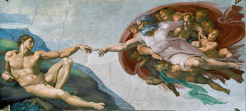 |
Photo by Ezra Libillas The Creation of Adam, 1511, Michelangelo Buonarroti |
 |
| The Creation of Adam (detail), 1511, Michelangelo, Buonarroti (as seen before the Sistine ceiling restoration, 1980-92) |
The centerpiece of this centerpiece is the sky, the negative space between the two figures wherein the powerful, outreaching, index finger of God makes psychological contact with the heavy, limp, digital appendage of man in his feeble attempt to reach for the divine spark of life. Secondary to this is the eye contact between the stern, yet loving God and the passive, awestruck, Adam. Linking the two figures are a series of curved, parallel lines, the first between the eyes, then others along the arms, between the hips, the knees, and the feet of both figures. The result is a dynamic symmetry, a mirror image, God reflected in man, devoted, strong, and innocent. Michelangelo's biographer, Vasari considered him the culmination of an Italian painting tradition dating back two hundred years to Giotto, passing through Duccio, Masaccio, and Mantegna. If so, then the culmination of that line also finds its terminus in The Creation of Adam and beyond that, the creation of modern painting as we know it.
Friday, September 23, 2011
Communist Art
When we read the newspapers, hardly a day goes by in which we don't see a story about the sorry state of affairs in Russia. We read about hyperinflation, exorbitant interest rates, capital flight, economic collapse, black markets, crime syndicates, graft and corruption at the highest levels of society. Interesting too, is what we don't read about. We don't read much about art. Of course art tends to thrive best in a stable economic environment and not at all when times are tough. Curiously though, Russian art has tended to be a minor topic of conversation in the motherland and elsewhere for generations. Not since the earliest days of the revolution when Chagall, Malevich, and Kandinsky thrived amidst the revolutionary excitement in Moscow, has there been much in the way of innovation or creative spirit in Russian art. Was Communism somehow anti-art?
Actually, no, but the question is much more complex than that. First of all, after the fall of the czarist regime and during the various "great leaps forward," any private market their might have been for art evaporated. That left only government commissions. And while these, initially at least, left quite a great deal of artistic latitude in which the artist might create, as time past, government commissions more and more became government control of the arts. Those in the politburo wanted to see the state get as much "bang for the ruble" so to speak, as possible. Abstraction had long been too esoteric to serve any communal good, and as time progress, even symbolist efforts such as Chagall's had to give way to the literal, realistic, banal, and propagandist common denominator. Vera Mukhina's massive stone monument Industrial Worker and Collective Farm Girl erected first at the 1937 Soviet pavilion at the Paris International Exhibition, is typical of this style.
While Picasso was exhibiting his equally propagandist, but emotionally explosive antiwar masterpiece, Guernica in the Spanish pavilion, it was as if the Germans and Russians were in a race to see who could impress the world most with their blandness. The Germans won the competition. Their pavilion featured a pinnacle complete with a Nazi bronze eagle topping out at 187 feet in height while Mukhina's monument towered a mere 106 feet tall. The Russians even had a name for this bulky bravisimo. They called it Socialist Realism (sometimes Heroic Realism). In short it was "art that was revolutionary in form, socialist in content." Themes included the rustic idyll of rural life, the personal fulfillment of manual labor, the glory of the Red Army, and the deification of Lenin. Artists included Alexander Gerasimov and his Lenin on the Podium" of 1929; Alexander Dejneka's Defense of Petrograd, 1928; and M. B. Grekov's Portrait of Stalin, (1935). If you've never heard of any of them, it's quite likely you are not now, nor have you ever been a member of the Communist Party.
 |
| Industrial Worker and Collective Farm Girl,1937, Vera Mukhina (now reconstructed in Moscow) |
 |
| Defense of Petrograd, 1928, Axexander Dejineka |
Thursday, September 22, 2011
Japonisme
During the postwar era in which most of us grew up (or can well remember), the words "Made in Japan" were synonymous with cheap trinkets, plastic jewelry, and Christmas toys that broke before New Year's Eve. Then came Sony, Yashika, Minolta, Honda, Toyota, and Panasonic. They were neither cheap nor trinkets. In the realm of art, Japanese imports have been around for well over a century. Their distinctive style and Eastern aesthetics made them a fascinating, and highly collectible form of art in this country dating back to the 1840s and 50s. And like today, they were neither cheap nor trinkets. The mark of an erudite millionaire art connoisseur was the quality of his Japonisme. The French fell in love with it first, then the English, and finally the Americans, though up until the Civil War, Japanese objets d' art were neither well known nor fashionable. However, after the Philadelphia Centennial Exposition in 1876, where the Japanese exhibits were immensely popular, the trend caught on.
The New York decorating firm of Herter Brothers was a leading importer. William H. Vanderbilt had an entire room in his New York City mansion decorated in a Japanese style in which he displayed his hundreds of Japanese art objects. Of course the room no longer exists, nor in fact, does the mansion, but photographs from the period depict an expensive clutter of sculpture, furniture, bamboo, vases, silk paintings, and heavy drapery exemplifying as much Victorian tastes in decorating as it does a love of things Japanese. Often wealthy American millionaires such as William Sturgis Bigelow, a Boston Physician, would go all the way to Japan on scavenger hunts that sometimes lasted several years, immersing themselves in the art and culture of this enigmatic civilization as they poured millions of yen into their collections. Bigelow was followed by artists such as John La Farge and the writer-decorator Samuel Bing, who collected Japanese literary works and wrote essays on Japanese which, in 1891, he published in a three-volume set--probably a rather limited edition given it's time and content.
Meanwhile, in England, the American expatriate artist, best known for painting his mother, created an entire room which today does survive, transported intact to this country, and now displayed in the Freer Gallery of Art in Washington, DC. Assuming the role of interior decorator, James McNeill Whistler created what has since come to be known as The Peacock Room for the London home of Frederick Richards Leyland. Unlike the Victorian clutter of Herter's Japanese Room in the Vanderbilt mansion, Whistler's effort is truly a work of art. Like so many of his paintings, the actual title, Harmony in Blue and Gold, reflected Whistler's interest in color as much as Japonisme. The walls are lined in leather painted a peacock blue overlaid by a gilded ribbing carved to imitate bamboo. (Why use the real thing when you can create your own expensive substitute?) There is a lavish use of gold leaf on shelves and the ceiling, even including electric light fixtures in a Japanese style (which, for its time, must have taken some imagination). The centerpiece of the room, however, was a sumptuous gold-leaf wall "painting" by Whistler of two delicately rendered peacocks so glorious in their radiant plumage that it was adopted as the trademark motif of the then-popular Aesthetic Movement. Though not designed by Whistler, nor as aesthetically pleasant, many homes today also have Japanese rooms...usually wherever it is we listen to our stereos, play video games, or watch TV.
 |
| The Japanese Room, Christian Herter, William H. Vanderbilt Mansion, New York |
 |
| The Peacock Room, 1876-77, James McNeill Whistler, Freer Gallery, Washington, DC |
Wednesday, September 21, 2011
Classic Facial Beauty
Yesterday, a friend and I were discussing the criteria defining beauty in the human face. Both of us, having some experience in portraiture, also professed some expertise in assessing this very transient and highly subjective subject. We fell to discussing the symmetrical versus the asymmetrical face, as well as the different cultural definitions of facial beauty, and the effects of age, race, sex, and nationality. All these things we readily agreed were factors, neither positive nor negative, but nonetheless critically important. Eventually, we decided that if we were going to get anywhere we'd have to limit ourselves to the media model of youthful, adult "classical" beauty from a Western point of view. Within those limitations, some general "rules" emerge.
I recall reading somewhere that in general, people tend to consider the symmetrical face more attractive than the asymmetrical one, though I can think of countless exceptions, the beautiful actress, Vivien Leigh for example. Her highly arched right eyebrow still turns me on. Beyond that however, a number of other features play a part. Here are some western guidelines to beauty that seem to prevail regardless of age or sex. The most important features are the eyes (large and colorful seems to be the rule). The nose is probably the least attractive part of the face, (bigger is not better). It goes without saying that sparkling, even, average-sized teeth are a plus. A flawless complexion is also a must. The mouth and lips are less important provided they are not abnormally large, thick, or thin. Oval seems to be the most attractive shape for the face. Hair length, style, and its color (despite the amount of time people of both sexes spend playing with it) seems to make little difference so long as it is clean and well-kept. (The quantity of it is a factor, however.) Eyebrows should be strong and arched for classic beauty to prevail. The ears and forehead don't matter much so long as they are not exceptional in any way. Youthful beauty demands a strong, smooth jaw line, and it is this one feature which defines age more than any other. A classically beautiful face does not necessarily demand all these assets be perfect, but usually there is no more than one of them to be found lacking.
It's important to keep in mind that a face is a work of art constantly "in progress." It might be called the very definition of metamorphosis. As it changes, we unconsciously change our criteria in defining its beauty. The image of a beautiful baby in no way resembles that of a young bride, nor that of our lovely, aged grandmothers. There are some constants though. An angelic little girl seldom grows up to be anything other than a lovely young woman, then an attractive matron, and finally a sweet little old lady. Classic beauty survives very nicely this transition. On the other side of the coin, let's "face" it, fat, lines, wrinkles, dry skin, sags and bags, warts and liver spots all rob a face of its classic beauty. Fortunately, this is where the painters art comes into play. We try first to make improvements by painting the face itself. Beyond that, the only other alternative is our clever, discreetly flattering artistic expression of that face on canvas. It is in this endeavor that the artist must be acutely aware of the building blocks of classic beauty and the outside influences coming to bear upon them.
Though she failed to survive
into what we would, today,
term "old age" (she died at
age 54), Vivien Leigh in later
years retained all the hallmarks
of great facial beauty. At every
point in her life, the work of
artists played a part in that.


 |
| Vivien Leigh. One distinctive, asymetrical feature adds character to great beauty. |
 |
| The same face (Vivien Leigh), 20 years later is no less beautiful as it matures. |
 |
Though she failed to survive
into what we would, today,
term "old age" (she died at
age 54), Vivien Leigh in later
years retained all the hallmarks
of great facial beauty. At every
point in her life, the work of
artists played a part in that.


On the male side of the ledger, we can also see in the face of English actor, Roddy McDowall, the risidual traits of classic "beauty" despite the effects of maturity and inevitable aging. In this case the work of the makeup artist is not a major factor.
Tuesday, September 20, 2011
Cindy Sherman
The Postmodern world of art is not, as a series of car ads used to put it, "Your father's Oldsmobile." Artists and public alike have had a rude awakening these past few years. The vast majority of working artists have, for years, been content to simply mosey around from style to style, subject to subject, turning out pretty pictures, hoping someone will buy them and make them rich and famous. The overwhelming majority of "the public" has been just as content to hang these pretty, innocuous ruminations of the artist's mind on their off-white walls over their earth-tone couches in an effort to announce to their friends their cultured "good taste." Never a thought is given as to whether the work "means something" above and beyond showcasing the artists technical skill, or his or her mastery of the esoteric aesthetics of art making. All too often, the best that can be said about such work is that it is art about art.
In 1976, a young woman graduated from the State University of New York in Buffalo. She was a photography major, but not your typical camera buff. She thought like a painter and did not buy into the premise of creating pretty pictures for the sake of creating pretty pictures. Unlike many photographers, the idea came first, then the photo. That is, she did not haunt the world around her looking for interesting subjects to click away at. Her early black and white photo-paintings always had a message before they had a negative. She was into stereotypes, such as Hollywood heroines, often with sexual undercurrents. Often she used herself as a model, dressing to fit the part, as much an actress as a photographer. Like a strong, Postmodern painting, her photos were contrived to address some aspect of the human condition from her point of view and on her terms. Sometimes they delved deep into her psyche, depicting her own experiences, using signs and symbols, exploring how the world, and particularly how the mass medium saw and used women.
Cindy Sherman is, today, 57 years old. Her exposures of feminine stereotypes have often been satirical and exaggerated. She "painted" with her camera the world of insecure, middle-class women, always seeking approval of men, of cultural conditioning, young girls measuring themselves by comic book or soap opera romantic standards. In the 1980s, Sherman turned to color, exploring what she might have done with her camera had she been a famous male artist from the past, such as Holbein, David, or Ingres. It was pure Postmodernism, exploring the past through parody as a one-eyed artist of the twentieth century.
Moving into the 90s, she was caught up in the movement to convey a message in her art at the expense of all else. Sherman began to explore reality with the same single-minded effort she'd exhibited in the past to "make a difference" through her art. Like an abstract artist, she never titled her work. But then again, there was seldom any need to. In her Untitled No. 175, for instance, she explored the beach after the people had all gone home, leaving behind the "human factor," their waste, filth, and litter, subject matter so repulsive as to border on the nightmarish. Untitled no. 175 is a sickening assemblage of rotting fruit, half-eaten cupcakes, and vomit. And just so you don't miss her point, it's a photo is living color six feet in diameter. It's not your father's fun day at the beach.
 |
| Untitled 97, 1982, Cincy Sherman |
 |
| Two of Cindy Sherman's history portraits, 1989-90 |
Moving into the 90s, she was caught up in the movement to convey a message in her art at the expense of all else. Sherman began to explore reality with the same single-minded effort she'd exhibited in the past to "make a difference" through her art. Like an abstract artist, she never titled her work. But then again, there was seldom any need to. In her Untitled No. 175, for instance, she explored the beach after the people had all gone home, leaving behind the "human factor," their waste, filth, and litter, subject matter so repulsive as to border on the nightmarish. Untitled no. 175 is a sickening assemblage of rotting fruit, half-eaten cupcakes, and vomit. And just so you don't miss her point, it's a photo is living color six feet in diameter. It's not your father's fun day at the beach.
 |
| Untitled 175, 1987, Cindy Sherman |
Monday, September 19, 2011
Charles Willson Peale
 |
| Self-portrait with Angelica,1782-85, Charles Willson Peale, seen here painting his wife while his daughter looks over his shoulder, offering perhaps a bit of unwanted help. |
Charles Willson Peale was born in 1741. As a young man, his first interest in art was piqued when he journeyed to Norfolk, Virginia, to purchase leather for his saddle shop. There he saw the work of portrait painters which he considered quite poor. In a typical "I can do better than that" frame of mind, he returned to his native Philadelphia and tried his hand at it. He read all the instruction manuals on painting he could come by, and took lessons from an artist in Annapolis. Encouraged, he set off for Boston to try his luck in this wealthy commercial center. He had little success. At one point, he was down to selling his watch to have money to return to Philadelphia. But just before he did, he received a commission for a small portrait. He was paid twelve dollars. Back home in Philadelphia, despite his poor showing in Boston, his friends and neighbors convinced him he had some talent. In fact, so much so they took up a collection and sent him to England for three years to study under the great Benjamin West, who had, himself, moved there from the colonies a few years before. When Peale returned in 1769, he tried again, setting up shop in his hometown this time. This time, he started getting commissions. During the next few years, as his skills matured, he became the most outstanding portrait painter not just in Philadelphia but in all the colonies.
 |
| The Staircase Group,1795, Charles Willson Peale. George Washington, in passing by, is said to have greeted the "fool the eye" painting of two of Peale's seven sons. |
Sunday, September 18, 2011
Charles-Francois Daubigny
There is an old saying that says, "Some are born to greatness, the rest of us have to work at it." One might think that being born the son of an artist into a family with numerous other artists would put you in the first category. For Charles-Francois Daubigny, (pronounced DOE-bin-yee) it wasn't quite that easy. Born in Paris in 1817, the son of Edouard Francois Daubigny, young Charles realized at an early age he was destined to become an artist, if not for greatness. His father was a working artist, though by no means a well-known or really a very successful one. The same was true for several of Charles' cousins as well. Though not impoverished, Daubigny grew up with a very strict understanding of ethics and money. When he was twelve, his mother died and the boy found himself plying the family trade at a very young age, doing what he could to earn money. Besides assisting his father and various odd jobs, Daubigny took to painting fans and bonbon boxes to earn a small return from his talent. It was good training especially in creating interesting, innovative artistic compositions.
By the age of 17, Daubigny and a friend, who was also a painter, had managed to save about three-hundred dollars for a trip to Italy, then considered the ultimate educational experience for any would-be artist. With his friend, Mignon, and all their worldly possessions packed up on their backs, the two painters set out on foot, no less, for Italy where they studied for a year in Rome, Florence, and Naples (and no doubt wrote the book on seeing Italy for less than a dollar a day). A year later, back in Paris, broke, the trip had nonetheless changed their lives. Mignon realized he was not cut out to be a painter while Daubigny found a job as an assistant conservator for the king's art collection. It was, however, a job in which he was not happy at, and after months of quarreling with his boss, he was fired.
But rather than being distressed at his dismissal, Daubigny felt free. Using the keen feeling for pigments, colors, and techniques he'd gained in studying the king's collection, and the great art of Italy, Daubigny applied himself to painting. In 1838, he entered in the Salon competition a painting of the Chancel End of Notre Dame, though it attracted little attention. However the next year, in spite of his lack of academic training, his St. Jerome in the Desert was a serious contender for the Prix de Rome. However, he lost out to what he considered an inferior, academic painter. Daubigny switched to landscapes, finding refreshing solitude in joining the so-called Barbizon painters who liked to work outdoors in and around that small town on the edge of the Fountainbleu Forrest. He eventually settled in another small town not far from Paris, Auvers-sur-Oise where he lived and painted. He was a never-ending source of support and inspiration for the next generation of out-of-doors painters--the Impressionists.
 |
| Rising Moon in Barbizon, is typical of Daubigny's Barbizon "in plein air" work. (Photos of Daubigny's Solon entries, mentioned above, seem not to be available.) |
Saturday, September 17, 2011
An American Icon
Without a doubt, he was one of the most beloved artists in American history. His work is as American as Norman Rockwell, Edward Hopper, Winslow Homer, or Jackson Pollock, though he never took up a brush and painted a picture in his whole life. Yet some of his images are more familiar today than that of any other artist. He has given us a child's eye view of baseball, taught us how not to fly kites and kick footballs, reminded us what it's like to be an utter failure in school, to undergo sidewalk psychoanalysis, and added the term "security blanket" to the American lexicon. We've seen his work produced on TV, in the movies, even on Broadway. Unlike other American art icons who claim influence from Rembrandt, Picasso, Monet, or Van Gogh, his art idols have been names like Clare Briggs, Walt Disney, Milt Caniff, Al Capp, and Roy Crane. He has drawn his inspiration from his life growing up in Minneapolis and from a mixed-breed dog named "Spike" he had as a boy. In fact, believe it or not, his first published work was a picture of Spike (a dog that would literally eat anything), appearing in the 1939 Ripley's Believe it or Not. He was fifteen. His nickname was Sparky. Today we know him as Charles Schulz.
Schulz would have been the first to admit that he was Charlie Brown, though the name was based upon that of a fellow artist and friend. And most of us would also admit that, at times at least, we are Charlie Brown. Charlie Brown is not special. In fact that's the beauty of it all. Like so many of us, he's so average, it's pathetic. And also like most of us, it's the people around him who are so interesting and unique and funny. We all live in a world full of Lucys, Linuses, Schroeders, Peppermint Patties, and yes, even Snoopys. Our Snoopys may not look like Charlie's but they all think the same way, and often act the same. And the fact that Charlie Brown is just over sixty years old makes us realize that we have, many of us, known him all his life--and ours. No other artist has ever drawn so precisely what it's like to be a child, nor projected so sharply the fact that the same childhood fears, joys, heartaches, and headaches continue to be a part of us as adults.
Charles Schulz was born in 1922. He was two days old when he picked up the name "Sparky" and it was his for the next twenty years. The son of a Minneapolis barber, Schulz began drawing cartoons when he was hardly much older than the Peanuts gang. And while other working artists brag of art degrees from the National Academy, the Art Students League, or the Chicago Institute, Schulz got his first art instruction as a result of a "Do You Like to Draw?" matchbook cover from the Art Instruction Schools and his only training in art from their correspondence course. It cost his father $170. After a stint in the Army during WW II, he returned to become an "instructor" at the school, opening dozens of envelopes a day and "grading" the efforts of would-be artists all over the country not unlike himself. His first professional work came as he managed to get several single-panel cartoons in the Saturday Evening Post during the late 1940s. His big break came in 1950 when United Features Syndicate in New York liked his work. His Li'l Folks became Peanuts, his little dog, Spike, became Sniffy (later changed to Snoopy because there was already a cartoon dog named Sniffy), and we all began to laugh and sometimes even cry as Charlie Brown and Charlie Schulz became a part of who we are.
 |
| A pre-Peanuts panel from 1948 |
 |
| The "Li'l Folks" became "Peanuts." Though having died more than ten years ago, last year, Schulz was second only to Elvis in earnings from the grave, more than $35-million--not exactly peanuts. |
 |
| November 26, 1922--February 12, 2000 |
Friday, September 16, 2011
R. Buckminster Fuller
About once per century the world is gifted with an individual so remarkably versatile and talented in so many fields relating to the arts and sciences that we have come to apply the term "Renaissance Man." Recently I've talked about the great Leonardo, and (to my mind at least) the even greater Christopher Wren, and from these shores, the incomparable Thomas Jefferson. From this country also comes a great 20th century thinker, scientist and artist who also fits the classic description of the Renaissance man--R. Buckminster Fuller. As with all these individuals, this man, "Bucky" to his friends, was at least a generation or two ahead of his time. He, like Wren, was first of all an inventor, but also a brilliant mathematician, a scientist, a thinker, and finally, an architect. But not an architect in the classical sense of the word as was Wren. In fact, quite the opposite. Though the underlying logic and geometric perfection of his designs might be deemed classical, he was, without a doubt, the first of what we call "green" architects.
Fuller was born in 1895 in Milton, Massachusetts. A Harvard graduate, right out of college he tackled the problems surrounding the efficient use of earth's natural resources and energy at a time, during the 1930s, when everything was scarce, yet paradoxically, few scientists had given the matter much thought. In 1932, he founded the Dymaxion Corporation. The term, though coined by a public relations firm (DYnamic MAXimum ION, a physics concept), was an umbrella designation for a number of lifestyle inventions all aiming to get the most from the least. His designs involved the Dymaxion House, the Dymaxion car, and eventually, whole cities designed to float at sea. The house was a factory built, self-sufficient, donut-shaped structure hung by cables from a central concrete mast; while the car was kind of a tear drop shaped mini-van capable of holding ten people, travel at speeds up to 75 miles per hour, and get in the neighborhood of 30-40 miles per gallon of gas.
Although the technology didn't exist at the time (and still doesn't), Fuller had in mind for his car to eventually be a flying vehicle landing and taking off vertically using movable thrusters not unlike today's Harrier jets. His thinking was that such a vehicle and such a home would open up vast unused areas of the earth's surface to habitation.
Much the same thinking went into his designs for pyramid-shaped floating cities. During the late 1960s the US Government seriously considered funding such a venture. Of course Fuller's trademark architectural achievement was his geodesic dome, which he didn't invent, but merely popularized. No one who has visited Disney's Epcot Center or seen the US Pavilion at the 1967 Montreal World Exposition can come away unimpressed with such an achievement. Fuller had in mind to use the structure to enclose entire cities as seen in his plans to cover downtown Pittsburgh (the other alternative he suggested for the city involved explosives). Imagine, an architectural structure that, as it becomes larger, also became lighter. A geodesic dome 1000 feet in diameter, when heated inside to a temperature of just one degree warmer than that outside, actually becomes lighter than the air it encloses. Fuller's designs were not limited just to the great and grand. He also invented what he called the "fog gun." It was a high powered misting device designed to conserve water while washing the body without soap. Actual tests indicated that a family of four could bathe (separately, of course) using only one pint of water.
 |
Photo by R. M Herman Dymaxion House, Buckminster Fuller, 1932, now atthe Henry Ford Museum, Dearborn, Michigan |
 |
| Dymaxion car, Buckminster Fuller, 1932, the front of the car is to the left. |
 |
| The logical corollary to Fuller's dome is the geodesic sphere. |
 |
photo by Cedric Thevenet Fuller's geodesic Biosphere, Montreal, Canada, 1967 |
Thursday, September 15, 2011
Thomas Jefferson
 |
| Monticello west front |
 |
| Monticello's main floor with the original 1772 structure in black. Note the minimized, almost hidden stairways. |
 |
| Library rotunda, University of Virginia, Charlottsville, influenced by the Pantheon in Rome |
 |
| Despite Jefferson's distaste for it, Monticello does have a seldom photographed "back" side, the East front seen here. The dome is so low as to be barely discernible from this angle. |
Subscribe to:
Posts (Atom)