Click on photos to enlarge.

Friday, August 31, 2012

The Early Work Spectre


Self-portrait, 1936, Jean Dubuffet
As "unknown" artists (or relatively so at least), most of us are really not conscious of one of the more persistent worries accompanying the level of having "made it" in the art world. It's what I call the "early work" spectre. Most of us cherish our early work, whether that means art from our first grade or our first decade as professional artists. We probably worried more about it at the time than we do now. Now we just look back and laugh... Aside from its amusing entertainment value, we prize it because, placed next to our current efforts; it makes us look good. It's a very satisfying reminder of just how far we've come without reminding us just how far we have yet to go. But for artists who have made names for themselves, they often see their fumbling, bumbling, trembling early work as a sword of Damocles hanging over their heads, threatening to be discovered by curious collectors for next to nothing, threatening (in their own minds at least) to give them a bad name, threatening to destroy their self-esteem, their market value, and even their careers. Some pretty big names have even gone so far as to destroy some of their early work in an effort to get out from under the perceived threat of its ominous dead weight.

Lecciones Botanica, 1924-25, Jean Dubuffet,
one of his earliest works.
An artist who didn't, but now (from his grave) probably wishes he had, is the French "noble savage" painter, Jean Dubuffet. The Pompidou Centre in Paris several years ago arranged a retrospective of Dubuffet's work which concentrated on his earliest painting efforts in an attempt to show Dubuffet's development as an artist--work referred to by that artist as "prehistory." Ordinarily, putting together a traditional exhibit of Dubuffet's work would be one of the easier curatorial assignments in art. I mean, the man left behind when he died in 1985 more than 10,000 works in virtually every art museum spread around the world. The problem is that, first of all, there was absolutely nothing traditional about Dubuffet's "mature" work. And conversely, it's his "immature" work that is more traditional. Even the use of terms like "mature" and "immature" with reference to Dubuffet are fraught with complications and irony in that there is a very immature, childlike quality to his mature work and a fairly mature, adult-like quality to his early or immature work. Stylistically, one might even go so far as to observe the paradox that his development as an artist was a deliberate act of regression.

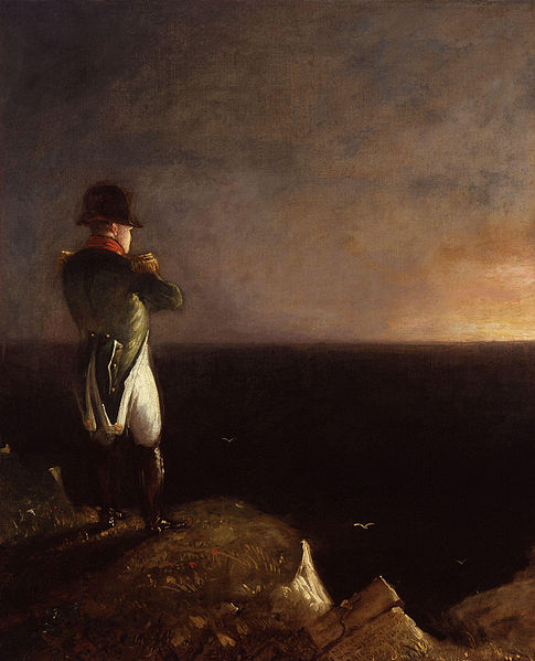
Vinous Landscape, 1944, Jean Dubuffet
Dubuffet had the misfortune of coming of age as an artist rather late in life and, worse yet, during the worst years of World War II in an occupied Paris that had no time for art, and in any case, even after the war, was an art capital long abandoned in favor of New York by anyone who really mattered except for Picasso (and even he was under virtual house arrest during the Nazi occupation). Most of the Pompidou exhibit dealt with Dubuffet's pre-war and wartime art, works such as his 1943 series of gouache portraits of Paris subway passengers (bottom, left)  depicting them whispering, hanging onto subway poles, or looking straight ahead in dour passivity. Other items included glittering collages made of butterfly wings, a kinky comic book, a series of desert nomads and camels under a blistering sun, and disturbingly "ugly" portraits of enormous, misshapen, naked women. Dubuffet created a series of life-size clowns called the Coucou Bazaar, also his free form doodles made while talking on the phone. Later works after the war are more familiar, "paintings" in which he piled tar and broken glass on his canvases, rendered children's drawings and finally, an unsettling series of mostly black paintings done the last year of his life up until he suddenly ceased painting just five months before his death. They are spare, sombre, depressing and, most strikingly, in marked contrast to the extravagant textures and bright colors Dubuffet used so profusely during most of his lifetime.

Lili Masque, 1936,
Jean Dubuffet
The greatest number of early Dubuffet works were found filed (hidden?) away in storage at the time of the artist's death. Among the earliest are three whimsical masks dating from 1935-36 (right) showing men and women with fleshy, rosy cheeks, one with a forced smile, one merely surprised, but both of which seem to foreshadow Dubuffet's childlike, noble savagery after the war. Dubuffet had high esteem for this savagery, based upon instinct, passion, whim, violence, and madness. His later work employs a "savage" use of color and especially texture, his paintings often more closely resembling montage or assemblage sculptures than even the most nontraditional abstract paintings. Whether concrete, sand, leaves, glass, plaster, plastic - if he could shape it and make it stick to canvas, it was fair game.

Subway (detail), 1943,
Jean Dubuffet
Vache à l'herbage, 1954, Jean Dubuffet.
Whatever would stick to canvas.
Artistic regression?
 

Thursday, August 30, 2012

Degas Mixes Media

Edgar Degas Self-portrait, 1855
I've always felt that artists should surprise people. I've always felt that way even before I really moved off in that direction myself, trying consistently to do things that make viewers blink, do a double-take, or maybe drop a jaw or two. One of my favourite artists felt the same way. At the Sixth Impressionists Exhibition in Paris in 1881, this well-known Impressionist from the very beginnings of the movement surprised a lot of people. In his painting, Edgar Degas often strayed from the straight and narrow Impressionist path trod by Monet, Pissarro, Renoir and the others. In fact, by 1881, he was becoming more than a little disillusioned with Impressionism. But it wasn't his painting that surprised, even stunned, viewers at the show, but the fact that he'd changed mediums entirely. He'd exhibited a sculpture, and not just any sculpture, but one done life-size in wax. Add to that, he gave his lovely young ballerina real human hair, a muslin tutu, satin slippers, and silk ribbons.

Little Dancer of  Fourteen Years, 1879-80,
(1922 casting in bronze), Edgar Degas
Degas called his sculptural deviation Little Dancer of Fourteen Years. The French, even some of Degas' closest friends, gasped in dismay. Who did he think he was, Madame Tussuad? No, he didn't, and in truth, he made no attempt to give the figure any kind of natural colouration, made no attempt to "fool the eye." Still, it was a little too close to that waxy, thoroughly French tradition for the comfort of the average Parisian art connoisseur. They loved the subject of course, one of Degas' most frequent interests, but why couldn't he be satisfied just painting her? And what's this idea of adding real clothes to his figure? She'd probably have caused less of a stir if she'd been nude...even at fourteen. Also, even though most agreed the figure was really quite charming, Degas had no training as a sculptor; it was really quite disturbing. Actually, if the facts had been known, Degas had very little training as a painter either, probably less than a year in any kind of formal classes. In the face of his critics, Degas rebutted that he was an artist, and as such, the medium, or in this case, the mixing of media, really didn't matter.

A Cotton Office in New Orleans, 1873,
Edgar Degas
The French weren't so sure. The Americans, on the other hand, loved it. Degas had relatives in the United States. He visited them in New Orleans at one point in his career (left). By the time his little ballerina made it to these shores, she'd been cast in bronze, but still sported her homemade tutu, slippers, and the ribbons in her hair. Moreover, these items were no less startling in their presence having made the transition from wax to metal. I saw one of Degas' bronze dancers at the St. Louis Art Museum several years ago, and just as the artist had planned, I also did the proverbial double-take. Then I fell in love with the seemingly shy, somehow slightly sad little girl. Her tutu had not stood up to the years very well. Apparently original with the work, it sagged noticeably. The slippers and ribbons were faded, making the overall effect one of her having once been alive, and then somehow, her delicate, fragile youth having been made immortal by her metallic transformation. It was as if she'd sacrificed life for eternal youth.

Dancer Taking a Bow, 1878, Edgar Degas.
Moving from paint to wax to bronze.
In all of Degas' work, but especially in his little ballerina, you see the influence of Ingres, and of Delacroix. You see the work of a man who loved women, a man who loved them as they were, unadorned, comfortable, often in seemingly unflattering circumstances, yet never do you see anything less than women of great strength as well as beauty, even at age 14. If you visit an exhibit of Degas' work, you see a surprisingly diverse artist; you see why one of his originals recently sold for $25-million. You will see why American collectors loved Degas, perhaps more than did the French. I don't know, maybe the French don't like surprises. Degas was nothing if not versatile. His repertoire  included figure studies,  jockeys and race horses, dancers, women bathing, and of course, his impressionist landscapes. His sculptures, drawings, paintings, and pastels form an amazing trail for one man to have followed. And around every corner we find his surprises--an amazing trail for us to follow too.

Wednesday, August 29, 2012

Early Art Museums

Designed to be impressive, visitors to London's ancient British Museum
today might also find it intimidating.
When we visit art museums today, we step into a cool, clean, uncluttered world of spacious, refined, good taste, near-perfect lighting, and various printed or audio-visual educational enhancements designed to further heighten our aesthetic art encounter. Seldom, if ever, do we stop to realise that our present museum experience dates back only about two hundred years. Two of the earliest museums, the Louvre (1793) and the British National Gallery (1824) are thus both relatively recent (in terms of art history) developments. Before that, fine art was largely the domain of the titled aristocracy and royalty. But as democracy dawned in the western world, art also became democratic. I wrote some time ago about the descent of history painting from its once lofty height in favour of paintings depicting everyday life (genre). This development was one of the direct consequences of the democratization of art. And of course, another was the art museum.

The Gallery of Cornelis van der Geest, 1628, Willem van Haecht, (here depicting a private
collection); it wasn't until the early 20th century that art museums took on the spacious, uncluttered look we know today.
Believe it or not, there were those in London in 1824 who didn't think a national art museum was such a good idea. One was the noted English landscape painter, John Constable. Though a direct beneficiary of the rise in popularity of genre, and especially landscape painting, Constable worried that such an assembly of fine art would encourage copying. His concerns were not unreasonable. In fact at the time, the act of copying great art was considered perhaps the best way for any would-be artist to develop his or her skills. It was no accident that the first facilities of the National Gallery in Trafalgar Square were also shared by the Royal Academy of the Arts. Students routinely set up their easels in the middle of the museums cluttered galleries, with the blessing and guidance of Royal Academy instructors. And there was a lot to copy. Wall space was limited. The art was not. Hung in what we today call "salon style," work ran literally from floor to ceiling in sky lit, windowless rooms...room after room after room literally overflowing with presumably original masterpieces.

Napoleon Bonaparte,
Benjamin Robert Haydon
Arthur Wellesley, 1st Duke of Wellington,
 1839, Benjamin Robert Haydon
I say "presumably" because, as one might guess, with that kind of learning system, and with the high calibre artists it produced, copies quickly lent themselves to becoming fakes which were often passed off to nouveau-riche industrialists and speculators as the real thing, or at least work by the same artists as hung in the nation's premier art museum. Unscrupulous dealers also commissioned always hard-up artists to copy works which were then "aged" in smoke-filled ovens, then kippered and distressed into new-found antiquities. Add to that as many as twelve-thousand similar works from other countries finding their way to market, and it would come as little surprise that the discriminating art buyer felt safest purchasing work from the artists themselves. But even then they were hardly guaranteed an "original" in that an artist with a "hit painting" might create dozens of copies himself. The history and genre painter, Benjamin Robert Haydon for instance, created no less than 23 versions of his portrait of a brooding Napoleon on St. Helena (above, left), while at the same time shamelessly painting 25 variants on Napoleon's conqueror, Wellington musing on the Field of Waterloo (above, right). Any similarities were purely intentional. With those kinds of numbers in circulation, God only knows how many fakes were painted by other artists!

Though not common today, some museums
still permit artists to copy works from their walls.
Amid that kind of abuse of the system taking place, museums and art academies eventually found it in their best interests to first control, and then gradually eliminate the copying of the art on their premises. Of course one of the problems, especially in England, was that the "premises" never could keep up with the influx of fine art as wealthy collectors died and willed their art, if not the money to house it, to the major museums springing up around the country. Even into the 20th century, the art in many museums was still being hung frame to frame in a maddening montage of styles, shapes, and subject matter.

From the old masters to Impressionism to contemporary art, the spacious, wide-open concept of museums today, though limiting quantity, displays work in a manner allowing
it to "breathe"--to exist in its own space.

It was only with the advent of Modern Art, which looked horrible under such circumstances, that museums began to follow the lead of privately sponsored exhibitions in hanging all work at eye-level with a generous expanse of uninterrupted wall space in between. However, because of this, the problem of more art than walls only worsened. Even with museums sprouting wings at a rate matched only by hospitals, many art institutions today have as much as ten times more art than they can display. As a result, the excess flows into warehouse or basement storage facilities where even now, beyond the watchful eyes of curators, it continues being copied. Of course, with today's high tech authentication procedures, few of these copies are likely to become fakes to be passed off as originals. So presumably, now at least, despite the size and number of art museums abounding today, John Constable is resting easier in his grave.
The White Horse, 1819, John Constable, many imitators, but few copiers.
 

Tuesday, August 28, 2012

Early American Painting

From the Alderman/Bissel Tavern,
Sturbridge, Mass. 1760
Those of us with both an artistic and a historic bent tend to high-mindedly consider portraiture as the earliest type of American painting. In fact, it's not. In the 1640s, Connecticut and other colonies passed legislation demanding that every community have licensed "public accommodations" or inns for weary travellers to rest their heads. A problem arose however when those weary travellers rode into town and tried to find such accommodations. The biggest house in town would look to be the most likely candidate but often was not the local inn. Before long, these inns were required to also put up signs, some painted by the owners, others by locals with a steady hand and a sharp eye, and others by itinerant artists providing the service. These were the earliest American artists, long before anyone in the colonies could afford even the simplest portraits.

Apparently,  few "ladies" did much traveling during 
the colonial era (depending upon whether the
misspelled word was "horse" or "whores").

What would you think, riding into an early colonial town, seeing a sign hanging before a roadside inn that read: "Entertainment for Man and Hors"? It might help to know that "entertainment" back then referred to meals and lodging, and the word "Hors" was an obvious misspelling The work was that of itinerant artist, Bill Rice, and is the earliest, un-repainted colonial era sign to survive. It's been dated from 1749 (despite what the sign itself says). You won't find his paintings in the National Gallery of Art, or even the Smithsonian. You'd have to travel to Hartford, to the museum of the Connecticut Historical Society, which has the largest collection of sign art in the world.
Based on such signage, 
a colonial traveler might
find it difficult to tell an
inn from a livery stable.


Of the thousands of signs from the colonial era, only about one hundred survive. And as interesting, insightful, and enlightening as they might be to daily life during that era, they are a nightmare for curators. First, the different wood panels, especially having been out in the weather for a good part of their working life, presents all sorts of varying preservation problems. Second, paints used during that period would, today, hardly be worthy of the name. They faded, often at different rates, depending upon the color, chipped, pealed, and as a result, were subject to frequent repainting, by other artists or the artistically inept owners themselves; often using totally different messages, even for totally different purposes. Thus, images from several different eras compete with one another, forcing curators to make agonizing judgements as to which layer is most important. Sometimes the most artistically important layer is not the most historically important. In effect, to preserve one layer, they're often forced to destroy the sign art from other times.


Monday, August 27, 2012

Delft Artists

View of Delft, 1660-61, Jan Vermeer
When someone mentions the name Delft, the first thing that comes to mind for most of us is the brilliant blue ceramic decorations seen on Delft tile and dinnerware. It would seem that what we know about Delft comes mostly from the Dutch scenes depicted by these ceramic artists. That's strange because, in fact, we can learn much more about this city by looking at its paintings. Located in Holland just three miles from The Hague, which was the capital of the country at the time, Delft was a sort of bedroom community for those of some importance who wanted to be near the seat of government, but not too near. During the late 1600s, when the area reached its cosmopolitan peak, Delft was a city of reserved, sophisticated, and wealthy art patrons--merchants and traders newly prosperous from the beer and linen trade. Pottery was only a sideline at the time. The real art of Delft then was painting. And the consummate Delft painter of the day was Jan Vermeer.

View of Delft, 1683, Fabritius--Delft by a lesser talent.
Jan Vermeer turned out only 34 paintings in his whole lifetime. Although he died young, in 1675 at the age of 43, that's still not very many. Typically he worked up to four months on a single painting. That compares to his colleagues at the time that seldom spent more than two or three days, never more than a week or two, on theirs. Consequently, his work, even then, sold for prices equal to a year's wages for a skilled labourer--and there were plenty of people waiting to buy. Vermeer was blessed with a couple of discerning (and wealthy) clients each of whom bought nearly a fourth of his work. Today, if you want to see Vermeer's work, you need go no further than New York--to the Metropolitan Museum of Art, or just down the street to the Frick, which owns three Vermeers. The Met at one time displayed as many as 15 works by the painter alongside some 70 other Delft paintings and 35 drawings by 30 other artists who lived and worked there during Vermeer's short lifetime.

The Little Street, 1658, Jan Vermeer
It's not hard to see why Vermeer was the preeminent Delft painter of his day. There is an intense beauty in the work of the average Delft painters, the exquisite, gem like qualities in those of the best; and then there is Vermeer, rising well above both groups. The luminosity of his highlights, the transparency of his shadows are both breathtaking. Such masterpieces as his 1667 The Art of Painting (below, left), The Procuress (below, right, 1656), and his The Little Street (left, 1658), are seldom shown in this country, but in just these three paintings, we see that the term "genius" is not used lightly with regard to Vermeer. And when you see Delft itself, through the eyes of the other exceptionally talented artists the city richly supported, you see why. You see drawings of the city, a city with the highest literacy rate in Europe at the time, with an economy surging ahead like never before, and a city in which the best painting was on canvas, not on ceramic tiles.


The Procuress, 1656, Jan Vermeer

The Art of Painting, 1667, Jan Vermeer


Sunday, August 26, 2012

Disasterware

Artists' Rifles Uzi, 2000, Charles Wing Krafft
At first glance it would appear as if one might have stumbled into a NRA gun show held amid the refined splendor of an art museum. There are AK-47s, Kalashnikovs, Uzi pistols, Berettas, Smith and Wesson revolvers, even grenades and stilettos. It's very discomforting. Even more disconcerting, as ones eyes wander around the room, are the weapons decorated with Ming, Delft, and Meissen floral patterns. Over in another corner are plates and mugs decorated with sinking ships, murder, and mayhem, even a Delft teapot bearing the likeness of Charles Manson (below, left). It's called "Disasterware." Gradually you come to realize it's all disasterware, all ceramic, and far, far from your grandmother's china painting. It's the work of a 62-year-old painter by the name of Charles Wing Krafft. He calls it his Porcelain War Museum. There is an absurdity of fragile weapons, painted either with tromp l'oeil realism, or decorated with frilly, pastoral designs in a style Krafft calls "Combat Kitsch."

Balkan Bunny, 2000, Charles Wing Krafft.
The first reaction is, how cute, then...
Working out of Seattle, Washington, Krafft's art goes far beyond its obvious antiwar statement. He sees it as a war memorial having a sort of twisted sense of humor. The featherweight weapons are the way guns ought to be made, totally useless, totally benign, totally decorative, totally fragile. His guns are made by creating plaster molds from the real things, then slip casting the work in delicate porcelain, which is then fired, decorated, and fired again. Krafft has been at it now for almost 20 years. Before that he was a painter.

It's not all just about weapons, murder and
mayhem play a part in Krafft's work as well.
(There's a similar piece with Hitler.)
Krafft is not in it for the money. His china weapons are not big sellers. An Uzi machine gun brings about $1,800, far less than his still-life paintings of china plates which sell in the $5,000 range. As a painter, he got interested in working on ceramic tile as the result of a commission from Von Dutch Holland, best known for creating custom cars, the flying eyeball icon, and blowing up things in Steve McQueen movies. Krafft studied with the Northwest China Painters Guild as well as at the Kohler Arts-industry Center in Wisconsin, and later in Europe. He casts and fires all his own work, and his decorating style ranges from elegant Delft, to the whimsical, to morbidly grotesque. He has shown his work in museums and galleries all over the U.S. Quite apart from the fact Krafft has decided there's little money to be made in creating such works, he plans to return to painting eventually, but for now, Disasterware has put him "on the map," so to speak, plus he's having too much fun to give it up.

Fishing With Lefty Kreh, 1995, Charles Wing Krafft.
Even his traditional painting is not very traditional.
 

Saturday, August 25, 2012

Dirty Old Men

Nu couche avec Picasso assis a ses pieds,
1902-1903, Pablo Picasso
One of the embarrassments curators and art historians have had to endure in the past is that of being put in a position of censoring the work of famous artists based upon its erotic content. Often, museums have acquired such works mostly for their historic and curiosity value but were highly reluctant to display them for fear of tarnishing the reputations of the masters and thus diminishing the value of their larger holdings by the same artist. On the other hand, Picasso for instance, left quite a portfolio of such works, a few of which have found their way into program publications from some of his major shows. But then again, we've always known Picasso was a "dirty old man" so there's little chance Les Demoiselles de Avignon would be worth any less for the exposure of a few "naughty" little forays into the boudoir. In fact, insofar as private collectors are concerned, such things add a bit of spice and color to what might otherwise be rather dry, esoteric holdings.

The Hundred Guilder Print, 1647-49, Rembrandt
The British Museum in London several years ago mounted a show titled "Rembrandt the Print maker." We've all come to feel we know Rembrandt the painter pretty well. And while a few of his more popular etchings such as the famous Hundred Guilder Print, and The Three Crosses have become familiar too, for the most part, we recall Rembrandt as having been a master of the etcher's art yet we're not well acquainted with much of his printed work. The British Museum show marked the largest exhibition of Rembrandt's etchings in history - fully one-third of all those he ever made. And for the first time, the restraints of curatorial censorship were removed, revealing that, like Picasso, Ingres, Caravaggio, Matisse, Gauguin, Cézanne, and others, Rembrandt was something of a "dirty old man" too.

The Monk in the Wheat Field, 1646,
Rembrandt van Rijn
In 1848, the British Museum purchased the Rembrandt print, The Monk in the Cornfield. It had been in the print storeroom ever since and it was already two hundred years hold when the museum bought it. What sounds innocent enough according to the title actually depicts the aforementioned monk and a willing young milkmaid involved in, as the catalogue demurely puts it, "a deed as old as humanity." Even today, such works are usually ignored by surveys of Rembrandt's prints (and there were more than a few). Until recently, and perhaps even now, such works have been deemed too obscene to display. Not only that, but in this particular case, inasmuch as a religious figure was involved, the element of sacrilege also raises its ugly head.

Woman Making Water and Defecating,
1631, Rembrandt van Rijn 
And what the British Museum didn't have along this line, the Rijksmuseum in Amsterdam was only more than happy to supply in filling in the gaps. Woman Making Water and Defecating forgoes sacrilege in favor of scatology without even so much as the pretense of a euphemistic title. And, while painters have never been reluctant to draw and even paint various scenes involving the act of seduction, Rembrandt's The French Bed picks up where most artists (except Picasso) have had the good taste to leave off. What artists won't do for money... It would appear that, in addition to selling exceptional etched masterpieces of both a secular and religious nature, Rembrandt also ran a thriving "under the counter" business in erotica.

The French Bed, 1646, Rembrandt van Rijn
In all fairness, the erotic works made up only a relatively small number of the hundreds of Rembrandt prints on display in the British Museum Show. And likewise, perhaps it's only because they've been suppressed so long that we now find them as shocking as they are interesting. And in Rembrandt's case, unlike the work of Picasso and most of the others, the Dutch master seems to have segregated sex from nudity. None of the sexual indulgences in Rembrandt's etchings depict total nudity, which I might add, he was in no way reluctant to paint. All of this makes us wonder if such prints should not have continued to be suppressed, if for no other reason than that of good taste. Do we really need this kind of stuff to "round out" the persona of some of our greatest artists? Or, has the exhibitionist art world come to the point that it needs such works to attract crowds to art shows, even when such a titanic talent headlines the exhibit? I'm not so prudish as to pretend erotic art doesn't have its place, but one does have to question whether its place is on the walls of our most prestigious museums. Maybe our museums need seductively lit back-room boudoirs for such exhibits.
Joseph and Potifar's Wife, 1634, Rembrandt van Rijn, who here even
combined the erotic with the biblical.


Friday, August 24, 2012

Cuban Art

Beautiful (from a distance), downtown Havana, the home of the Havana Biennial.
We all despair at the odds of becoming rich and famous as artists. I had an instructor once in college who noted that if he'd been in show business instead of the art business, he'd be a household name by now (then). Wouldn't it be fun to be a household name? As difficult as any major degree of success might be in this country, imagine the odds in a third world country, and not just that but a Communist third-world country...like Cuba for instance. Imagine living and working in a country where there is literally no domestic market for art...few if any of its impoverished citizens can afford art of any kind. Even the government has better things to do with its money. Yet there are a few outstanding Cuban artists with some international standing. There's even a Havana Biennial.

Paseo del Prado, Daniel Roca. Vintage American
autos (pre-Castro) are something of an infatuation
with many Cuban artists.
Every other year artists, curators, and gallery owners converge in Havana (or in other major cities in the world where the Biennial has been held) to greet and meet third-world artists on an international stage sponsored by the Wilfredo Lam Center of Contemporary Art in Havana. They buy art. They even "buy" artists, bringing them back home to various residency programs all over the world. A surprising number end up here in the United States for short periods of professional growth and/or exhibitions. And despite economic conditions back home, they sell their work for a decent price by any economic market standards. Cuban art, because of the political and economic isolation of the island country - so near yet so far from our shores - thus has an exotic air about it. It's in. Galleries such as Art in General in New York feature it. Wealthy Americans such as Manuel Gonzales of Chase Bank in New York collect it.

Colorful tropical pieces are to be expected in Cuban art and local artists don't disappoint.
La Conga, Evelio Garcia Mata
Though they must rely on international sales in order to survive, outstanding Cuban artists find themselves treated by their government as a special breed because they must rely on international sales. They bring much needed hard currency to the beleaguered economy and thus have special privileges such as the freedom to travel, study, and exhibit in foreign countries. The Biennial has taken them to Johannesburg, South Africa; Istanbul, Turkey; and Lima Peru. This year's Biennial features the work of 170 artists invited from all over the world showing their work in some twenty different sites throughout Havana.

Religion, politics, Surrealism, and Spanish influences find their way into Cuban art such as In the Kingdom of God Everything is Possible, by Cuban artist, Rodriguez.
Surprisingly, however, some Cuban artists worry about what might happen with the passing of Fidel Castro and the possible (or probable) opening up of Cuba to the western world. They worry because of what they saw happen to dozens of Russian artists with the fall of the Soviet Union ten years ago. They and their work went from being international curiosities to just another group of struggling ethnic artists. Their work lost the aura of exclusivity a closed Communist society had created. Now, one Cuban artist, photographer Miguel Pina, laments that you can count on the fingers of one hand the number of Russian artists with any significant international standing. "They lost their international market (largely American) while continuing to live and struggle in a country which still has little or no domestic market." He ought to know, he's studied in both Russia and the US.
In Cuba, as in many Latin-American countries, art takes to the streets. Murals,
often crude and amateurish, nonetheless have long been a creative mainstay.


Thursday, August 23, 2012

Jim Dine

Self-portrait, 1987, Jim Dine
When I was an undergraduate at Ohio University in Athens, Ohio, starting in the fall of 1969 and the first few years of the 70s, the place was in something of an uproar. What with war protests, Kent State, hippies, yippies, yuppies, and their puppies all darting around all over the place, the smell of pepper gas lingering over the college green, and instructors sometimes far more radical than their students, it was an exciting, but confusing, and highly volatile environment in which to try and get an art education. But one constant at Siegfried Hall (the school of art) was that in whatever class you took from all but the youngest teaching assistants, each professor would at least mention, often to some length, the fact that he'd had the famous Pop artist, Jim Dine as a student. To us, he was made to seem like some kind of god almost. And even though Dine did, indeed, get his BFA at OU, he in fact, only attended there his senior year. But to hear the locals tell it, in that one year, he must have taken every single course in the catalogue to have had that many different instructors in such a short time. And I thought I carried a heavy load.

Seven White Hammers, 2008, Jim Dine 
Jim Dine was born in Cincinnati in 1935. He came to OU in 1957 having studied first at the University of Cincinnati, and the Boston Museum School. His grandparents owned a hardware store on Court Street in Athens where he worked part time; which no doubt would explain his long fascination with all manner of hammers, saws, axes and other such off-the-shelf items amalgamated into his early creations. It's a good thing he didn't work in a deli. Upon graduation, Dine started in a graduate program at OU but was quickly lured away to the bright lights of New York City when he read in Art News of the work of Robert Rauschenberg and realised, "Hey, I can do that." In fact he already was; and had been doing similar pieces ever since coming to "Harvard on the Hocking" (an OU nickname).

A scene from The Smiling Workman, 1960, Jim Dine
In New York, Dine made the acquaintance of Rauschenberg and Jasper Johns, among others, all of whom would soon become the next wave, replacing the slowly dying Abstract Expressionist movement. In the meantime, he became involved in "happening art," which he preferred to call "artist theatre." In one instance, (The Smiling Workman) he began painting a canvas in bright red, then started drinking the paint (really tomato juice) before pouring it over his head, then diving through the paper canvas, supposedly becoming one with the painting. Okay it sounds silly, but this was the beatnik 50s (actually 1960), remember. When it came, the "next wave" was labelled "Pop Art" by the media and critics, and with his found-object paintings, Dine fell under the label even though he relentlessly objected to it. His work, for sure, had Pop elements, but the general definition and image of the movement were too shallow and narrow for his liking. It's tempting to try to sum up Dine with hardware tools, bathrobes, and hearts. But his work is much more than that. There's also skulls, sculpture, neckties, and Pinocchio.


The Robe Following Her, 1984, Jim Dine
Meadow Heart #1, 1971, Jim Dine


Indeed, while Lichtenstein, Johns, Warhol, Oldenburg, Indiana, Segal, Rosenquist, and others welcomed the Pop label and rode the wave, Dine merely tolerated it, always striving to supersede it. By and large he succeeded. While the others each settled into well-known (and well-worn) styles; despite the lethal hardware and bathroom attire, Dine's work has been much broader...much more searching. And though he has suffered no shortage of gallery representation, awards, retrospectives, and travelling exhibitions, Dine has always considered his work a logical progression from Abstract Expressionism, rather than its conqueror. Likewise, he's always been academically oriented, involved in artist-in-residence programs, lecturing, and writing. In fact, he's an exceptional poet. Moreover, he was perhaps the first contemporary artist to incorporate the painted word into his work. His Name Painting #1 (1969, below) is one of his best...no imagery...only names, in charcoal, on an enormous, 6'x15' unmounted canvas, in chronological order, of every person he'd ever met in his entire life up through the year 1965. Utilizing various styles of lettering, some thin, some heavy, in an exquisite interplay of lights and darks, the work seems almost like a flickering movie, like a life passing.


Name Painting (1935-1963) #1 (detail),
1969, Jim Dine
Today, at 77, the cutting-edge art world, as well as life itself, is passing him by. He's currently involved almost exclusively with various graphic media, relief prints, serigraphs, etching, and sculpture, sometimes all in the same work. Images of hardware, hearts, even his trademark bathrobes, still "Pop" up sometimes. So do his familiar symbolic self-portraits. But by now, having shaken off "Pop", he gets hung with the dreaded "traditional" label. Since 1967 he's been associated with Cornell University, but his academic resume includes Yale, Oberlin College, and guest lectures at universities all over the world.

Walking to Boras, 2008, Jim Dine. As much a sculptor as a painter, Dine's
fascination with Pinocchio dates from his childhood, seen here in Boras, Sweden.


Wednesday, August 22, 2012

Dali in Depth

The Sun of Dali, 1965, Salvador Dali
In writing about art and artists, day after day, I make a conscious effort to showcase artists whose work I don't like. I try to be objective. I try not to let my distaste for their work color what I have to say, although I sometimes mention the fact that a given artist is not my "cup of tea" if for no other reason than to alert the reader to the fact that there might be some unconscious bias in my words. On the other side of the coin, for the same reason, I guess I should also alert the reader when I talk about the work of an artist whom I really like. I've often mentioned the fact that Salvador Dali is an idol of mine. Well, BIAS ALERT, Dali was not only a master of Surrealism, but also one of optical Illusions. In seeking after this aspect of his painting, we uncover a little more "meat" in the artist's work than may have been known in the past.

Dali flirted rather unhappily with Hollywood in the
Hitchcock-Selznick production of Spellbound.
Gala Contemplating the Mediterranean Sea,  1976 Salvador Dali.
At a distance, painting becomes a pixilated image of Abraham Lincoln.
(If you can't see it, try squinting a little.)
For better or worse, all too many people think first of Dali the showman, or Dali the limp watch painter when his name comes up. There's little of the former and none of the latter in Dali's optical illusions. Instead, we see work done in the 1940s for Alfred Hitchcock's and David Selznick's 1945 movie, Spellbound. There in his original 20-minute dream sequence (which Selznick cut, then cut again, eventually eliminating it entirely) we find much of Dali's little-known experiments with three-dimensional illusions. The Hirshhorn Museum in Washington, DC once rigged up several of Dali's paintings in stereoscopic fashion, employing mirrors and other optical devices to allow viewers to enjoy the genius of Dali as he intended. Particularly noticeable was a harbor scene employing a rather enormous female nude (above).


Soft Construction with Boiled Beans, 1936, Salvador Dali
Nieuw Amsterdam, 1974, Salvador Dali
There was also a political side of Dali. His Soft Construction with Boiled Beans (above), painted during the Spanish Civil War, depicts a dissected human body strangling itself. When the Second World War forced Dali to flee to the US, he did a painting of a bronze bust of the Native American, Chief White Eagle. It's titled Nieuw Amsterdam (right). Reflected in his eyes are Dutch burgers congratulating themselves on the purchase of Manhattan Island for the proverbial twenty-four dollars, toasting one another with  bottles of Coke.

Moreover, Dali should probably be thought of as an important 20th century artist despite his crass showmanship, but only if we allow Dali to be Dali. It's impossible to divorce Dali from limp watches,  but he's also painted a floppy cello and wavy piano keys.  We must also give a nod toward Dali, the egotistical clown, as seen in his The Sun and Dali (top) complete with his trademark long, thin, curly mustache. But to see all of the man, we must look at, if not all of his work, at least some of his less famous images where the man's optical illusions bloom unexpectedly.
Salvador Dali, one of his most famous optical illusions.