Click on photos to enlarge.

Monday, February 28, 2011

The Industrial Revolution

Every generation or so the world undergoes a "revolution." The current one is the Internet.  Just before that, and leading to it, was the digital revolution. Before that was television,  before that, plastics, preceded by pharmaceuticals, aviation, automobiles, radio, telephones, and all manner of technical innovations before that. If you want to go back into ancient history, you could name revolutions that literally caused revolutions (the armed kind) including the printing press, gun powder, and steam. 

Steam? One of the most studied periods in history was the so-called Industrial Revolution, and steam had a lot to do with that. It hit England in the early 1800's and much of Europe only a little later in the century. Sociologically, it's hard to overstate the impact this coming of the machine had on daily life. Like most drastic changes, it had both positive and negative effects for the citizens of every society it touched. Most of all though, it gave birth to a permanent "middle" class.   
   
And how did the Industrial Revolution effect painting and painters? Well, among other things, it brought a new clientele to the painting market and a new awareness of the daily lives of those who now, thanks to the machine age, could afford the time and money to collect art. Artists like Gustave Courbet devoted a lifetime to portraying these people, and in so doing opened up a new avenue of subject matter, portraying peasants, workers, merchants, and other contemporary individuals in a serious spirit. 
 
The Stone Breakers, 1849, Gustave Courbet
Without really meaning to, Courbet started a war within the art world. Noble ideals and flights of fancy were pitted against an old man and his young helper breaking up stones as in his Stone Breakers of 1849. History painting became anecdotal. Religious painting became introspective.  Mythological painting gave way to Romanticism; landscapes became geographically identifiable; still-life painting eschewed elegance in favor of humble elements of daily life. Paintings shrank. No middle-class homes had room for earlier wall-size canvases.  Art was no longer "GRAND" but approachable--all because of steam.
   

Sunday, February 27, 2011

Impressionism Matures

In any artistic exploration, whether of a certain medium, or style, or subject matter, the "easiest" material always gets explored first. Take Impressionism for example. With the mass production of oil paints in tubes that came with the nineteenth century, paint became cheaper, of higher quality, brighter in color, and thus artists tended to use it in greater quantities, "al fresco" so to speak, straight from the tube almost. In terms of style, the large, loose, divided brushstrokes were the first step toward a new way of painting with these store-bought colors. Landscape painting was the natural jumping-off point for Impressionists. But Paris didn't need a dozen or so prominent Impressionists all painting landscapes. Even Monet moved on to haystacks and cathedrals.

The youngest of the Impressionists were to be the chief beneficiaries to the maturation of Impressionism as they experimented with new ways of using color, and most of all new subject matter. Two of the lesser-known Impressionists are typical--Armand Guillaumin (pronounced JEE-amin) and Gustave Caillebotte (pronounced KI-bot). Both were born in the 1840s and were slightly younger than artists such as Monet and Manet. Thus, they came late to the Impressionist movement. Their earliest works were not painted until the early 1870s. By then the "rules" of Impressionism had all been worked out by the ground breakers and were up for grabs, ready to be broken or ignored. Guillaumin painted no pretty water lilies or ladies bathing, or cute little children picking flowers. His subject matter came from the industrial suburbs of Paris--brilliant sunsets punctuated by chimney smoke from the growing number of industrial plants springing up along the Seine, and populated by the workers who ran them.

The Floorscrapers, 1875,
Gustave Caillebotte

Caillebotte painted the rooftops of Paris under snow, or manual laborers such as The Floorscrapers. In 1874, this dark interior scene of three barebacked workers resurfacing a floor was considered an insult to painting. A protege of Monet, whom Caillebotte claimed to have discovered (not vice versa), he was a well-to-do maritime engineer, wealthy, and mostly a part-time ainter.  Monet consulted him in the building of his floating studio. He loved rowing, and his paintings on the water have a vacation "snapshot" quality in their compositions, not unlike those of Degas. He was instrumental in underwriting the cost of several of the later Impressionist exhibitions, as well as purchasing quite a number of his friends' works. He died in 1894 and left his collection to the Louvre. They were not displayed however until 1937. The Louvre collection could have been greater still.  The original bequest numbered 67 works, of which 30 were rejected.

Saturday, February 26, 2011

Impressions of Impressionism

Claude Monet,
photo by Nadar
 We are in the habit of considering Impressionism as one of the high points in the history of painting. Art Historians have elevated Monet, Renoir, Degas, and to some extent the  Post-Impressionist as well, Gauguin, and Cezanne, to the status of artistic demi-gods. Yet for the most part, these individuals themselves had a much less favorable "impression" of their involvement in this style of painting. Monet noted: "Pictures aren't made of doctrine (referring to Impressionism's "rules"). Since the appearance of Impressionism, the official salons, which used to be brown, have become blue, green, and red, but peppermint or chocolate, they are still confections."   


Auguste Renoir
Renoir was even less gracious about his own experiences with Impressionism. He noted that by about 1883:  "I had wrung Impressionism dry, and I finally came to the conclusion that I knew neither how to paint nor how to draw. In a word, Impressionism was a blind alley, as far as I was concerned..." He added further, "If a painter works directly from nature, he ultimately looks for nothing but momentary effects; he does not try to compose, and soon he gets monotonous." 


Paul Gauguin
 
Paul Gauguin was not "impressed" much with Impressionism either: "The Impressionists study color exclusively, but without freedom...  For them the ideal landscape, related from many different entities, does not exist. They heed only the eye and neglect the mysterious centers of thought, so falling into merely scientific reasoning. When they speak of their art, what is it? A purely superficial thing, full of affectations and only material. In it, thought does not exist." Paul Cezanne, surprisingly, (for all his rough-shod opinions and rebellion against Impressionist virtues) was much more generous in proclaiming: "What follows Impressionism does not count."               

Friday, February 25, 2011

Impressionism Beyond Landscapes

Impression, Sunrise, 1872, Claude Monet
When we think of French Impressionism, one of the unfortunate tendencies is to think that it began and ended with landscape painting with nothing in between except more landscape painting. And, if we accept the fact that Impressionism, for all intents and purposes, began and ended with Claude Monet then this attitude is not surprising. Monet painted Impression Sunrise from which the term Impressionism was coined, and he was fortunate enough to outlive virtually all the other original Impressionist (he died in 1926) so a pretty good case can, in fact, be made for such a premise. The problem with all this is that what came in the middle was not all landscapes and waterlilies.

Quadrille at the Moulin Rouge,
1892, Toulouse Lautrec

There were florals, there were portraits, there were bathers, there were still-lifes, there were cityscapes, trains stations, children, the list is nearly endless--everything but the gods and goddesses and Sunday School pictures the Academics so loved. However, the one thing so many people fail to recall in thinking of Impressionism is the love these artists had for the Paris social life of their time. Paris was a party town. The cafes and nightclubs are practically legendary, and painters such as Manet, Toulouse Lautrec, Renoir, and Degas painted them endlessly. Add to that the outdoor concerts, dancing in the park, the opera, the ballet, the circus, and horse racing and you have a pictorial reference to what it was like to live, love, an play in the glittering "City on the Seine" in the latter half of the nineteenth century like none in the history of art.

The Absinthe, 1876,
Edgar Degas

The burgeoning bourgeoisie, for the first time in history, was now able to rub shoulders with the rich and famous, dining out, attending the opera and ballet, betting on the horses, and appreciating all the arts to a degree never before seen. The Impressionists recorded it all. But they didn't stop with the glitter that was not all gold. They chronicled too, in paint on canvas, the not uncommon descent of the middle classes into alcoholism, prostitution, poverty, and despondency as well. The same artists who painted dancers at the Moulin Rouge also painted the despair in the eyes of the whores across the street, and the blank stare of the absinthe drinker sitting in a desolate cafe.  Impressionism was not all pretty pastures and pretty pleasures. There was also stark, naked, ugliness as well, just behind the thin curtain of respectability that served as a backdrop for the Paris social life of the times. Painters had never painted any of that before.

Thursday, February 24, 2011

The Hudson River School

We are accustomed today of thinking of the "wild West" as buffalo, Indians, or perhaps, Buffalo Bill and the Indians. However there was a time when the wild west meant the Hudson River Valley and upstate New York.  The time was the early 1800s and the art that depicted this "wild West," or perhaps we should more accurately dub it, "wild East", has come to be known as the Hudson River School. And for those who know anything at all about early American landscape painting, the artist, Thomas Cole, is synonymous with this region.  To that name we could add his successor, Asher B. Durand or Jasper Francis Crospey as the century progress and the "wildness" began to wear a little thin in the valley.   
    
Mount Adams and the Peabody
River in Pinkham Notch, 1817,
Alvan Fisher

Although we know the Hudson River was discovered by a guy named Henry who thought it would be nice to have a river named after himself; in terms of art, the Hudson River was discovered by a man named Alvan Fisher who refrained from trying to change the name of the beautiful, broad waterway. Born in 1792, Fisher was a mere 24 years old when he began painting very naturalistic landscapes of the river and it's tributaries shortly after the end of the war of 1812. It was a lonely pursuit and it could hardly be said that he founded the Hudson River School, but his work did inspire others, principally the Philadelphia artist, Thomas Doughty who did make something of an impact upon American landscape genre of the time.   

The Last of the Mohicans, 1826, Thomas Cole
   
After some early success however, Doughty turned more and more to fantasy landscapes, creating dreamy, romantic visions of the scenic vistas, often marked by towering European castles poised on high cliffs.  Alas, his work was a bit too poetic for the Yankee art mentality of the time. It seems that nature lost its reality when it vaulted to such lofty heights. And by then of course, Thomas Cole was dogging his tracks with the kind of wilderness landscape manifestations the country yearned for. His 1826 painting, The Last of the Mohicans, inspired by James Fenimore Cooper's novel, was both a soaring landscape and a dramatic visual recounting of the story of the white woman, Cora, brought before the ancient Chief Tamenund and forced to choose between the wigwam or the knife.  Strangely enough, Cole, educated in the Grand Manner of English art, always considered landscape painting a "low art" and history painting to be the highest art to which a painter could aspire.  However, unlike Doughty, he had the good sense not to try and combine the two. Instead, in 1829, he abandoned the Hudson River and spent the next three years studying in Europe where is The Course of Empire series evolved.          
                       

Wednesday, February 23, 2011

Hopper and Rockwell

In going to art museums and seeing their various special shows or retrospectives, one gets a better grip on the artists as juxtaposed against the work of their contemporaries and the times in which they lived. I guess all people have fantasies and artists probably more than others. In the "Special Exhibits I'd Like to See" fantasy category let me propose a joint exhibition of the work of Edward Hopper and Norman Rockwell. It could be called "Two Views of America." I'm sure it would be a big hit as a traveling exhibition across the country, perhaps in special shows set up in the public libraries of the small cities and town both artists liked to paint. The show would have something for everyone.  I tend to think of such a show as having Republican art and Democratic art.  Both artists' work are steeped in nostalgia. Rockwell's Republican art would appeal to those conservatives wishing to bring back the "good old days" while Hopper's Democratic art would appeal to the liberals who would remind us that the "good old days" weren't all that good.


The Nighthawks, 1942, Edward Hopper
 Of course the contrasts in the work of the two painters would be much more stark than their similarities which only serve to make them comparable. There is a sunny, sweet optimism in Rockwell's work and a dry, cold, lonely quality to Hopper's. Both are extremes for the most part.  I would like to see Rockwell's 1957 painting After the Prom hung next to Hopper's 1942 Nighthawks.  The settings are similar but what a contrast in outlooks.  In another room
After the Prom, 1957, Norman Rockwell
could hang Hopper's 1930 painting Early Sunday Morning beside Rockwell's 1953 Walking to Church, paintings so similar in setting they look to have been painted on the same street, right down to the storefront colors and the familiar barber poles in both paintings. Rockwell's 1946 The Chars would underline still more forcefully the difference in the two artists if hung next to Hopper's 1951 First Row Orchestra. Hopper's 1931 The Barber Shop would make a strong statement next to Rockwell's 1950 Shuffleton's Barber Shop.

The Barber Shop, 1931, Edward Hopper

 The list of combinations in hanging such a show is practically endless. Of course it is a fantasy show by all means because I doubt very much that any museum would dare mount such an artistically controversial juxtaposition of two artists revered by such diametrically opposing camps. Moreover, I think both artists might suffer in the comparison because neither, in their extreme view of Americana, portrayed an accurate view of twentieth century America. 
Shuffleton's Barber Shop,
1950, Norman Rockwell
Rockwell would make Hopper look even more austere and sadly pessimistic while Hopper would make Rockwell's doggedly eternal optimism seem saccharine sweet.  The result would be such visual conflict as to make Washington politics seem tame by comparison. But then again, there's something to be said for the Chinese quality of sweet 'n sour. Could we trust the viewers of such a fantasy exhibition to come to the conclusion that the truth lies somewhere between the two extremes?

Tuesday, February 22, 2011

Fakers

Elmyr de Hory
 In twentieth century art, three names stand out as being the best at what they did. Each, in his own way, contributed to the art world being what it is today. If you ever see the names Elmyr de Hory, David Stein, or Van Meegeren, stop, take a moment to read about them, to look at their work, and marvel at their audacity. All three were fakers. That's right, all three made names for themselves by fooling a lot of people who thought they knew a lot about art. All three eventually ended up in jails, and in the end, became celebrities to some degree for their efforts. Of the three, de Hory was far and away the best. He got his start in the 1950s faking Picasso drawings--not too smart in that Picasso was still alive at the time. When Henri Matisse died, he switched a safer line, and then eventually began doing Modiglianis, from all indications, better than Modigliani, in fact. His fakes were in such prestigious venues as the Fogg Museum in Boston, and the Meadows collection in Texas. Alger Meadows was so impressed he ended up with 44 de Hory fakes, all adequately authenticated and certificated (also faked). When de Hory was finally caught, only one dealer would testify against him. The rest refused to admit publicly they'd been duped, for fear of deprecating their reputations as art experts.

David Stein was a lesser evil. He was the best painter of Marc Chagall's since Marc Chagall. Even during the artists lifetime, Stein skillfully and daringly reaped the benefits of his talent. To be successful in faking the work of living or dead artists, the faker had to be as good at forging art as forging the almighty paperwork that gives that art its monetary value. Stein was undone by the fact that he offered his work at prices that were too low. Bargain Chagall's have never existed outside the realm of forgeries. Alarms went off in the heads of dealers offered his works. At first, they were often thought to have been stolen. When the police came to question Stein, he literally escaped out the back window of his New York apartment, down the fire escape, and hopped a plane to Paris where he finally ended up spending a few years in jail for his efforts.

Van Meergeren demonstrating the
forgery of Jesus Among the Doctors, 1947,
aledgedly by Jan Vermeer

Just as the Second World War was dawning in Europe, a previously unknown religious painting by Vermeer was offered for sale. The problem was, Vermeer had never painted religious subjects. Still, the painting looked like a Vermeer, and if it was authentic, it would be extremely valuable because it was a previously unknown subject matter relevant to Vermeer. Suggestions were floated that it had been lost for centuries or even hidden away by the artist himself. As the German's occupied Holland, several more previously unknown Vermeers emerged. A Dutch man by the name of Van Meegeren was arrested for selling national treasures to Nazis such as Hermann Goering and others. In a strangely ironic twist, Van Meegeren contended in his own defense that he was not guilty because the paintings were his own work, and that he'd merely signed the name "Vermeer. " The jury didn't buy it and he went to jail. He apparently was too good for his own good. It was only when, from his jail cell, he demonstrated his skill at faking Vermeers (complete with artificially aged canvas and deliberately induced paint cracks) that he was released. Today, his works are collectors' items because they are such good fakes.

Monday, February 21, 2011

Alex Katz

In the latter half of the twentieth century, since the advent of Abstract Expressionism, the tendency in the art world and amongst the general public has been to divide all artists into two camps--Realists and Abstractionists. Even people who ought to know better fall back on this dichotomy of oversimplification. And the art world especially hates those artists who straddle the fence, sometimes painting realistically, sometimes painting abstractly, as if they were somehow schizophrenic in doing so. Some artists even manage to "straddle the fence" in the same painting. Of course the labeling critics will look at the work and cast it one direction or the other, either Realism or Abstraction, based sometimes, I think, on pure whim. One of the artists whom they love to do this to is Alex Katz.

Katz was born in 1927, in Brooklyn, later moving to Queens--New York born and bred--still lives there, in fact. His parents were Russian-Polish immigrants, steeped in the arts. He studied at the legendary Cooper Union, practically in his backyard, coming of age in the art world almost precisely at the dawn of the Abstract Expressionist era. By all rights he should have become an abstractionist. He was a contemporary of Pollock, Rothko, Hoffman, Johns, Motherwell, and all the others, but amazingly, any abstract tendencies in his work are strictly formalistic. Perhaps it was because he won a scholarship to study at the Skowhegan (Maine) School of Painting and Sculpture, taking him away from the boiling pot of the New York School right when it was bubbling at it's hottest. Not surprisingly, given the environment, he picked up a love of landscape painting, very nearly the antithesis of Abstract Expressionism at the time.

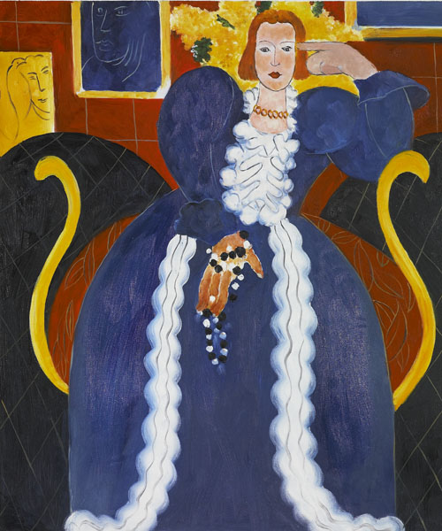
Katz's first one-man show was in 1954 at the Roko Gallery in New York. The headlines might have read: "Hometown boy returns and makes good." Except it wasn't at all like that. His landscapes and poster-like, flattened portraits were quite out of step with the mainstream. It took the passing of the Abstract era and the 1950s before the advent of figural painting and Pop allowed Katz's work to hit its stride. It fell neatly into both categories, even though it displayed a number of quite abstract elements. In the 70's and 80's, he capitalized on this blending. His Varick from 1988 is a prime example, or his Ada and Alex from 1980 (a double portrait of himself and his wife). Both are excellent examples of his mature work. In the portrait, an exquisite, design realism dominates. In Varick the five by twelve-foot black canvas seems the ultimate minimal statement, until one begins to inspect the bank of twelve small rectangles in the upper left corner--lighted windows of what appears to be a second story office or lab. Suddenly, the mind flip-flops, making a futile effort to discern the rest of the structure amidst the impossibly inky night.

The poster-like quality of many of Katz's paintings has led him into the printing field, creating, in collaboration with master print makers, same-size screen prints of his favorite works, all intended to dominate walls just as his enormous paintings do. Unlike many painters who find themselves at the mercy of publishing houses, Katz takes an active, hands-on role in the printing of his works, usually is editions of less than fifty. He's even found occasions when he likes the print better than the original painting. And recently, just to confound the damnable critics, he sometimes goes so far as to veer off into purely abstractionist images such as his Piers 6 from 1998. Excuse me for playing favorites, but I love an artists who can (and will) do that. In my own work, I consider the most successful, those paintings that straddle the proverbial fence--Realism which, in it's sometimes highly abstract qualities, appeals to those who can appreciate such things, and in it's illusionary, subjective content, those who can't.

Work by Alex Katz is copyrighted but can be seen at: http://www.newyorkartworld.com/gallery/katz2.html

Sunday, February 20, 2011

Adolph Gottlieb

I've been studying art and art history now for about thirty years. I'm not sure why it's taken me so long, but recently I've come to the conclusion that the simpler a piece of artwork appears on the surface, the more complex it is to understand. The reverse of that is also true. A compositionally busy American genre scene by Norman Rockwell, for instance, while no doubt taking weeks or months to paint with all its intricate detail, complex composition, demanding draftsmanship, and striking color relationships is, after all, pretty much what we would call in computerese WYSIWYG (what you see is what you get). My grandmother could appreciate it as much as I do. On the other hand, take a three-foot tall, four-foot wide canvas, paint the upper 60% a mottled white with a couple large circular shapes, a rectangle, and a couple hemispheres, then fill the remainder of the horizontal composition with a complex pattern of seemingly random brush marks and you have an exceedingly simple piece of art on the surface, but one with such a complex pedigree Howard Janson, all the king's horses, and all the kings men have to struggle mightily to put together any sensible discussion of what the piece "might" mean.

Frozen Sounds No. 1, 1951, Adolph Gottlieb

The title doesn't help much. It's called The Frozen Sounds No. 1. It was painted in 1951 by the New York School, abstract expressionist, Adolph Gottlieb. Normally a quick peek at the painting on the Whitney Museum of American Art Web site might help but, somehow, with this painting, and indeed, most of Gottlieb's work, a thousand words (or so) are definitely worth more than the picture. Gottlieb's work, along with that of Franz Kline, Mark Rothko, Robert Motherwell, and a few others from this era, is definitely what we'd call hard art. Normally, I compare Abstract Expressionism with classical music, but this goes even beyond that. Some artists even go so far as to sometimes label it as "non art" or on the other extreme, "pretend" to know and like it without the "foggiest" as to what it all means.

Gottlieb, was of German descent, but born in this country in 1903. Raised in New York during the height of the Ashcan School, he was taught by no less than Robert Henri and John Sloan themselves. A trip to Europe in the 1920s introduced him to the Avant-garde, where he picked up influences from Picasso and Paul Klee. During the 1930s, his work tended toward abstract landscapes with surrealist overtones before the process of simplification set in. After the war, he felt right at home amongst the likes of Kandinsky, Pollock, Kline, and Hoffman. Yet even as abstractionist go, Gottlieb is deep. "Frozen Sounds No. 1" is something on the order of an obscure acronym. He attempts to say as much as possible with as little as possible. It's a monumental, Morse code of captured auditory art. It's a rhapsody transposed to a visual pictograph begging the viewer to share the moment of creation when perfect harmony is derived from total disarray, and slices through it like a clear, profound, bell tone dispelling the white noise of electronic static. Now before you look back at the painting and sigh, "I knew that," be aware, I just made it all up myself. That's what the painting means to me. Okay, no fudging, you're a Gottlieb expert now, you tell me, what does it mean to you?

Saturday, February 19, 2011

Abraham Zapruder

One of the most arbitrary elements in the art world is the PRICE of art. A painter states a price, a buyer makes an offer, the painter lowers his price, hoping for a counteroffer, the buyer either makes one or walks away. It's old-world, street-market haggling at its most basic level, and it hasn't changed all that much since the days of old world street market haggling. Today, of course, it's still done sometimes at street-market art shows, but more often at giant indoor art marts, snobbish art galleries, and behind closed doors deep in the bowels of the US Government bureaucracy. The family wants $30 million, comparing their family heirloom to Vincent Van Gogh's "Sunflowers," which sold for $40 million in 1987. The government is offering a measly one million. The controversy boils down to whether the item is "art" or merely a national treasure. The "artist" is Abraham Zapruder. The work of "art"/national treasure, is the 30-second, 8 mm strip of celluloid which captured the assassination of President John F. Kennedy.

There is no question of ownership. The government has the film and intends to keep it. It's locked away in a freezer vault, at 25 degrees Fahrenheit, in a National Archives warehouse in College Park, Maryland. The family continues to own the copyright. The question is, how much should the family be compensated for the government's siezure of this piece of documentary evidence. The government sites the 1996 Sotheby sale of Kennedy memorabilia (from the Jacqueline Kennedy estate) where prices ranged in the thousands of dollars, rather than millions. The top price at that sale was $1.4 million for an antique desk used by President Kennedy in signing the 1961 Nuclear Test Ban Treaty. The government points out entire collection "only" brought $34 million. And the government points out that President Kennedy never even so much as "touched" the Zapruder film so therefore their offer is quite generous.

Art appraiser, Beth Gates Warren, writing for the Zapruder family, compares the film to Andy Warhol's "Orange Marilyn" which recently sold for $17.3 million, calling it a unique cultural icon, undeniably a part of the emotional Kennedy mystique and the controversy surrounding the President's death. She sites it as an example of "vernacular photography" which has recently come to the art world, depicting various aspects of modern, daily life where the creator had no intent toward artistic ends. Such works have regularly become a part of various museum exhibitions, such as a recent show at the Museum of Modern Art made up of photos of bank robberies taken by automatic bank cameras. She claims that the film, is far more viable as a work of art than pictures taken by surveillance cameras. She further points out that, "The film captures a profound moment in 20th century history in a deeply moving and visually compelling way." The argument therefore comes in a full circle. Is the film art, or merely an historic document? You've seen it. What do you think? One million or thirty-million?

Ansel Adams

One of the most interesting questions you can ask an artist is: "If you hadn't become an artist, what might you have been?" Had I not become an painter/teacher, I would probably have become an architect. Many of us, of course, have what I call "slash" careers, painter/mother or painter/engineer, painter/neurosurgeon, etc. So what I'm speaking of is often not an either-or proposition, but mostly I'm concerned with the painter side of the slash. If you hadn't become an artist, what would you have been? Many of us, in fact, probably came perilously close to actually becoming something else. Give or take a chance meeting here, an unexpected success there, and some of us might have become shoe salesmen, plumbers, or pumpkin growers. But we were lucky, had just the right influences, just the right deciding moments, and just the right good fortune to be where we are today.

On February 20, 1902, at 114 Maple Street in San Francisco, was born a baby boy, the only child of Olive and Charles Adams. He was a bright, talented youth...and lucky. He managed to come through the 1906 San Francisco earthquake with only a broken nose. Though something of a misfit in the public schools, he did well in a private school, took piano lessons, and in 1925, at the age of twenty-three he decided to become a concert pianist. He even bought his own Mason and Hamlin grand piano. However that's about as close as he ever came to the concert hall. Some nine years earlier, in 1916, at the age of fourteen, he had persuaded his parents to take a family vacation to Yosemite National Park. It was on this trip he took his first photographs. Today his name is practically synonymous with the park, the Sierra Club, and outdoor nature photography. There is even a mountain in the park named for him--Mount Ansel Adams.

Monolith, Face of Half Dome, 1927, Ansel Adams
 Though outdoor nature photography was already several decades old before young Ansel ever picked up a camera, no one had ever photographed nature as he did. Monumental surroundings demanded monumental photographic works of art. Even with the advent of color photography late in his life, his work was never at a loss for beauty and grandeur for lack of color. The professional equipment was heavy, awkward, and burdensome. His chief assistant was Mistletoe, his burro, laden with the tools of his trade. His first masterpiece, Monolith, the Face of Half Dome, was made when he was just twenty-five. For the next sixty years almost, his "visualizations" as he called them, were the face of Yosemite, in fact, of most of the National Parks in the whole country. Despite having lost over 5,000 negatives in a fire at his Yosemite darkroom in 1937, his work survives today as the most outstanding art and textbook of nature photography ever created. And to think, except for a seemingly arbitrary family vacation in the mountains, Ansel Adams might have become "merely" a concert pianist.

Friday, February 18, 2011

Holocaust Art

A recurring news story in various shapes and forms has plagued the art world and especially major museums for several years. Actually, we're talking not about one story but several regarding paintings stolen by the Nazi's from European Jews before and during WW II. The Museum of Modern Art in New York and the Seattle Art Museum have both had difficulties dealing with paintings that disappeared during the Holocaust, only to turn up in major museums and in the hands of private collectors after the war. Thanks to computers and careful cataloging by Jewish groups, when these paintings are offered for auction or loaned to museums for retrospectives, immediately, questions arise as to their rightful ownership. With the paintings valued in the millions of dollars, it's the stuff serious lawsuits are made of.

Landscape with Smokestacks, 1890, Edgar Degas

In 1939, when they came to this country, Frederich and Louise Gutman changed their name to Goodman and began efforts to find and reclaim a pastel drawing by the French Impressionist, Edgar Degas, which they claimed was stolen from a Paris warehouse by the Nazis during the war. The work was entitled, Landscape with Smokestacks. It wasn't until 1987 that the drawing somehow made it's way to a New York art dealer where it was sold to the Searle Pharmaceutical Corporation founder, Daniel Searle, for $850,000. The work was purchased in good faith in what seemed at the time like a routine sale.

In 1995, Simon Goodman, one of the grandsons of the original owners, stumbled upon a photo of the painting in a book of Degas monographs. By then the drawing was worth $1.1 million. For over two years, attempts to contact Searle regarding the work of art were fruitless. Finally, the Goodman family attorney wrote Searle threatening litigation. Fortunately for all concerned, a settlement was quickly reached. Searle agreed to donate the painting to the Art Institute of Chicago which in return would purchase the Goodman's share for an undisclosed amount. Happily, everybody won, and the public can now view a work of art which, unfortunately, shares a dark past with thousands of other works confiscated during the Holocaust. The sad part is it took  fifty years to reach such closure.

Thursday, February 17, 2011

Hogarth's Legacy

As working artist, we all take for granted the effects of copyright laws protecting our creative endeavors. But few of us know the debt we owe to one particular English artist whose lobbying was directly responsible for the English Parliament's passage, in 1735, of the first copyright laws. His name was William Hogarth, and it was little wonder he pushed so hard for legal protection for the work of artist like himself, for he was being robbed blind by the unscrupulous (and at the time, legal) engraving and reproduction of his wildly satirical paintings. His work, which poked fun at the aristocracy, was immensely popular with the middle classes, yet because of their scandalous content, he could not sell his paintings to those with money enough to buy them. For example, his "An Election Entertainment," painted in 1754, after hundreds of prints of it were sold, brought a mere 200 pounds at auction.

An Election Entertainment, 1755, William Hogarth
 Even though Hogarth's sympathies were with the common people, politically represented by the Whigs, this painting is a devastating political cartoon with eight or ten different things happening at the same time as almost three dozen figures celebrate an election eve victory over the Tories who are marching just outside the window in spite of boiling water being poured upon them and a man about to toss a stool through the window at them. Meanwhile, another man is being hit with a brick tossed through the broken window from the other side while another is having his head wound dressed with alcohol, which he is also imbibing. Elsewhere, a young boy pours from a keg into a washtub full of punch, the mayor has passed out from eating too many oysters and is being bled by his barber; a candidate is being kissed by an elderly woman while her husband sets fire to his wig and his daughter steals a ring from the man's finger.

All around the two tables that serve to unite the composition, are celebrants drinking too much and thinking too little. On the wall is a slashed portrait of King George III, there is a mockery of a string quartet playing in the background, a man entertains the revelers (who are mostly too drunk to appreciate his efforts) with a scarf tied around his fist turning it into a hand puppet; and in the foreground, a political operative counts cash, the life's blood of all political endeavors. If much of the action seems to be of little consequence, it's only because time has caused it to lose its significance. The scene seems to be one straight from Fielding's "Tom Jones," which was published some five years before. In addition to his legacy of copyright legislation, William Hogarth was also responsible for paving the way for the founding of the Royal Academy of Art, thus insuring that England's artistic tradition would one day match her literary excellence.

Wednesday, February 16, 2011

History Painting

 American artists of a hundred years or more ago who studied abroad were often captivated by the awe-inspiring tradition on the continent for massive history paintings. If for no other reason than they were often gargantuan in size had to mean that they were important. And of course, history was important, as anyone of the time could tell you, and naturally, to those producing it anyway,art was also vitally important even though it's monopoly on visual communication was rapidly fading. Today, motion pictures like Titanic and Gone With the Wind, or Television masterpieces such as Roots have taken over the place history painting once held simply because they are so much more effective in portraying it.   
   
Pity the poor nineteenth century art student returning from Europe with the high-minded intentions of becoming the all-American history painter of all times. Artist like Morse, Mount, Cole, and dozens of others fell into such a trap and paid dearly for their folly in terms of years of frustration. The fact was, there simply was no grand palaces, massive churches, or monstrous temples to government in which they could hang their idealistic masterpieces. Yet strangely, one artist did have a modicum of success in this endeavor. He was a German immigrant named Emanuel Leutze.   
   
Leutze was born in Germany in 1816 and brought to this country by his parents as a child.  In 1840, he returned to Germany to study art. It became a rather extended educational experience. It lasted some twenty years. It was there, in Dusseldorf, in 1851 that he painted his greatest, perhaps the greatest American history painting of all time. When he returned to this country with his 21-foot-long masterpiece it was immediately hailed a success, which led to additional commission, among them a mural for the United States Capitol--Westward the Course of Empire Takes its Way, painted in 1860. The name Leutze still not ring a bell? Then maybe you might recall his famous painting, Washington Crossing the Delaware?
  

Washington Crossing the Deleware, 1851, Emanuel Leutze


Tuesday, February 15, 2011

Edward Hicks

Painters with little or no formal training in art are often referred to as "naive" or "folk" artists and the tradition goes way back  to the very beginnings of art in this country. Perhaps one of the most well known is Edward Hicks. Born about 1780, he was a Quaker minister and sign painter in Bucks County, Pennsylvania. His skill as a sign painter can be seen in his early work including a charming, 1825 landscape of Niagara Falls with inscriptions, not from the Bible, but from a poem entitled Descriptive of a Pedestrian Journey to the Falls of Niagara by Alexander Wilson, framing it on all four sides.

Peaceable  Kingdom, 1834, Edward Hicks
The Quaker influences in his art however can be see in his most famous work, Peaceable Kingdom painted about 1834.  In it he depicts not one but two peaceable kingdoms.  In the foreground an idealized menagerie of predatory animals coexisting, indeed, posing, with cattle, lambs, children and other more passive beasts. It would appear that some of them he was only passively familiar. In any case, the  scene is based upon Isaiah 11:6 which foretells of a coming peace on earth wherein "The wolf shall dwell with the lamb, and the leopard shall lie down the the kid..."   
   
The second peaceable kingdom is a much more earthly one, based upon Benjamin West's painting, Penn's Treaty with the Indians. Placed off to the left in the composition, in a distant middle ground, the comparison between the two "kingdoms" is hardly subtle. A great admirer of Penn, Hicks saw in him one who tried to bring about the fulfillment of Isaiah's prophecy.  Interestingly enough, Hicks, for all his idealism, was not above making a tidy living from his art. Of this one work, the exact number of variations he painted is unknown, but sixty are known to survive.
Penn's Treaty with the Indians,
1847, Edward Hicks
William Penn's Treaty with the Indians,
1771, Benjamin West


Monday, February 14, 2011

Henry Tanner

One of the difficulties in writing about outstanding African Americans is what I call the "first to" syndrome. That is, this or that individual was the "first African American to" blah, blah, blah. It's patronizing. It's also very difficult to avoid. Alas, art history is no less prone to this fault than any other subcategory. And, while the recipients of such titles welcome the success, they are often acutely conscious of the terms under which their fame is portrayed. Black film maker, Gordon Parks put it succinctly, "The first black this, the first black, that. I don't appreciate that as much as people think I do.  I have no doubt there were other blacks who could have done it just as well or a lot better." Perhaps in the past, there was not this sensitivity. Whatever the case, in discussing the life, times, and success of African-American painter, Henry Ossawa Tanner, the story comes couched in so many such "firsts" that you'll please excuse me if I succumb to this problem.


The Banjo Lesson, 1893,
Henry Tanner
 Henry was born in 1859, in Pittsburgh, the oldest of seven children of a minister and his wife, living in the North, outside the bonds of slavery, just as the war to decide this travesty was starting to heat up. He grew up in Philadelphia where he discovered "art in the park" so to speak by watching an itinerant artist selling his work. At the age of twelve, he borrowed fifteen cents from his mother for paint and brushes. He never stopped painting until his death 78 years later. Henry Tanner was fortunate almost from birth. He grew up in a black, middle-class family at a time when that alone would have almost qualified as a "first." Not unlike many families at the time, his parents considered his art a nice hobby but pushed him to find a "real job." He tried for two years, working in a mill, then got sick. His parents relented and allowed him to attend the Pennsylvania Academy of Fine arts where he became a skilled painter.


Gateway, Tangier, 1912,
Henry Tanner

Like his original inspiration, he traveled around, trying to eke out a living. Much of his time he spent in North Carolina where he painted mostly religious scenes, trying to save enough money to finish his education in Europe. He ended up in Atlanta, Georgia, with an unsuccessful photography studio and a modest teaching position at Clark University. It was there a friend of the family arranged a public showing of his work. Not one painting sold. The friend, in dismay, bought them all himself. With the money, Henry finally made it to Europe where he studied for six years at the Academie Julien. Finding less racism in his adopted country, he remained there the rest of his life. He never changed his style or his subject matter despite the dozens of new art movements swirling about Paris in those years. In 1897, he became only the third American to have a painting purchased by the French Government ("The Raising of Lazarus"). During the war, he was a lieutenant with the Red Cross. Later, his work won numerous awards both in this country and France, culminating in 1923 when he was awarded the French Legion of Honor. He was the first American of any race to be so honored.

Sunday, February 13, 2011

Henri Rousseau

There are many ways to label or classify artists, good, bad, or indifferent (not the artist, the labels). They are usually be earmarked by style, or by media, or by subject matter, etc. Perhaps the most delicate classification refers to the degree in which the artist is self-taught. It would seem that only folk artists are indifferent to this matter, perhaps even taking pride in their lack of professional training. For the most part however, those without much academic training are the most sensitive to distinctions drawn according to diplomas and degrees. And speaking of degrees, there are, of course, degrees to which artists are self-taught. Those at either end of the spectrum seem to have it easiest.  Today, because art training is so easy to come by, the completely self-trained artist is a rarity. But when they occur, we've traditionally called them "naive" and we tend to excuse them from most of that which is expected of all other artists. In fact, we admire them for their virginal purity. At the other end of the spectrum, there are those artists whose academic credentials are so intimidating they can flaunt the rules and no one dares raise an eyebrow.

Self-Portrait, 1890, Henri Rousseau

Perhaps the best-loved of all naive artist was the French painter, Henri Rousseau. Born in 1844, in his youth he lived and traveled in Mexico, playing in a military band. Later, returning to Paris, he married, started a family, and settled down with a routine job in a customs house. But the wilds of Mexico had left an indelible impression. He began to paint that which was within him. His style we would call primitive. He was as untrained as was possible, given the times in which he lived. He had no thought of selling his work or making a name for himself. However, with his trademark painter's smock and black beret, he seems to have very much relished the "image" of the artist. His paintings of snarling tigers, peaceful lions, sleeping Arabs, and fanciful jungle vegetation, are charming and decorative, strong in what seems to have been an instinctive sense of color and good compositional design. His work is often compared favorably with that of Paul Gauguin's Tahitian paintings, though Gauguin's primitive style was studied, rather than natural.

Exotic Landscape, 1908,
Henri Rousseau

Perhaps the most exceptional thing about Rousseau's work was the fact that each was a personal expression of his nostalgia for his exciting glory days in the Mexican wilderness. He cared little for the fact he could not draw from nature and though he admired the work of Delacroix and Gericault, he perhaps considered himself to old to emulate them or burden himself with their academic accuracy. His strength as an artist was his fun-loving, totally idealistic freedom to express that which he loved most without regard for the niceties of the natural over the idealistic.

Saturday, February 12, 2011

Henri Matisse

Everyone has favorite artists; and one of the joys of writing about art is getting to share my favorites with others. On the flip side of that, everyone has artists that grate on them. I've encountered people who detest Norman Rockwell, who can't stand Picasso, who wish never to see another Cezanne, and those who could do without the garish gals of De Kooning. In general, I'm pretty tolerant of most types of art and most artists. But I too, (I must confess) have at least one artist that rubs me the wrong way. If it weren't for the fact that, historically speaking, he's pretty important, I might be able merely to ignore him, but alas, he's one of the more omnipresent art influences of the twentieth century--Henri Matisse.

As one of the three founders of the Fauvist movement in French painting during the first decade of this century (along with Vlaminck and Derain), and easily the leader of this group, he stands with the likes of Picasso, Cezanne, Monet, and Duchamp as seminal influences in modern art. And it's not really Fauvist painting that I dislike. Fauvism is about color and what's not to like about color, even that which is totally expressionistic rather than rational. Nor am I bothered by the work of either of Matisse's henchmen. Derain's wild landscapes are "hot"--exciting. Vlaminck takes some getting use to, but there's a sort of Van-Gogh-like swirling excess of paint and color that delights the eye.
 
The Red Room (Harmony in Red),
1908-09, Henri Matisse
 
The Blue Lady, 1837, Henri Matisse
I think what bothers me most about Matisse is the flat, wallpaper, paper doll quality that marks his work, especially once he begins to depart from the emotional "freshness" of Fauvism and starts laboring over his creations. I've seen progressive stills of his work over the course of some four weeks.  Typically, Matisse would hire a model, spend a day or two brushing in the essence of the sitter, then begin working and reworking the painting in the absence of the model for several weeks, scraping and scratching away at half-dried paint, layering on more and more paint to the point that the end result is not only tiresome when compared to the work of other artists, but strikes me as a travesty when compared to his own initial efforts. His Red Room (Harmony in Red) from 1908-09 strikes me this way. So does his Lady in Blue (1937).  Actually, most of his interiors are like this. In all fairness I must say a few of his pieces I find tolerable, The Joy of Life from 1905-06, for instance. But even here, his sensuous lines, colors, and brushwork, which are quite lovely, continue to be plagued by a disturbing tendency toward flatness that I find most annoying.

Friday, February 11, 2011

Helen Frankenthaler

After the Second World War, the amalgamation of European artists who fled the conflict in Europe and congregated in New York began to have a profound effect on art in the U.S., both through their own work and their influence on the more impressionable younger artist of this country. Gradually, their infatuation with surrealism melted into Abstract Expressionism and what we now call the New York School. The art scene in New York during the late forties and early fifties was a wildly creative and expressive festival of daring experimentation with all manner of paint and painting.  It was also very much a boldly male celebration, macho in style, color, and techniques.   
  
Mountains and Sea, 1952,
Helen Frankenthaler
 
Into this virtual whirlpool of men splashing around in the paint stepped a young woman fresh out of Bennington College in Vermont, still in her early 20s, married to one of the stronger movers and shakers of Abstract Expressionism, who not only rose above the work of her husband but staked claim to being the dominant female figure in the New York School at the time.  Her name was Helen Frankenthaler.  She was married to Robert Motherwell, a west coast immigrant to the New York scene whose bold, black and white color field paintings (juxtaposed with subtle secondary shades) looked nothing like hers.  Frankenthaler's soak and stain painting techniques on raw canvas broke new ground in bringing softer, more feminine qualities of color and technique to Abstract Expressionism.  It became her trademark as she established herself as a leader in the unique use of flowing areas of subtle color.   
   
Still in her 20's, Frankenthaler's work began to surpass in popularity many of her male counterparts.  She continued to produce and innovate all through the sixties, seventies, and eighties, and today, at 82, she is still the predominant female Abstract Expressionist. Her later paintings, done in the last twenty years, present a somewhat darker side of her artistic personality. The hues are deeper, richer, more varied with higher, stronger contrasts than her earlier work. Even though the colors are darker, there is nothing sad or somber in their visual effect. They are intense, dramatic, vibrant, and strong without loosing the inherently feminine quality that made her work so divergent in the fifties.

Thursday, February 10, 2011

Hans Holbein

From time to time, everyone "overindulges" at the dinner table. The problem is, some of us have the misfortune of having every such incident recorded for all to see at or near the belt line. The problem is not new nor is it limited by class. Perhaps the poster boy for such gluttonous endeavors is the renown King Henry VIII. Even though his eating habits and extravagant eight-course meals are legendary, it is through the exquisite portraits of his court painter, Hans Holbein the Younger, that we are left with a lasting visual impression of what the portly monarch and his 54-inch waist looked like.   
   
Most of us willpower-challenged individuals shrink from any graphic representations of our bodily magnitude, or turn blue holding our guts in while the photographer tries desperately to focus his camera. Elbowing your way to the back row of a group photo works too. But if you're king, no one stands in front of you and it might be difficult to exert enough abdominal control to pose for an oil portrait. Of course if the artist owes his job to your royal patronage, perhaps he could be bribed a few pounds to take off a few pounds.  However, such was apparently not the case with Holbein. Instead, he used the vain young king's magnificent obesity and over six-foot frame as a showcase for his incredible dexterity in handling a wide range of jeweled embroidery, velvets, furs, brocades, and other, miscellaneous sartorial detail, doing so with such delicate realism that we're hardly aware of the massive girth of the model.   
    
Henry VIII, 1540, Hans Holbein

However Holbein's skill with a brush didn't start or end with regal vestments.  He was first and foremost a great portrait painter in the finest English/German sense of the word. Born around 1500, he was originally a member of the humanist circle of Sir Thomas More. He was appointed court painter in 1536.  In 1540, he painted Henry VIII at age 39, probably the best known and most striking of his several royal renditions. Given the king's proportions, the painting is almost as broad as it is tall, but the direct, eye-contact of the stylishly bearded monarch is so commanding our gaze is riveted by his countenance rather than his enormous physique or even it's elegant attire. Holbein was undoubtedly rewarded quite well for his mastery of this painting skill, but he was not the highest paid painter in the employment of the King.  That honor belonged to a Flemish woman named Levina Bening Teerling, officially known as the King's Paintrix.

Wednesday, February 9, 2011

Gustave Klimt

We all have favorite artists. Most people who "know" art to any degree have several, perhaps so many they'd be hard pressed to choose only one as a favorite. It's kind of a futile mental exercise anyway because we like different artists for different reasons. Often our favorites are vastly different too.  It's somewhat frustrating sometimes, this picking of favorite artists, because often these favorites may be so obscure that when we mention their names we're met by a blank stare and either a spoken or unspoken, "who?" It's the same feeling as when your favorite movie isn't nominated for an Academy Award or your favorite song doesn't even come close to making number one on the Top-40 listing. That's the case with one of my all-time favorite artists, Gustave Klimt.

Klimt was born in Austria in 1862, the son of a goldsmith. The influence of his father's trade is evident in his work. He, himself, even referred to his "golden style" of painting, and while he rarely use the precious metal itself on his canvases, in many of his best work there is a metallic, golden elegance and detail that gives it the delicate sparkle of fine jewelry. The other element ever-present in Klimt's work is a romantic, barely cloaked eroticism in his portraits and figures. His work is stylish and stylized. It is awash with Art Nouveau motifs that further enhance the delicate elegance of its refined, sensuality.  Painting almost exclusively female figures, with an occasional male presence to heighten the romantic element, Klimt's paintings were the epitome of high fashion in the first decade of the twentieth century.


The Kiss, 1907-08, Gustave Klimt
 One of his best known works, and my personal favorite, is his 1908 The Kiss. The work is often said to depict Klimt and his mistress as they are cloaked in golden robes, his with rectilinear designs imbedded into it's glowing fabric, hers with oval shapes decorating its surface. They kneel on the edge of a jade precipice sparkling with lavender petals against a nocturnal meteor shower of gold flecks in a sepia sky. In his later work, the emphasis on sexuality blossoms into one of regeneration, love, and finally, death. Klimt is an artist often forgotten in that he had no precursors and no predecessors. The Art Nouveau style which he fostered quickly becoming dated and decadent-looking after the World War I. But for sheer, sensual loveliness, his paintings have no peer.

Tuesday, February 8, 2011

Guernica

Few artists in this century, or perhaps in any century, have ever lived and worked as ferociously as Pablo Picasso. A powerful bear of a man even into his early ninety's, he was a precocious, often obnoxious, artistic force to be reckoned with even before he was a man.  Everything about him was drawn larger than life. As a mere teenager he quickly outstripped his father's ability to teach him (or handle him), and absorbed art instruction in such a sponge-like manner he even outgrew that art training his native country had to offer, before abandoning Spain (more or less) permanently around the turn of the century. And when he hit Paris, a brash young man of 20, stories of his carousing, and sexual exploits have become the stuff of legends. Such folklore might seem merely that except for the fact that it is underlined boldly in every stroke of his brush and slash of his pen. The sheer quantity of his lifetime creative output is as staggering as some of the stories of his love life.   

Les Demoiselles d'Avignon,
1907, Pablo Picasso
   
At the age of 56, Picasso was riding a wave of personal and artistic success that would have been the envy of any artists. The Spanish Republican Government honored him above all others with an invitation to paint a mural for the Spanish Pavilion of the Paris World's Fair. He was having important shows in New York, Paris, London, and Germany. His work was bringing huge prices. The Museum of Modern art sold a Renoir to raise money. A part of the money was needed to purchase his Les Demoiselles d'Avignon for $24,000.  (A huge price at the time for a living artist).  Then on April 26, 1937, he was staggered by an event in his homeland which unleashed a creative outrage that was monumental even by Picasso's standards.  Planes borrowed from Hitler by Generalisimo Ferdenand Franco, completely laid waste the small Basque town of Guernica in the first known use of saturation bombing in the history of warfare.

Guernica, 1937, Pablo Picasso
Picasso had his subject for the Spanish Pavilion mural!  He began sketches for it less than a week later, resurrecting motifs from numerous earlier works as well as new elements.  He started painting on May 11th.  With his mistress at the time, Dora Maar, photographing each step of the process, he completed the 26 foot by 11 foot tall canvas in an incredible three weeks of feverish effort.  Even for Picasso the work was stark.  Limiting himself to powerful black, pristine white, and modulating grays, Guernica screamed for all the world to see and, figuratively speaking, hear, the monstrosity of Franco's Spanish Civil War.  Even after it was finished the impact upon Picasso's creative output was indelible.  Motifs from the painting continued to show up in his work for months afterward, and the impact the painting had upon the rest of the world stamped even more indelibly the horrors of modern warfare.

Monday, February 7, 2011

The Group of Eight


Three of the Group of Eight,Everett Shinn,
Robert Henri, and John Sloan, 1896

During the latter part of the nineteenth century, art in America, and particularly painting, had a rather effete image...one might even say effeminant.  Men might pay for paintings but women often chose them, and their highly refined tastes were reflected not only in what sold, but even what was painted.  Part of this was the French influence, both in terms of impressionism and the academic style, but it went deeper than that.  There was a "prettiness" to painting that lent a "sissified" aura to any young man professing an interest in the this gentile artform.   
   
Around the turn of the century however, Robert Henri returned to Philadelphia from his studies in Paris where he'd been exposed not only to academic painting, but to Impressionism, Manet, Whistler, and most importantly the seventeenth century work of Valazquez and Hals.  There he gathered around him a group of newspaper illustrators such as John Sloan, Everett Shinn, William Glackens, and George Luks.  These men were accustomed to the rough and tumble life of the big city rather than delicate romantic fantasies.  Moving on to New York City he acquired the following of Arthur B. Davies, Ernest Lawson and Maurice Prendergast.  Together, they have come to be known as the Group of Eight. 
McSorley's Bar, 1912, John Sloan
  
Though their work varied somewhat in subject matter, in terms of style the word "macho" comes to mind.  Brush strokes were bold, colors were vivid, compostions bustled with the vim and vigor of upper, middle, and lower class city life.  There was a robust power in all their work that revitalized painting in New York, influencing later artists such as Columbus, Ohio,  artist George Bellows, Edward Hopper, Reginald Marsh, and African-American artist Archibald Motley Jr. 
The Eviction, 1904, Everett Shinn
 Not always appreciated by the high-minded New York art establishment, these hard living, hard drinking, hard working men could hold their own as well in a studio loft or a bar room brawl.  Sometimes referred to as the "Ashcan School", they erased forever the "prissy" stereotype of the American Artist.

Sunday, February 6, 2011

Thomas Moran

One of the quickest ways to start an argument among artists is to proclaim some famous master the "greatest" portrait painter, or still-life painter, or landscape painter, or whatever, who ever lived. Of course greatness can be measured in many ways--influence, economic success during the artist's lifetime, current prices at auction, number of works completed, and probably a couple more criteria. When he died in 1926, the 89-year-old Thomas Moran was dubbed the "Dean of American Landscape Painters" which certainly puts him in the running as the "greatest" American Landscape Painter. He has two huge landscapes hanging in the Capitol building in Washington, one, the Grand Canyon of the Yellowstone and the second, The Chasm of the Colorado. And no American museum collection would be complete without one of his works.  Moreover, he was so prolific every museum in the country could have one of his works with some left over for private collections.

The Grand Canyon of the Yellowstone,
1873-74, Thomas Moran

Thomas Moran was born in 1837 in Bolton, England, a suburb of Manchester, where the Industrial Revolution first erupted in the 1840s with the introduction of power looms, which displaced a large number of factory workers like Thomas' father, Thomas Moran Sr. He took his family to this country where his son came of age and was apprenticed to an engraver.  Following this apprenticeship, he, in effect, served a second with his older brother Edward, who ran a successful painting studio in Philadelphia. There young Thomas came under the influence of James Hamilton, who had been dubbed an American Turner. Having studied Turner from reproductions, in 1861 the two brothers escaped the Civil War and went to England where Thomas studied the work of J.M.W. Turner face to face on museum walls.


Chasm of the Colorado, 1872, Thomas Moran
 A decade later, he was to put this study to good use as he joined the Hayden expedition to Yellowstone where his real life's work began. So skinny he had to have a pillow on his saddle to withstand the rigors of the journey, Moran's watercolor's first saw publication in Scribner's Magazine before being worked into the enormous masterpieces hanging in the Capitol. When he grew to old to trek the western mountains he established a studio near the beach on Long Island where his interests shifted to the eastern mountainous waves and shipwrecks, often within walking distance from his home.


The Cliff Dwellers, 1899, Thomas Moran
 Around the turn of the century, as western travel became easier on an old man's bones, Moran again went west painting extensively in Arizona, New Mexico, and Southern California, such works as Cliff Dwellers showing the pueblos of the ancient native Americans.  While others might nominate Thomas Cole, Albert Bierstadt, or Winslow Homer as the "greatest" American Landscape painter; for sheer breadth, depth, and beauty of his undertakings, my vote goes to Moran.