Click on photos to enlarge.

Sunday, March 31, 2013

Painting Pets

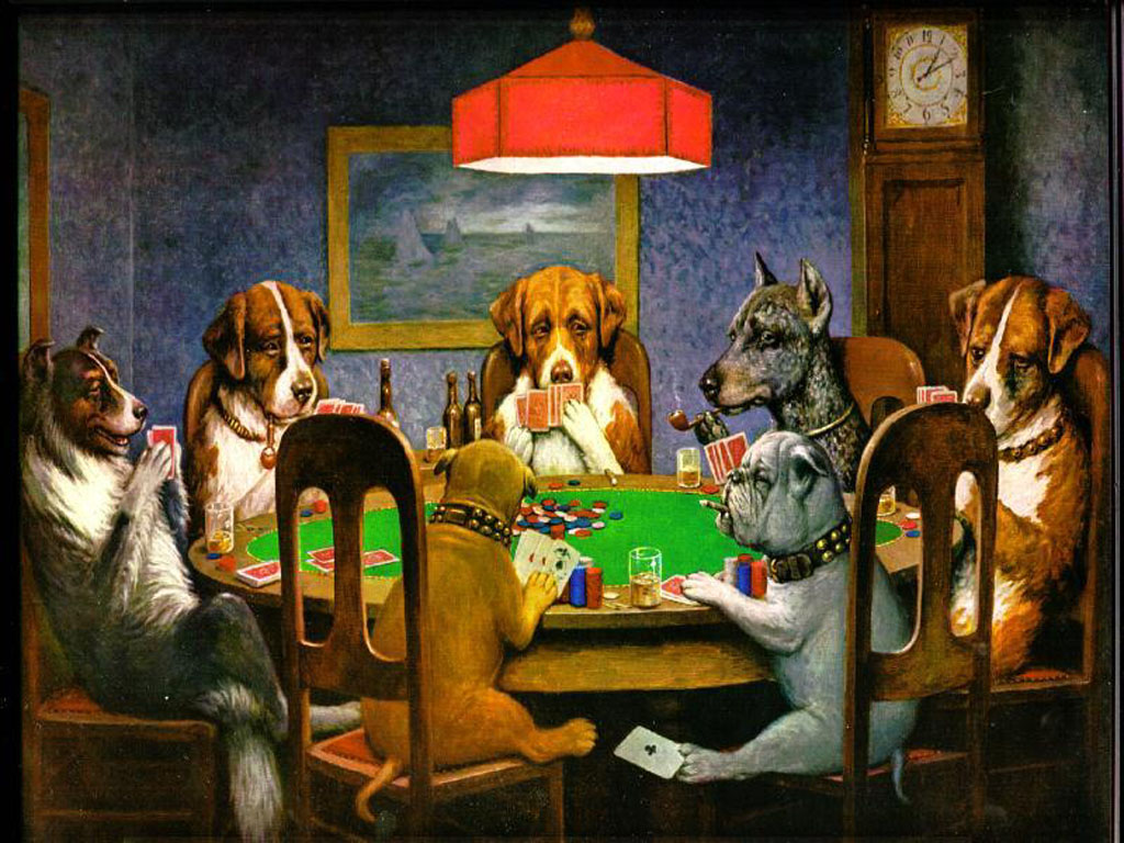
Rosemary Coonie, 1988, Jim Lane
Despite the title and the portrait-like pose,
this is just an animal, not a portrait.
When people talk about portraits, the obvious image that comes to mind is the typical head and shoulders pose popularized around the time of the Renaissance and since engraved in stone by portrait photographers. In more recent years, giving credit where it's due, the portrait artists behind the camera have loosened up somewhat, broadening their repertoire of poses to include even full-length depictions, though their work still tends to follow tried and true formulas--albeit new formulas. However, the second most popular subject for portrait painters is that of pets. Painting pets and simply painting animals, though related, are two different undertakings, as different as oils and acrylics. A pet has a well-known, look and personality. An animal has neither. Wildlife painters don't have to worry about getting the nose "just right."

Felina and Jonathan, 1990, Jim Lane.
Both the noses required foreshortening.
Over the years, I've probably drawn and painted almost as many pets as people, and just for the record, one is pretty much as demanding as the other. Of course the subject of the pet portrait seldom complains if there's a nose problem, but you can bet your palette knife their owners will. Likewise, the pitfalls in pet painting and people painting are quite similar. Naturally, except for portraits of goldfish and boa constrictors, the hair is critical and often the most difficult feature to capture. Often, however, the artist will be so concerned with the facial features the fur coat is treated as just a nuisance afterthought. Anyone who has ever painted the feminine gender knows the folly of treating the tresses as trivial. Male or female, the same applies to dogs and cats, the most commonly painted pets (though glistening horsehide is much more difficult).

The other most common pitfall is the feature mentioned earlier--the nose. One of the most troublesome parts of the human face is the nasal protrusion. First of all, it's likely the least attractive part of the face, and the one in which the Modern Art mantra, "less is more" was never more valid. More often than not, it calls for some degree of foreshortening, which very often baffles beginning artists and all too often antagonizes the more experienced as well. With most pets (goldfish and boa constrictors aside) the painter encounters noses of enormous variance in length ranging from a few millimeters to several inches. Add to this the critical importance of the head angle in determining just how long to depict the nose, and it's enough to send a painter scurrying back to the relative safety of the human face.

The Marriage of Giovanni Arnolfini and his Wife, 1434, Jan van Eyck.
The dog is show in more detail below, left.
The Arnolfini Marriage (detail)
My definition of a portrait is that it's any depiction of a proper noun--a specific person, place, or thing important enough for someone to pay an artist to render it. Though pet owners would probably cringe at my counting their four-legged family member as a "thing," the term has the important attribute of simplifying the definition to include a "miscellaneous" category. Historically, it's hard to accurately place the first true "pet" portrait among the thousands of animals artists have rendered on canvas over the centuries, but we could probably be fairly safe to suggest Jan van Eyck's Marriage of Giovanni Arnolfini and his Wife (above) from 1434 as a good starting point. Historically, it's also one of the first portraits painted in oil, which may or may not be a coincidence with regard to the dog. The puppy-dog is rendered in very low contrast so as not to "steal the show" by literally upstaging the newlyweds. It has an almost cat-like face. Art historians disagree as to whether it was an actual pet or merely a symbol of marital fidelity--man's (and woman's) best friend.

Saturday, March 30, 2013

Ad Art

Four Freedoms, 1943, Norman Rockwell
One of the things that rankles me most is that some of the best art created, now and especially in the past, is thought to be not art at all. The reason? Because it is (literally) designed to sell. Art has many purposes. That's just one of them. Think where we'd be without buying and selling. Insofar as my pet peeves are concerned, the denigration of "ad art" is right up there with the related penchant those in the "fine" art world have of looking down on the artists skilled at creating ad art as "merely" illustrators. Such aesthetic snobs use the term with the same distaste usually reserved for lawyers, politicians, and used car salesmen. Of course, there are hundreds of excellent artists who have suffered under the curse of being relegated to this second class citizenship but the unfortunate poster boy for such disrespect is Norman Rockwell. Yet, his Four Freedoms series (above) alone puts him near the top of anyone's list of great American artists. Moreover, his work often brings at auction, prices in excess of many so-called "fine" artists.
 
By the 1920s, stereoscopic card viewers may have been on the way out,
but newspaper and magazine ad art was in its ascendancy.
Historically speaking, leaving aside propaganda art designed to "sell" ideas or sell the image of ancient rulers(probably the earliest form of ad art), the art of sign painting stands out. Of course, such art usually had more to do with words than pictures and has remained that way for hundreds of years (at least until the advent of billboards). The real impetus for artist-drawn pictures designed to sell a product came with the technological refinements of the printer's art. To oversimplify somewhat, the proverbial "thousand words" of pictures took up less valuable space on paper and could be more quickly and easily digested that their equivalency in words.


Ad art circa 1876. What is it selling? Would you believe, a watch winder.
among other, less identifiable, items. Notice the mention of the number of "cuts"
 referring to images created from woodcuts. (Love the guy on the goat.)
From time-consuming wood blocks to lithography and hand-etched plates, artists and artisans by the thousands took up various creative and technical positions in producing this highly efficient ad art. But just as surely as the technology moved forward, so did the sophistication of the art itself. By the year 1900, technological advances, combined with developments in marketing and distribution (weekly national news magazines), demanded and lured highly accomplished painters to the highly lucrative field of ad art. However those who succumbed to this seductive lure were figuratively seen as akin to male prostitutes. I suppose female artists should consider themselves fortunate that early creators of ad art were mostly male.
 
An early 20th century portrait? No, ad art to sell Arrow shirts, J.C. Leyendecker.
Besides Rockwell, the top names in ad art from the past century include Howard Chandler Christy, Charles Dana Gibson, James Montgomery Flagg, Winslow Homer, J.C. Leyendecker, Maxfield Parrish, Howard Pyle, Ben Shawn, and N.C. Wyeth. There are dozens of others, those are just the ones I've written about. Moreover, those are also the ones who mostly transcended the derogatory label of "illustrator." Ironically, the majority of the ones listed above are actually more famous than their "fine" art counterparts. I suppose this, "rankles" those in the fine art world writing and promoting artists such as Joan Miro, Jean-Michel Basquiat, Jean Dubuffet, Rene Magritte, Mark Tanguy, Lucien Freud, and Freda Kahlo, all of whom I've also written about but whom most people have never heard of. By the way, the list of artists from which I drew the last group had only one name from the first group. Want to guess which one?
Today the Internet absolutely devours ad art. What are they selling here? Who cares?
It's art that captures quite effectively the intense angst of modern day travel.
(If you really care what the ad is selling, scroll down.)


Did you guess right? Did you have a clue?
 

Friday, March 29, 2013

The Pantheon

Interior View of the Pantheon, 1734, Giovanni Panini.
It must have taken a brave draughtsman to tackle a round interior with a
coffered dome on a rectangular canvas before the age of photography.
For the college undergrad taking his or her first timid steps into art history or art appreciation, the effect is like opening a book titled: The History of the World (the Untold Story). I'm quite familiar with this feeling, from both sides of the lectern. Not only that, but each chronological chapter is somewhat redundant--the history of painting, the history of sculpture, the history of music, literature, drama, architecture--the list seems endless (though it really isn't). There is some degree of parallelism, of course, but each medium of creative expression has its own cast of characters, timeline, and list of masterpieces, all of which tread dangerously close to the realm of Alex Trebec and Jeopardy trivia. Artists in each area of creative expertise, if they are to attempt greatness, must know and understand the past as related to their own art, but also have some working familiarity with that of their close art relatives.

Only in an aerial view can one gain
some feeling for the immense size and
engineering prowess required in erecting
 a structure that has survived virtually
intact for some 2,000 years.
 
For example, in taking my first art appreciation course as a college freshman, the Ohio University College of Fine Arts very wisely put together a course called "Comparative Arts" in which painting, sculpture, architecture, literature, music, and drama were all studied side by side. The first three interested me intensely...the others, not so much. Still there was the confusion regarding Manet and Monet, Bellini and Bernini, Pietro Lorenzetti and Ambrogio Lorenzetti, and finally the Parthenon and the Pantheon. I think the reason Art Appreciation 101 students find the the two architectural landmarks so confusing, other than the names, is that they were both ancient temples and both represent the high water mark of the cultures which built them.

A cross section of the Pantheon gives some indication as to why the building has survived
floods, fires, wars, earthquakes, not to mention the invading hoards (of tourists).
The name, Pantheon, simply means all gods. Some sort of Pantheon temple was built on the present structure's site as early as 27-25 BCE. However, in 80 AD it burned to the ground (the gods must have been displeased). The emperor Hadrian is said to have designed the present structure in its place though building apparently didn't get underway until around 125 AD. The new and improved Pantheon was much larger than the first, which was rectangular and about the size of the new Pantheon's front porch. Hadrian's Pantheon functioned as a pagan temple for two centuries with statues of the various gods filling the niches around its circular perimeter. The distinctive 27-foot hole in the center of the dome (called an occulus) not only served to admit light but to allow smoke to escape from burnt offerings on an altar centered under the daringly flat concrete dome.

The Pantheon is notoriously hard to photograph at street level due to its being hemmed
in on all sides by modern day buildings and Rome's horriffic vehicular traffic.
After the year 346, when pagan worship in Rome was banned, the Pantheon fell into disuse until 602 when the Byzantine emperor Phocas gave it to Pope Boniface IV for use as a Christian church (a not uncommon practice at the time) dedicated to the Virgin Mary and all Christian martyrs, thus continuing its pantheonic tradition. Though some 1500 years older, the Pantheon rivals St. Peters Basilica across the Tiber in size and scope, its non-reinforced concrete dome soaring some 142 feet above the floor, which non-coincidentally is the exact diameter of the rotunda. Hadrian (or his architects) knew their geometry. The outside walls of the rotunda rise exactly half the height of the dome. Originally, that dome was covered with gold-plated bronze and must have been quite spectacular. However, bronze, not to mention the gold, were much to valuable to have survived the millennia. A Byzantine emperor "stoled the gold" in 663 A.D. while Giovanni Bernini confiscated the bronze to melt down in fabricating the giant Baldacchino hovering over the high altar under Michelangelo's much taller St. Peter's dome.


Unlike the Parthenon and Notre Dame de Paris, the Pantheon is downright ugly from
the rear, owing in large part to its having been merely the centerpiece to a much
larger temple complex in Roman times.
Touring the Pantheon by boat.
It's hard to overstate the influence Hadrian's revolutionary concrete cylinder with a dome and a front porch has had on architects down through the ages. Andrea Palladio had his Villa Rotunda while Thomas Jefferson had his Monticello and more noticeably his design of the library at the University of Virginia. Stanford White was, in turn, influenced by Jefferson's library in designing the Gould Memorial Library in the Bronx, to name only a few. In referring to the Pantheon earlier as the high water mark of Roman architecture (high water literally being a problem in the lowland area near the Tiber where it's located, left), some might argue that the somewhat younger Roman Coliseum deserves this designation. I might agree, if the Coliseum had featured a dome.


Jefferson's Pantheon, University of Virginia,
Charlottsville.


Thursday, March 28, 2013

Food Sculpture

Fruit Basket, 16th century, Giuseppi Archimboldo
two paintings in one, just hang it upside down.
There was a time when one mentioned the word "sculpture" the image that came to mind was automatically a white marble statue. However, ever since Picasso discovered glue and started poking through the Parisian dumpsters for cheap art supplies, the range of acceptable sculptural media has broadened to include virtually any three-dimensional substance. I've long pointed out that artists choose their content based upon its importance in their lives. In dealing with food sculpture, that same axiom may also apply to their choice of media as well. I mean, what's more important to an artist than food (putting aside sleep and sex).


The Cupcake Wars
--judges high on cupcakes.
Actually artists started painting food before they began sculpting it. Actually, the first food sculptures probably came from the hands of confectioners and bakers rather than artists, though today, that line has pretty much disappeared. Just watch The Cupcake Wars on the Food Channel sometime (left). One of the earliest artists to explore food sculpture as a subject was the 16th century Italian painter, Giuseppi Archimboldo (top). He virtually made a career of it. Of course, the major problem food sculptors encounter over their painting counterparts is that of archival considerations. Modern day photography helps, but no one has yet developed a method of preserving food sculpture more than a few days before a feast for sore eyes becomes little more than a feast for more flies.

Automotive calories--Rice Krispies sculpture
Years ago when I taught school, I had as an optional art activity I called edible sculpture. Along with an assortment of fruits and vegetables, cakes and breads, one of my students developed a whole new sculpture medium--Rice Krispie treats (having since become quite popular). Her cereal and marshmallow creme creations each year came to be highly anticipated by her classmates and grew ever more sophisticated, involving candies, icing, and painted food coloring. The best part, was that after presenting her work, photographing it, and discussing it, we all got to "evalueat" it.

Supposedly an owl, though the sculptor
took considerable liberties with the beak.
One of the staples of cruise ship chefs is the buffet with edible sculptural decorations (no one ever actually eats them, of course). Watermelons are probably the favored medium (after ice, if you want to call that food). Here, fruits and vegetables dominate and ingenuity, coupled with excellent manual dexterity and eye-hand coordination, are a must (those knives are sharp). I've even seen sculpted lard as well as butter. My wife loves this sort of thing and never misses one of their "how to" workshops. Her own efforts tend to be limited to edible flower arrangements, which do sometimes get eaten ("ooo, it's too pretty to eat.")
Cruise chef culinary creativity.
 

Wednesday, March 27, 2013

HTML Part 4

(See 03-21-13 for HTML Part 3)
 
Everyone worries about their image. Artists do too. And when they get on the Internet, they have dozens of images to worry about. Putting an image on a Web page is one of the simplest tricks in HTML. You simply tell the browser the name of the image, what type of image it is, and if it's not in the same folder, where that image is. The tag is simply "IMG," which, as one might guess, stands for image, while "SRC" stands for source. The file name should then follow, such as "paintings/masterpiece.jpg" or if it's out there somewhere on the Internet (as sometimes happens) the title inside the quotation marks would, be an entire URL ending with the title of the image file. Images on the Internet are usually jpg files for good color resolution and detail or gif files for lower resolution, fewer colors, smaller files, and quicker loading (such as buttons, banners, or logos). However any type image file may be used provided there is a corresponding file with the exact same title (which is case sensitive) stored somewhere the browser may access it (preferably in the same folder as the HTML file).

Okay, that will get you an image on a Web page which is a little like turning a bull loose in a china shop. Next we need to learn to control it. First we need to give it a title in case, horror of horrors, it somehow fails to load. We use the "ALT" attribute to do this, adding ALT="My greatest masterpiece." This would follow the above image tag inside the same < and > marks. This title is useful for slow loading images to give the viewer something to read over and over again until the picture arrives. It used to be important for "text only" browsers but since the last one of those was long ago consigned to the Smithsonian, that's of little consequence now.

Now that we've given our raging bull a name, we must confine it to a certain size. This is done by telling the browser, in pixels, how big to make the picture. One inch equals 96 pixels, by the way. We would simply assert WIDTH="600" HEIGHT="400" right after the ALT tag still inside the same set of < >. To avoid image distortion, be sure to keep the width to height ratio the same as that of the original image (3:2 in this case). The thing to remember here is to keep the image on file about the same size as called for in the HTML file. If the image on file is smaller than what's called for, the resolution of the page image suffers, and if it is larger, the loading time will be greater than necessary. The actual size the artist chooses to use would be determined by the amount of detail in the picture and the page layout itself. With today's broadband, downloading time is not the constant consideration it once was.

And finally, training the bull, in effect, telling him "where to go," involves the attributes ALIGN="left" (default) ALIGN="center", or ALIGN="right". These also are placed inside the image tag, usually at the end, and are pretty self-explanatory; but are best used with a healthy dose of trial and error in that text placement may be influenced by their use. (One rule to always remember is that anything immediately following the "=" symbol should always be within quotation marks.) Thus, the complete image tag would read:

This, of course, only covers the horizontal placement of the image and there are, indeed, instructions for vertical alignment but they are so complex and so seldom used today they are no longer important enough to be worth learning. Vertical control especially, and indeed, horizontal image placement as well, is almost always handled by the use of TABLES. And they will not be the subject of our next learned discourse. Instead, we'll deal with LINKS. Golf anyone?

Tuesday, March 26, 2013

Notre Dame de Paris

Notre Dame as Seen front the Quai de la Tournelle, 1897-1902, Jean-Francois Raffaelli 
Notre Dame Cathedral in Paris may be the second most famous building in the world in which the back is more often photographed (and painted) than the front. First place in that category would have to go to the Parthenon in Athens, Greece. Like the Parthenon too, Notre Dame is the architectural symbol of the city in which it resides, though the Paris cathedral once more probably comes in second, behind the Eiffel Tower. When I went looking for paintings by famous artists of the ancient island landmark, the first ones to come to mind were those of Claude Monet. Oops, Monet painted the Rouen Cathedral of Notre Dame. Although many artist have painted the Notre Dame in Paris none appear to have been famous, which left me free to choose one of the best, that of Jean-Francois Raffaelli, Notre Dame as Seen front the Quai de la Tournelle (above) from about 1897-1902.
 
Probably the most famous painting of Notre Dame is not of the outside of the cathedral,
but the inside, Jacques-Louis David's Coronation of Napoleon Bonaparte, 1805-07. Of
course it's hard to see the church for all the people.
It's tempting to think of Notre Dame de Paris as being as old as Paris itself, though inasmuch as the city dates back at least as far as Roman times, such an assumption would miss the mark by more than a thousand years. Archaeologists have found ruins of a pagan temple on the site. Notre Dame was begun in 1160 by the Bishop of Paris, Maurice de Sully after having torn down an "inadequate" church dedicated to St. Etienne on the site, though historians think it more likely he considered it simply "out of style." Style is important to Parisians. De Sully employed the "new" Gothic style he'd seen in the St. Denis Basilica, not far from Paris. Of course over the nearly two centuries which passed before the cathedral was finally completed around 1345, tastes changed, architectural styles evolved, and the engineering grew ever more complex as the Notre Dame joined what could only be deemed a "race to the heavens" among similar churches popping up all over France at the time. Notre Dame builders were not architects but visionaries. What they built influenced other such builders as what they built flowed back to influence the final style of the Paris cathedral.
 
A quick primer on Gothic
architectural terms
Notre Dame was, for instance, the first instance of the  flying buttress. From the outside, these seemingly delicate, soaring arches add an almost fantasy element to the Gothic style. Yet, they are anything but delicate and developed as a matter of necessity rather than adornment. Without them, the stone walls, which grew ever thinner and thinner as the churches grew ever taller and taller, would have bowed outward and collapsed inward on worshippers, shortening their life-long journey to heaven. And if a Gothic cathedral appears as something of a spiritual vision on the outside, inside they soar to what could nearly be call the heights of ecstasy. The ceiling of the Notre Dame choir tops out at 33 meters (just over 100 feet.) The Beauvais Cathedral in northern France won the race upwards at 48 meters, an astounding 159 feet in height on the inside (the height of a 16 story building).


The "X" marks indicate the ribbed ceiling vaults.
Besides astonishing heights, four other elements make up the Gothic style--the fluted column, the pointed arch, the ribbed vault, and finally, stained glass. And if actual heights weren't enough, all four of these other features serve to enhance the illusion of even greater heights. Unlike the "fat" Roman/Greek columns of earlier Romanesque architecture, the fluted column featured numerous vertical grooves which made them appear thinner and taller than earlier church supports. The pointed arch appears more graceful and slender than ancient Roman arches. At the same time, the ribbed vault replaced the barrel vault, topping off the soaring fluted columns, also largely replacing frescoes with structural ceiling elements that appeared to be decorative. And finally, to quote no less an architect than God Himself, "let there be light." Hundreds of huge, slender windows on three different levels not only provided light, but reduced the weight of the ever more precarious piles of cut stone in their reach toward the sky. Moreover, stained glass not only told the story of Christendom but cast an unearthly heavenly glow upon the soaring interior. Notre Dame de Paris was the proving ground for all these Gothic innovations. And despite fires, riots, revolutions, restorations, and even attempts to secularize the worship within, Our Lady of Paris continues to stand as a cultural, architectural, and religious icon after almost a thousand years.
Modern day lighting makes the interior of Notre Dame as spectacular at night as when daylight pours through the acres of stained glass above.
 

Monday, March 25, 2013

Funny Paintings

Don’t be lost in the weird world of investments, Tiago Hoisel
Artists, like most everyone else, have a sense of humor, though some might consider what we consider funny somewhat warped or weird. Sometimes it comes through in their work; most often, though it does not. I guess most artists wish more than anything else to be taken seriously and humor, by definition, flies in the face of that aim. In art, humor takes many forms. Probably the most virulent is that art which caricatures individuals, or, more often, art itself. Marcel Duchamp probably started it all when he painted a moustache on the Mona Lisa in 1919. Salvador Dali lambasted poor Mona again with his 1954 self-portrait and his own flamboyant moustache. Dali, himself, takes a hit with Brazilian artist Tiago Hoisel's "homage" (above). This genre of art humor has been going downhill at least since Dali with Leonardo taking the brunt of the mischief. In selecting paintings to highlight here today, I've deliberately avoided such work. Art, especially painting, has a tendency to be somewhat pompous and pretentious (the very point Duchamp was trying to make), but which, frankly, makes it too easy a target.

Breakfast in Bed, 1897, Mary Cassatt--love with a side order of cookie crumbs.
I've also excluded cartoons and the risqué or the downright pornographic (though some of it is downright hilarious). And though many of them qualify as highly creative, I've also excluded photos and that art owing its existence to photo editing. Anyone with a Facebook page sees a ton of that type of humor every day. The painted humor I enjoy is that in which the artist displays an inventive, though somewhat subtle sense of his or her own humor. Usually such artists are not famous, though Mary Cassatt's 1897 Breakfast in Bed (above), employs a subtle humor perhaps only a mother could appreciate. Many of such artist probably should be more famous than what the are. I know it's not paint, but sidewalk chalk artist Julian Beever's, human-scaled fool-the-eye work (below) stands up well (lays down, actually) against the best such similar work hanging on the walls of museums.

Julian Beever's temporary sidewalk humor owes much to careful photography.
From the same era as Cassatt, though certainly not in her league, comes probably the most iconic of such "funny" painters, C.M. Coolidge, and his poker playing dogs (below, left). He painted thirteen different versions in a single year (1903). Trite? Yes, but even today it's hard to look at them and not, at least, smile. And to compliment such work, a tastefully nude cat (below, right).

Dogs Playing Poker, 1903, C.M. Coolidge
The feline version of Rembrandt's Danae.
As with the feline femme fatale above, very often the humor of present day artists is inspired by that of past painters as can be seen in the work of Lichtenstein inspired Mathiole and in an effort to one-up Norman Rockwell, artist, Berezhany Oleg Shuplyak, creates a postmodern self-portrait for which the most I can say is, "...wish I'd thought of that."

This painting has "gone viral,"
unfortunately minus the name
of the artist, Oleg Shuplyak

Postmodern humor


Cat in a Can, 1979, Jim Lane, 
my own attempt at feline humor.


Sunday, March 24, 2013

Frames


An early 1900s era frame shop by an unknown artist.
When strolling through an art gallery or museum, as we look at a painting or photo, ideally, we do not notice the frame. Or, if we do, it's only for a moment before the work once more draws us back into its magical embrace. Somewhat less ideally, we consider that the frame should enhance the art work. And in a worst case scenario, the frame should at least not detract from its content. Beyond that, in a postmodern context, there are artists, myself included, who have incorporated the picture frame as a part of the content, accepting its aesthetic and cultural presence and purpose as a natural, inherent art commodity.

An example of a one-piece carved frame
from the 14th century. The artwork is an
annunciation by an unknown artist.
As to purpose, the picture frame's first duty is to protect the artwork. That may be simply a matter of keeping the edge of the painting from getting "dinged" or in providing support for glass or Lucite coverings which further protect the work. Of course, very often such framed work must be handled with great care to protect the frame, which, to my mind, somewhat defeats the purpose in framing, though a carefully protected frame, by definition would mean its artwork would also be protected. Historically, picture frames are a product of the Italian Renaissance, though an Egyptian fayum mummy portrait dating from the second century A.D. has been found with its wooden frame intact (preserved by the desert climate). Rare instances of one-piece carved frames from the 12th and 13th centuries also exist, especially in the case of religious icons.

Picture framing developed when art became portable. Thus religious altarpieces are some of the earliest examples that come to mind, in which the artist and his workshop created art and frame as the single entity. However, the real impetus for the "invention" of what we think of today as a picture frame came as the result of the growth of secular art in the sixteenth century. When wealthy Florentines, for example, commissioned wall decorations, they did so knowing that very often the art would last far longer than the wall. That fact of social and political life dictated some means of protecting their investment. As art grew in size (approaching that of the mural) picture framing became a major industry, taken over by furniture makers of the time. Even today, picture frames bear a sometimes uncomfortable relationship to the coffee table or the nightstand.
 
The "gallery wrap"--we don't
need no  stinkin' frames.
As tastes in the painter's art grew ever more elaborate and pretentious, so, too. did the heavily carved and gilded lumber "protecting" them. As time progressed, the value of the art often came to be judged by the cost of its frame--the bigger, heavier, fancier, more laden with gold leaf, the more valuable the painting. This mindset remained dominant well into the 20th century, even as "less is more" Modern Art often heaped ridicule on such thinking. Then came Abstract Expressionism, which very nearly spelled the death knell for the picture frame or at least anything more than the most minimal protective woodwork. Minimalism went even beyond that with the popularity of what came to be known as the "gallery wrap" in which the painting surface extends around the edge of the stretched canvas making a frame undesirable and, presumably, unnecessary. Such canvases continue to be popular with non-representational artists even today. However, despite the name, many gallery owners and museum curators have come to hate such efforts to eschew the frame. In fact, they have, in recent years, belatedly started adding frames to cover up edge damage.
 
Escaping Criticism, 1874,
Pere Borrel del Caso


In the Postmodern era, artist have come to accept the picture frame as, at worst, a necessary evil. Besides protecting art, the frame also serves as a dividing line between the improvised world created by the artist and the real, also improvised world of the viewer. The effort to cross this line, to, in effect, "break the frame" is largely a development of our present era, though examples, usually involving trompe l'oeil, can be found in art dating back to the 19th century Spanish painters such as Pere Borrel del Caso's Escaping Criticism (left). In this case, the frame is painted on the surface of the canvas. Dutch, English, and American painters have also played with this concept. In my own work, I've often extended the painting by various means out onto the frame, either by painting on the frame or through the use of various modeling media serving to three-dimensionally transition from the painting to the "real" world of the frame and the viewer. In my most recent work, The Peterhof Cascade (below), I glued to the lower portion of the painting a strip of primed canvas cut to imitate dripping water, then highlighted it would acrylic gel medium to extend the painted illusion of cascading water within the frame out over the frame. I'm thinking of placing a mop next to the painting.
 
The Peterhof Cascades, 2013, Jim Lane
 

Saturday, March 23, 2013

MoMA, NYC

Reflections of Clouds on the Water-Lily Pond, c. 1920, Claude Monet
Few, if any, art lovers would have any problem with the acronym above. Often I find myself writing about ideas, entities, and works of art so familiar to me I fail to elaborate for the benefit of those not so intimately predisposed to all things arty. The Museum of Modern Art in New York City (MoMA) is one such entity. It's one of the city's "big three" in my mind, along side the Guggenheim and the Met. There I go again. The "Met" refers to the Metropolitan Museum of Art, while the "Guggenheim" is simply the Guggenheim Museum (also primarily modern art) founded by the mining family of Solomon R. Guggenheim. If that name doesn't ring a bell, one look at Frank Lloyd Wright's iconic, tornado-shaped building will. Unfortunately, the MoMA, while architecturally impressive, is not so iconic.
 
Abby Aldrich Rockefeller, 1941,
Robert Brackman
The MoMA is what we might call the "middle child," not so old as the staid Met and not so young as the rambunctious Guggenheim. The museum was born in 1929 in rented quarters at the corner of  Fifth Avenue and 57th Street just nine days after the stock market crashed. MoMA's mother was Abby Aldrich Rockefeller, the wife of John D. Jr., who was quite opposed to the museum and, indeed, modern art itself. She enlisted the support of a couple of her rich society friends who, together, came to be known as "the daring ladies." The museum's initial holdings consisted of eight prints and one drawing, though by the end of 1929 they were hosting loaned works by van Gogh, Cezanne, Gauguin, and Seurat. At the time, the museum was virtually the only such public venue for modern art in the U.S. First housed in six rooms on the twelfth floor of a Manhattan office building, the MoMA was to move to three more locations during the course of the next ten years. Despite the primary founder's last name, her husband's fortune was not part of the deal, though he was to later donate the land for the museum's present site and eventually become a major benefactor.
 
MoMA and its sculpture garden
The MoMA finally came to rest some four blocks down Fifth Avenue from its birth (Fifth Ave. and 53rd Street). It was housed in Phillip Goodwin's and Edward Stone's appropriately modern International Style landmark. Stretching out before it is the Phillip Johnson designed sculpture garden named for Mrs. Rockefeller by her two sons, Nelson and David. They later became the driving force behind the museum and its aggressive acquisition of works by virtually every big name in the world of modern art. As early as 1935 the museum organized an unprecedented show of sixty-six works by Vincent van Gogh at a time when the artist was anything but a household name. In 1939-40, the museum held a retrospective of Picasso's work which was highly influential in cementing that artist's name into the annuls of art history.
 
MoMA is the home of van Gogh's The Starry Night.
In 1958, a fire on the second floor, during the installation of air conditioning, destroyed Monet's 18-foot-long Water Lillies (since replaced). Fortunately, a number of other works were saved, including Seurat's Sunday Afternoon on the Island of La Grande Jatte, which was on loan from the Art Institute of Chicago at the time. The museum was closed again in 2002 for renovation and redesign (reopened in 2004). Today it holds 150,000 works plus an additional 22,000 films and some four million still photos. The MoMA is where you'd go to see van Gogh's famous The Starry Night (above), Picasso's Les Demoiselles d'Avignon, Dali's The Persistence of Memory, Wyeth's Christina's World, as well as instantly recognizable works by Rousseau, Chagall, Mondrian, Matisse, Warhol, Pollock, Kahlo, and dozens of other modern artists from the past century. Today, the spectacular glass and granite citadel at 11 West 53rd Street is the premier showcase of Modern Art in America.
A sampler of MoMA's vast holdings of Modern Art.
 

Friday, March 22, 2013

Full-length Portraits

 
As portraits go, we don't see them much anymore. Few homes, even the largest ones, lend themselves to the tremendous ceiling height and wall space needed to hang a full-length, life-size, standing portrait. In any case, they would seem embarrassingly pretentious in a modern setting. And today, certainly in the case of male figures, and only slightly less so where women are concerned, modern dress does not embrace the flamboyance of style and fabric to warrant so much square footage. Even the largest portraits today are seldom more than half-length unless the figure is sitting and even then the view is often cut off just below the knees. Anything more than that becomes something more akin to a figure study and in any case is seldom rendered life-size.

Sir Robert Sherly, 1622,
Anthony van Dyck. It looks like
the man got his money's worth.
But...there was a time...back in the good old days when kings were kings and image was everything, when a man's (or woman's) worth was determined by how grand and glorious the portrait artist could render their face, figure, and frock, when money was no object, when wealth and royalty brazenly competed for prestige, when what we might call the "swagger" portrait was an absolute necessity (left). Sir Anthony van Dyck, back in the 1600s, if he didn't invent the genre, certainly wrote the rules. The size was seldom less than seven feet in height, usually more like eight or nine. The pose was formal but relaxed. Eye contact was a must. Opulent surroundings were to be preferred, if not actually demanded. Certainly elaborate dress, shiny fabrics, lace, furs, ribbons, buttons, and bows, regardless of sex, were to be expected. And whatever the accessories, the painting had to have a powerful, direct, dramatic impact on the viewer. Subtlety was nowhere to be found.

Portrait of Louis XIV, 1701,
Hyacinthe Rigaud


Titian, Holbein, Cranach, and others were among the first to venture into this most grandiose of the painter's arts during the 16th century, and van Dyck drew from their early experiments. But it was van Dyck's public relations portraits of the homely Charles I and his wife, Henrietta Maria, which set the model for not just English artists (van Dyck was Dutch), but for similar artists and their royal patrons all over Europe. Hyacinthe Rigaud's 1701 Portrait of Louis XIV (right) owes much to van Dyck's style. The shapely legs, the heavy, carpet-size, ermine-lined robe, and the "rug" of a wig on his head, the red, strapless pumps, the billowing drapery overhead, and the fleur-de-lis all over the place, lend a silly, comical look to the work today, but three hundred years ago, it probably bought the House of Bourbon an extra century on the French throne.

Blue Boy, ca. 1770
Thomas Gainsborough
Though Thomas Gainsborough was of a different century, the impact of van Dyck's style still dominated English portraiture, though by now it was no longer reserved for kings and queens. Any commoner with a few hundred pounds to spare could be made to look like royalty. Gainsborough even went so far as to maintain a closet full of hundred-year-old garments in case his wealthy portrait clients didn't have anything appropriately shiny in their own wardrobe. His most famous portrait of this type, Jonathan Buttall, owes its title and dramatic impact to just such foresight. Today we know it more commonly as Blue Boy (right). Jonathan was not royalty, nor even rich, though thanks to Gainsborough's clothes, pose, and mastery of the medium, it would be hard to tell. In fact, Blue Boy was not a portrait commission at all, but apparently done for the artist's own amusement. Today we might suspect a romantic attachment but there's little to indicate more than a latent homosexuality on the part of Gainsborough. The strikingly attractive, fourteen-year-old boy, later one of the few invited to the Gainsborough's funeral, was the son of a friend and neighbor, an iron monger (that means he owned a junkyard).

The Skater, 1782,
Gilbert Stuart
One of America's most famous portrait artists, Gilbert Stuart, is best known for the full-length portrait of Washington (the Lansdowne portrait discussed a few days ago) Though much beloved and copied, it's a mediocre work, at best. That's the one Dolly Madison rescued from the White House in 1814 just before it burned. But Stuart first came to prominence in 1782 while studying and practicing his art in London. It was there that he was commissioned by a wealthy Scottish lawyer, William Grant, to paint his first full-length portrait. In reporting for his first setting, Grant commented that the weather was much better suited to skating than posing, so on a whim, artist and client set up shop on Serpentine Lake in Kensington Gardens. Stuart's The Skater (left), a strong, dynamic depiction of what seems to have been an equally strong and dynamic attorney, added the element of action to van Dyck's centuries old portrait formula. Who knows, if our first president had been a good ice skater, perhaps we might not today have such a top-heavy portrait of him staring down at us from the wall of the elegant East Room of the White House. 


Trike Tike,
1986, Jim Lane.
 

Full-length portraits of children have long been a staple of portrait painters, perhaps because their diminutive size lends itself more to smaller canvases which seem less pretentious (and take up less wall space).