 |
| The Starry Night, 1889, Vincent van Gogh |
What's your favorite color? If you're male, there's a 42% chance you'll choose blue. If you're female, that number drops to 29%. It would be interesting to know if the choices and percentages are also the same for artists. My guess is that, generally speaking, they are. The least favorite color, by the way, is yellow. However, Vincent van Gogh is an interesting case in point. Judging from one of his most famous paintings, The Starry Night (above), it's obvious he loved blue. Yet one doesn't repeatedly paint sunflowers without also having an affection for yellows. He originally planned to paint a series of twelve. He ended up doing only seven, two of which have disappeared. Personally, I'm not sure I have a "favorite" color, but I suppose, if I did, I'd choose blue as well.
 |
| Sphinx of Amenhotep III |

Why is blue a perennial favorite of so many people? My guess is because there are so many of them (shades and tints of blue, that is, not people). When the range is from navy blue to so-called "baby" blue that equates to just about one shade or tint" per person. Over the course of art history, artists of all media have utilized the multitude of unique shades of blue as a means of expression. For example, Pablo Picasso underwent a “blue period” where all his paintings were created in shades of blue and blue-green to create a subdued, melancholic at-mosphere. With the latest blue pigment, YInMn, which was discovered less than a decade ago, the color blue continues to unveil its artistic prop-erties, carrying a rich history and significance for both artists and audiences alike. As with so many other things, the first blue color was produced by ancient Egyptians around 2200 B.C. in an effort to create a permanent pigment that could be applied to a variety of surfaces. Since, the color has continued to evolve, and its association with calming, natural elements like the sky and clear water have solidified it as a universal favorite among artists, interior designers and other disciplines.

Although the Egyptians were fascinated with lapis lazuli, they never discovered how to create pigments with the mineral. Not until the 6th century did the color blue emerge as a true pigment when it appeared in Buddhist paintings in Afghanistan. The pigment was eventually imported into Europe by Italian traders in the 14th and 15 centuries, where it was renamed “ultramarine.” In Latin, ultramarinus translates to “beyond the sea.” It soon became the most sought-after color in medieval Europe, with a price tag that rivaled that of gold.
 |
| The Last Judgment, 1536-1541, Michelangelo Buonarroti, |
The scarcity of the blue minerals ultramarine and lapis lazuli led early artists to seek chemists in their search for a means to produce blue that was less costly. Because blue pigments were rare and expensive to acquire up until the dawn of the Industrial Age, it has often been associated with royalty and divinity. That may be why it is a favorite color today. Because it was so costly, the color was often reserved for royalty.Great artists of this era such as Michelangelo and Raphael were forced to use it sparingly. Art historians believe that Michelangelo’s The Entombment (1500) was left unfinished because he could not afford to buy more ultramarine. Ultramarine is a blue pigment found naturally. It is ground down from a mineral called lazulite, the main component of lapis lazuli. The pigment remained expensive until a French chemist discovered a synthetic version in 1826; aptly named “French Ultramarine.”
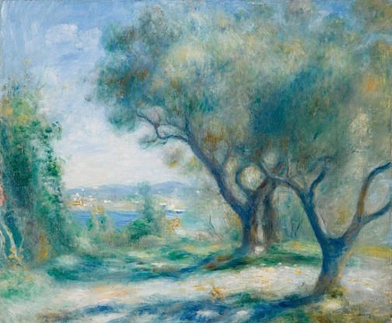 |
| Vue du Mourillon, 1890, Pierre-Auguste Renoir |
In 2016 Pierre-Auguste Renoir's
Vue du Mourillon (above) sold for £305,000. Renoir and Vincent van Gogh utilized cobalt in many of their iconic works, including the instantly recognizable
The Starry Night (top). Cobalt was originally discovered in the 8th and 9th centuries, where it was used to decorate ceramics and jewelry. In China, cobalt was the chosen pigment for the iconic blue and white porcelain patterns that emerged in the region. A purer version was discovered by French chemist, Louis Jacques Thénard in 1802. Not long after, commercial production began in France.
 |
| Le Grand Canal, 1908, Claude Monet |
Cerulean comes from the Latin word caeruleus, which means “dark blue” and is most likely derived from caelum, the Latin word for “sky.” The pigment was originally composed of cobalt magnesium stannate, or compounds of tin. In 1805, it was perfected by roasting cobalt and tin oxides. It was put on the market for artistic use in 1860. Cerulean was used heavily by Impressionist painters such as Claude Monet as in his
Le Grand Canal (above), one of 37 Venetian scenes painted during his stay in the city in 1908, Monet combined cerulean with other bright blues like cobalt and synthetic ultramarine to create vibrant, colorful works. In 1999, cerulean was even named “color of the millennium” by Pantone.

Indigo is a blue dye, rather than a pigment, which comes from Indigofera tinctoria, a crop grown in abundance around the world. The indigo plant originally came from India. The Ancient Greek language word for the dye is indikon. The Romans used the term indicum, which passed into Italian dialect and eventually into English as the word indigo. Because it could be grown in excess, it was an affordable option for dying textiles, and became a highly desired import throughout the 17th and 18th centuries, sparking tensions and trade wars between Europe and America. Isaac Newton named and defined indigo as a spectrum color when he divided up the spectrum into the seven colors of the rainbow. In 1880, a synthetic version of indigo replaced the natural version, and it is still used today to dye blue jeans. The color shown at right, electric indigo, is the closest hue possible to display on a computer to the color of the indigo color band in the rainbow.
 |
| Portrait d’Angel Fernández de Soto, 1903, Pablo Picasso |
The pigment Prussian blue consists of iron cations, cyanide anions, and water. The name Prussian blue originated in the 18th century, when the compound was used to dye the uniform coats for the Prussian army. Over the years, the pigment acquired several other “blue” names, including Berlin, Parisian, and Turnbull’s blue. It has been used for centuries in unusually diverse applications Despite the presence of cyanide groups, the pigment is not toxic to humans. Older artists among us will recognize “Prussian blue” as a crayon color. Prussian blue was one of the 38 original Crayola colors introduced in 1903. The Prussian blue crayon name lasted until 1958, when it was changed to midnight blue. The reason for the change is unclear. One source says it was made because by then no one knew what Prussia was anymore; while others suggest the move was spurred by political correctness during the Cold War. Picasso's
Portrait d’Angel Fernández de Soto, (above) dating from 1903. is painted almost entirely in Prussian blue.
 |
| Moonscape, 1965, Roy Lichtenstein |
Navy blue is the darkest shade of blue, and they have many variations of the pigment. It is not normally termed an artist's pigment. It was originally referred to as marine blue since it was the color for British Royal Navy uniforms and worn by officers and sailors after 1748. Since, modern navies have darkened their uniforms even further in an effort to reduce fading that happened quicker with a lighter navy color. Today artists often create navy blue using Phthalocyanine Blue (below, right) which is also called by many names. It is a bright, crystalline, synthetic blue pigment from the group of phthalocyanine dyes. This brilliant blue is frequently used in paints and dyes. It is highly valued for its light fastness, tinting strength, covering power and resistance to the effects of alkalis and acid. Roy Lichtenstein makes heavy use of it in his Moonscape, (above) painted in 1965.

Blue can have a variety of meanings and symbolize a diverse range of ideals depending upon various cultures. Largely, the color blue is considered beneficial to the mind and body. It is believed that it slows human metabolism, which produces a calming effect. Light blue is associated with health, healing, and tranquility while dark blue represents a more powerful, serious, but sometimes melancholic nature. Surveys have shown that blue is the color most associated with the masculine, just ahead of black, and was also the color most associated with intelligence, knowledge, calm, and concentration.

 In 2016 Pierre-Auguste Renoir's Vue du Mourillon (above) sold for £305,000. Renoir and Vincent van Gogh utilized cobalt in many of their iconic works, including the instantly recognizable The Starry Night (top). Cobalt was originally discovered in the 8th and 9th centuries, where it was used to decorate ceramics and jewelry. In China, cobalt was the chosen pigment for the iconic blue and white porcelain patterns that emerged in the region. A purer version was discovered by French chemist, Louis Jacques Thénard in 1802. Not long after, commercial production began in France.
  Cerulean comes from the Latin word caeruleus, which means “dark blue” and is most likely derived from caelum, the Latin word for “sky.” The pigment was originally composed of cobalt magnesium stannate, or compounds of tin. In 1805, it was perfected by roasting cobalt and tin oxides. It was put on the market for artistic use in 1860. Cerulean was used heavily by Impressionist painters such as Claude Monet as in his Le Grand Canal (above), one of 37 Venetian scenes painted during his stay in the city in 1908, Monet combined cerulean with other bright blues like cobalt and synthetic ultramarine to create vibrant, colorful works. In 1999, cerulean was even named “color of the millennium” by Pantone.
 The pigment Prussian blue consists of iron cations, cyanide anions, and water. The name Prussian blue originated in the 18th century, when the compound was used to dye the uniform coats for the Prussian army. Over the years, the pigment acquired several other “blue” names, including Berlin, Parisian, and Turnbull’s blue. It has been used for centuries in unusually diverse applications Despite the presence of cyanide groups, the pigment is not toxic to humans. Older artists among us will recognize “Prussian blue” as a crayon color. Prussian blue was one of the 38 original Crayola colors introduced in 1903. The Prussian blue crayon name lasted until 1958, when it was changed to midnight blue. The reason for the change is unclear. One source says it was made because by then no one knew what Prussia was anymore; while others suggest the move was spurred by political correctness during the Cold War. Picasso's Portrait d’Angel Fernández de Soto, (above) dating from 1903. is painted almost entirely in Prussian blue.
 Navy blue is the darkest shade of blue, and they have many variations of the pigment. It is not normally termed an artist's pigment. It was originally referred to as marine blue since it was the color for British Royal Navy uniforms and worn by officers and sailors after 1748. Since, modern navies have darkened their uniforms even further in an effort to reduce fading that happened quicker with a lighter navy color. Today artists often create navy blue using Phthalocyanine Blue (below, right) which is also called by many names. It is a bright, crystalline, synthetic blue pigment from the group of phthalocyanine dyes. This brilliant blue is frequently used in paints and dyes. It is highly valued for its light fastness, tinting strength, covering power and resistance to the effects of alkalis and acid. Roy Lichtenstein makes heavy use of it in his Moonscape, (above) painted in 1965.


No comments:
Post a Comment