Click on photos to enlarge.

Thursday, June 30, 2016

Do It Yourself Home Design

An architectural rendering in a highly realistic landscape, capable of being viewed from any angle, complete with furnishing, lighting, plumbing, cutaways views and no burdensome blueprints.
 
Have you ever wished you could design and build a dream home, limited only by your own creativity? That you might build it anywhere in the world, any terrain, and size, any style, money being absolutely no object? Better than that, you could virtually "live" in it? It's possible, you know. I've been doing it as a kind of creative outlet hobby for years now (below). No, it doesn't involve complicated 3-D house design software capable of producing detailed blueprints any builder would be delighted to utilize, although it does have some of the same 3-D features as such Computer Assisted Design (CAD) software (except only more realistic). I've tried such software and inevitably grown frustrated and or impatient with it. Each time I've gone scurrying back to Electronic Arts computer simulation "game" (if you stretch the definition of gaming a little)--The Sims 3.
 
I obviously have a yearning for Minimalist beach house.
Let me warn you in advance. If you're a frustrated would-be architect whose creative streak is much wider than any notable engineering streak, this game is terribly addictive. As with all computer games, especially simulation games, the learning curve is steep, though always lots of fun. Even if you use basically only one element of the game (the highly sophisticated home design features) it takes some time to work your way through all the intricacies. It works backward from most CAD software. CAD programs usually start with a floorplan which, eventually results in 3-D illustration. With the Sims, one begins by creating the 3-D rendering. Not only that, one also stops there too--no, floorplans to fool with, no structural engineering, in fact, no architectural drawings whatsoever. Actually, I utilize only a small segment of the game's capabilities. The Sims 3 (and now, Sims 4) is basically a self-directed soap opera complete with custom made Sims, wardrobe, makeup, relationships, emotions, careers, sex, life, death, weddings, funerals, ghosts, babies, and kids of all ages for kids of all ages. The architecture is merely the set design background element of this grown-up toy doll house.


Click above for a guided tour.

But, OH what a beautiful toy it is! It even lets you take photos of your architectural creation and has built into it's home design software capabilities allowing the user to conduct animated video tours of the house (above). Though large, contemporary designs are my favorites, even very modest suburban ranch style houses (below). offer the same design possibilities inside and out, right down to magazines on the coffee table and kitchen counter clutter. All of this and more are available as custom content (CC) mostly at no cost for downloading from www.thesims3.com and from various digital designers also addicted to the architecture/interior design features of this simulation.

A comfortable, lived-in look complete with shadows which change with the passing of time, reflections in mirrors, and the difference between night and day.
A Victorian dowager which, with
a little more color and closer
neighbors could be one of
San Francisco's "Painted Ladies."
Moreover, there is virtually no style or architectural era which Sims 3 or 4 software, with a few items of downloaded CC, can't handle (left). The other basic commodity needed to fully enjoy a free-for-all building spree is the Sims' legal tender known as "simoleons." Although there are numerous means for the Sims to earn cash in playing the game, the easiest way to bypass all that is through the use of numerous "cheats." (Alt-shift-C) brings up the cheat screen; typing in "motherlode" gives your Sim family one-million simoleons--more than enough to build (or buy) even your most outrageous abodes. Or, simpler still, using the "build" mode, there is no cost unless a Sim family wishes to buy the house, allowing you to watch them live in your creation. Don't worry about making a mistake in con-structing your house. If you do, your Sim family will indicate what you've done wrong and sometimes angrily berate you for screwing up their "lives."

Look familiar? It should if you're a horror movie fan. This replica
of the Amityville Horror house was created by a Sims 3 fan
named Celtic Guardian.
A Swiss Chalet in spring.
With a little research and some expertise in building, one can even recreate famous house from television or the movies, such as the "Amity-ville Horror" Dutch Colonial (above). Even A-frame houses (left) with complicated roofs are possible once the architect builder has obtained his or her degree and gained a license to practice Sim architecture. A devotee to architectural eras from the past can design in the Federal style (below) as easily as something Tudor, Georgian, Gothic or Gallic.

The Federal style, or perhaps English Edwardian. No, you can't design the cars out front, but virtually any make or model automobile that ever tooted its horn is available as free CC on the Internet.
Although its best to start small with a modest bungalow, it's much more fun to design wildly extravagant mansions (as seen below) complete with multiple-car garages, indoor swimming pools, grand staircases, video arcades, marble bathrooms, on a scale just short of Buckingham Palace. I've actually seen reasonably accurate furnished renditions of the White House. A personable young man named Curtis Paradis has actually carved out something of a career for himself creating how-to videos posted on YouTube featuring dozens of Sims houses he's designed.

Ridiculously large and ornate, complete with a small burial plot out back and what appears to be a chapel (upper-left). And that's just the ground floor.
For more experienced designers, the Sims 3 Island Paradise expansion pack (just one of many) allows the design and "construction" of resort hotels (below) with a variety of styles, sizes, and features. For those with a more aquatic bent, the designer can also create houseboats (bottom) which can be moved by their Sim owners from one "port" to another along the shoreline of island communities. Incidentally, all this does not come cheap. I believe the basic Sims 4 game sells for about $45 (the Sims 3 basic game is somewhat less). Sims 4 also invites the user to buy two optional expansion packs, two game packs, and six "stuff" packs (additional building items, furniture, and clothing).
 
Even Sims sometimes need a little time off.

They're big, and they're slow, but they're not too fast.

Perfect for your backyard. The maze pool is
nice too.


Wednesday, June 29, 2016

Guernica (revisited)

Today marks the first time I've ever revisited an old post. This one dates from February 8, 2011, more than five years ago. A few days ago I wrote highlighting GIF art. I noted that GIFs could be a valuable teaching tool when dealing with individual paintings. Today I've spent a considerable amount of time in an effort to prove that point using Blumenthal's Easy GIF Animator, which I purchases a few days ago. I'm still learning, but I've gotten a reasonably usable image from it. It's not without flaws, and I think I've run into a memory problem (a lack thereof) which prevents me from perfecting it. In any case you'll find my effort at the bottom of this post.
 
The work of art I've chosen to explore in GIF mode is Pablo Picasso's famous anti-war painting, Guernica. In my earlier posting I dealt mostly with the circumstances under which the painting was created. This time, I'd like to deal with the painting itself, not in a thousand words or so but with a single GIF image file to which I've added brief "blurbs" dealing with the many symbolic images Picasso employed. Now, without further ado, the original posting:

-----------------------------------------------------
 
Tuesday, February 8, 2011

Guernica


Few artists in this century, or perhaps in any century, have ever lived and worked as ferociously as Pablo Picasso. A powerful bear of a man even into his early ninety's, he was a precocious, often obnoxious, artistic force to be reckoned with even before he was a man. Everything about him was drawn larger than life. As a mere teenager he quickly outstripped his father's ability to teach him (or handle him), and absorbed art instruction in such a sponge-like manner he even outgrew that art training his native country had to offer, before abandoning Spain (more or less) permanently around the turn of the century. And when he hit Paris, a brash young man of 20, stories of his carousing, and sexual exploits have become the stuff of legends. Such folklore might seem merely that except for the fact that it is underlined boldly in every stroke of his brush and slash of his pen. The sheer quantity of his lifetime creative output is as staggering as some of the stories of his love life.
 
 
Les Demoiselles d'Avignon,
1907, Pablo Picasso
At the age of 56, Picasso was riding a wave of personal and artistic success that would have been the envy of any artists. The Spanish Republican Govern-ment honored him above all others with an invitation to paint a mural for the Spanish Pavilion of the Paris World's Fair. He was having important shows in New York, Paris, London, and Ger-many. His work was bringing huge prices. The Museum of Modern art sold a Renoir to raise money. A part of the money was needed to purchase his Les Demoiselles d'Avignon for $24,000.  (A huge price at the time for a living artist).  Then on April 26, 1937, he was staggered by an event in his homeland which unleashed a creative outrage that was monumental even by Picasso's standards. Planes borrowed from Hitler by Generalissimo Ferdinand Franco, completely laid waste the small Basque town of Guernica in the first known use of saturation bombing in the history of warfare.

 
Guernica, 1937, Pablo Picasso
Picasso had his subject for the Spanish Pavilion mural!  He began sketches for it less than a week later, resurrecting motifs from numerous earlier works as well as new elements. He started painting on May 11th.  With his mistress at the time, Dora Maar, photographing each step of the process, he completed the 26 foot by 11 foot tall canvas in an incredible three weeks of feverish effort. Even for Picasso the work was stark. Limiting himself to powerful black, pristine white, and modulating grays, Guernica screamed for all the world to see and, figuratively speaking, hear, the monstrosity of Franco's Spanish Civil War. Even after it was finished the impact upon Picasso's creative output was indelible. Motifs from the painting continued to show up in his work for months afterward, and the impact the painting had upon the rest of the world stamped even more indelibly the horrors of modern warfare.


Tuesday, June 28, 2016

Art on Vacation

The Winter Palace, St. Petersburg, Russia

Now that summer has officially arrived, it's time for artists to take a vacation. Some artists still pack their art stuff and paint what they see. I once met an artist vacationing on a cruise ship. Every morning he set up his borrowed easel in the atrium and worked painting an abstract image employing shapes he encountered on the ship. Moreover, he sold the painting before the cruise ended. In the years before photography reached today's heights of technological refinement, artists very commonly sketched and painted using watercolors to capture vacation memories. Some, in fact, made a career of it. Before I go on in offering tips and advice on the art of vacation photography let me admit I'm not a professional photographer. I don't think I've ever sold a photograph in my life. I am, however an artist; and I have taken lots of vacations during which I've taken lots of photos. I'd like to claim that each one was taken with an artist's eye and thus stands alone as a work of photographic art. I'm still working on that part. However, quite a number of photos I've taken while on vacation have, in fact, become the basis for works of art (below).

Copyright, Jim Lane
The paintings often differ considerably from the photos
especially as to color.
My first bit of advice, upon arriving at some famous picturesque location is to by a packet of picture postcards. They're probably the cheapest and most practical souvenir a traveling artist can acquire. Once you've paid your dollar or two for them, look at them, study them, and memorize them all from an artists' perspective. Then, having done that, do not shoot anything like what you already have. Such images are shot by professionals capturing the essentials in a manner which tourists are predisposed to desire (below). Your goal should be to search out that which tourists are not likely to buy.

What not to shoot in London.
As you tiredly trek from one familiar landmark to another look for unusual angles (below); look for local color; look for the unexpected; look for details often overlooked by others. And as you do, think like an artist. Compose each photo; watch out for brightly lit backgrounds which destroy foreground items (unless you're using flash). Include a few strangers in your photos but avoid crowded scenes. Be on the lookout for exceptional colors--flowers, fabrics, even souvenirs. Take the time and make an effort to be the star of your own photos from time to time (if traveling alone, carefully choose a stranger to take your picture). Do not waste time taking gimmicky shots. There are a million photos already of people holding up the Leaning Tower of Pisa.

This is the type of work which separates the amateur
artist from the professional.
Copyright, Jim Lane
Never pass up flowers or local ambience.
Copyright, Jim Lane
Murano glass in the form of masks, two of the most
colorful symbols of Venice Italy.
Copyright, Jim Lane
Selecting and composing is a learned art.
Color is but one component in the process.
Much of the art of capturing your vacation in a creative manner comes down to simply being sensitive. Don't get so wound up by the excitement of seeing some famous landmark that you ignore that which may one day be the basis of one of your best paintings. The young boy (below) on the seawall was a shot I grabbed as we were landing from the ship's tender in Villefranche-sur-Mer along the southern coast of France. It was totally unexpected, un-posed, and took only a few seconds. I spoke not a word to him either before or after taking his picture. I'm not even sure he knew. Yet for me, it totally summed up the entire day on the French Rivera, beyond all the other photos I shot that day. I've never painted it, perhaps because I could never improve upon the photo.
 
Copyright, Jim Lane
The symbol of the city.
Copyright, Jim Lane
An artist at Eze.
The photo of me (left) was taken by my wife as I paused during a long, uphill trek to the ancient medieval village of Eze (the same day as the photo above). An artist friend saw it on my web page and asked permission to paint it in watercolor as a seminar demonstration piece. In return, he gave me the painting. He placed a walking stick in my right hand. The same day, in the street opposite the tiny marina, there was a local flea market. There I encountered the unexpected, an honest to goodness French nude, likely from the 19th-century. That was 2001. It looks to have been an amateur painting of someone's great grandmother. I wish now I'd bought it.

Copyright, Jim Lane
The leading lady of the
French flea market.
As an artist who has sat through many hot, sunny days with an outdoor art display, I'm always on the lookout for others so inclined to such torture. Usually the medium of choice is watercolor, and usually depicting the area's most famous landmark. Sometimes I even buy one or two. There's nothing new about that. The 18th-century Italian painter, Canaletto, worked the tourist trade in Venice, and later London, for most of his life, eventually organizing a virtual "factory" of young, probably underpaid, artists to keep up with demand. Venice is still one of the best venues in Europe for colorful street art (below).


Copyright, Jim Lane
This hardworking painter was, I believe, in Venice,
probably a descendant of Canaletto.
Copyright, Jim Lane
Cities such as Venice are so iconic and, quite frankly, overexposed, it's
very difficult to find a truly creative point of view. I did a painting based
upon this photo with a giant cruise ship poking its nose into the scene
from the right (as indeed, they do). I called it, Intruder of the Seas.
Copyright, Jim Lane
A Venetian panorama from our balcony with the ship "flying bridge"
and the tour boat adding scale and depth to a scene virtually
unobtainable from any other platform.
All artists know something about framing, as suggested by the slight, peripheral presence of the ship in the photo above. Never is this more important that when shooting landscapes. The vacationing photographer/artist should learn to think in layers as seen in the photo from the Dalmatian coast near Dubrovnik (below).


Copyright, Jim Lane
The rocky foreground frames the lower part of the scene, while the
overhanging tree frames the top, drawing the eye to the tiny center
of interest in the middle. It was a hot day. I was tempted to join them.
Copyright, Jim Lane
A villa atrium in Pompeii. Rendering perspective in a painting
is far less difficult than using it to compose a photo, especially
when the main center of interest is in the foreground.
One of the more difficult and persistent problems encountered by vacationing artist is in shooting large objects in a confined space. In visiting the island of Maggiore opposite the San Marco Piazza in Venice I came upon a typical Italian marina with one particular boat (ship?) I thought might make a nice painting. However the street next to the stone quay was too narrow (not to mention too busy) for me to back off far enough for a good shot. Instead, I centered myself as far back as possible and shot three separate photos of the vessel, rotating slightly between each shot but being careful not to change position. The three photos are below. The final result, as edited, is below that.

Copyright, Jim Lane
The digital source photos.
Copyright, Jim Lane
The city of Venice is in the distant background.
The Memphis, Tennessee skyline. Shooting at
night is a great way to capture nuances not
seen during the day. Smartphones now
make it easy.


Copyright, Jim Lane
Bugs on the sidewalk? No, baggage
carts waiting to come aboard the
Grandeur of the Seas in Barcelona.


Monday, June 27, 2016

Donald Zolan

Angel Triptych, Donald Zolan...always sweet little girls.
Heilige Schutzengel
 (Holy Guardian Angel)
by Lindberg.
As a small child there hung in my bedroom a cheap reproduction of a painting by an artist named Lindberg. There seems to be no record of whether that's his first or last name or what either might have been, although judging by the imitations and variations I've found, it's apparent the work remains popular even today. The painting depicts a lovely winged female figure (right) watching over two young souls making their way across a rather rickety bridge. There's little doubt as to the country of origin, given the title, Heilige Schutzengel, (Holy Guardian Angel), which is obviously German. In any case, that was what passed for children's art a century or more ago. Today, we still find angelic beings in children's art but they've changed a little, usually taking the form of that which art experts refer to as puti. They came out of the Renaissance, direct descendants of the Roman Cupid and the Greek Eros. Today's children's angels, whether of the guardian type or not, usually resemble the work of Arizona artist, Donald Zolan, as seen in his Angel Triptych (top). Strangely enough, none of these depictions are scripturally accurate. In the Bible, angels are always men.

Donald Zolan in his studio, ca. 2006.
This is not so much about the work of Donald Zolan as it is about the nature of children's art today. In fact, when you go in search of children's art you find ten times more work by children than for children. The prevailing attitude seems to be if kids want art to decorate their rooms, they can just make it themselves. Of course, art intended for children is actually aimed at parents. Children don't buy such work, their parents do (usually their mothers). Having said that, the offspring, even at a fairly young age, still have no small amount of input into the buying decision. I've chosen to highlight Zolan's work simply because it is so typical of today's "mainstream" art for children. Moreover, Zolan was at it for more than fifty years, (he died in 2009 at the age of seventy-one) so he probably knew what he was doing.
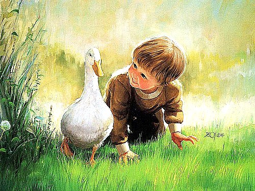
Untitled (as far as I can tell), Donald Zolan. I'd call it
Wild Goose Chase, but it might be a duck, and anyway, it's not wild.
Born in 1937 with a family legacy of five generations of artists and sculptors, Donald Zolan grew up in Brookfield, Illinois. His middle-class parents, according to his website, "...embodied the values of the Heartland--honesty, humility, and straightforwardness." That's probably true, there was a lot of that sort of thing going around at the time. His paintings, almost exclusively of small children, seem to confirm those character traits. What he captured in his paintings was the pure, honest, and open expression of his heart.

'Twas the Night Before Christmas, Donald Zolan
Something of a child prodigy, Zolan began drawing and painting at the age of three, though it was another ten years before he won his first scholarship in oils to the Art Institute of Chicago. Upon graduation from high school, he won a full scholarship to the American Academy of Fine Art in Chicago. Once more he was a fast learner. He completed the Academy’s four-year program in just two years. From there, Zolan apprenticed under Haddon Sundblom, the well-known illustrator of the Coca Cola Santa Claus. Zolan's Christmas paintings bear the unmistakable marks of Sunblom's influence (above). Later, Zolan attended the Arts Students League in New York City.


21st Century Children's art
Zolan pursued a fine arts career exhibiting and selling his oil paintings at shows and museums throughout North America, Europe, United Kingdom, and Japan. He won numerous awards including Best of Show at the Salmagundi Club in New York. His success led to the opening of the Zolan Gallery on Nantucket Island. By the mid 1970’s, as Zolan’s reputation in the fine art world flourishing, his portrait commissions expanding to include political leaders, writers, religious figures, astronauts, and industrialists from around the world. But Zolan’s first love was painting children. By that time also, he had developed a fresh new style in children's paintings, which launched his career into the collectibles and licensing world. His work displayed a prodigious talent at portraying the joyfulness, innocence, tenderness and wide eyed wonder of early childhood, which propelled him to the top as his works commanded some of the highest secondary market values at the time.
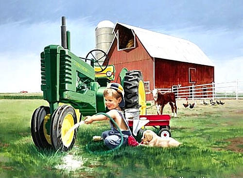
 
Zolan's kids became the faces of a whole new generation of farmers.
Zolan had the ability to constantly adapt the artwork to the changing times yet always keeping within his classical style. His subject matter became a natural to co-brand with some of America’s greatest trademarks. In 1996, Zolan’s nostalgic portrayal of children on the farm led to a mingling with John Deere tractors his first licensing success. In the last decade of his life, Zolan’s work was also branded with Coleman, New York Yankees, Radio Flyer, International Harvester, and Collegiate. Today, Zolan’s artwork is licensed to 30 multinational companies in North America, Europe and Russia.

 
Children's art today--prints and plates
As Zolan’s childhood depictions came to grace collectible plates, prints, figurines, children’s books, and other licensed products over some thirty years, expanded, so did his generosity in directly helping children and those in need. Whether visiting children’s hospitals; giving money directly to struggling families; donating artworks to nursing homes, children’s homes, and hospitals; or simply helping aspiring artists to start their careers, Zolan always gave from the heart and anonymously. Donald Zolan leaves behind an enormous legacy of artwork with over 200 oil paintings in the collection that will continue to be licensed nationally and internationally by his wife, Jennifer. Zolan’s sudden death did not allow him an opportunity to fulfill all of his dreams, but his legacy will go on, with plans to establish a children’s museum and programs to help young, needy and aspiring artists reach their artistic dreams. And that's where Children's art is as of today.
 
Rainy Day Pals, Donald Zolan
(GIF by Jim Lane).


Sunday, June 26, 2016

GIF Art

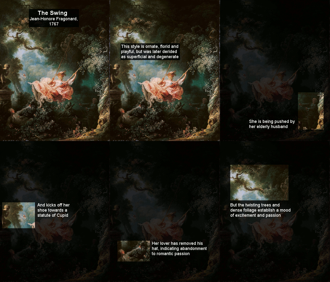
A GIF art lesson (be patient for it to start).
Yesterday, some friends and relatives were sitting around talking about the olden days before Wi-Fi, at which time I came to realize that I've had an Internet presence now for more than twenty years! I got my first modem for Christmas, 1995. WOW! How time flies when you're having fun. And it has been fun...every minute of it. Very few people noticed it at the time (because so few people even had computers, much less the Internet, but about ten years before I came on line, a group of software developers in Columbus, Ohio, led by Steve Wilhite, came up with a totally new art medium capable of making digital images move. 
 
The 1980s and 90s, tech breakthroughs came
like lightning in a thunderstorm.
 
The famous dancing baby.
They called it the Graphics Interchange Format, better known by its acronym, GIF. Under normal circumstances, such a startling invention would have been hailed as a technological breakthrough just short of color TV and having a greater impact than say...Rice Krispies? But as it was, such digital developments at the time were occurring like lightning in a thunderstorm. The reaction was...hmmm, interesting...did you hear about this new company called AOL that's doing away with hourly Internet access rates? CompuServe's new GIF format was little noticed until along came a dancing baby. Today we'd say the little toddler went "viral," though the term hadn't yet arrived. That was roughly 1990. Today, Wilhite's crude little creature has been replaced with the real thing, yet still using the same basic technology (below).
 

Get down, little guy!
We need your dancefloor for lunch.
If what nerdy math geniuses in dimly lit computer labs could do with this new image medium was little short of miraculous, putting GIF soft-ware in the hands of artists was like giving candy to a baby. (Speaking of babies, do you have any idea how hard it is to write with a drooping diaper dancing directly next to your text?) During the next several years the use of eye-catching little GIF icons spread like butter on a hot sidewalk to early websites like my own (which probably still has a few even after all these years).

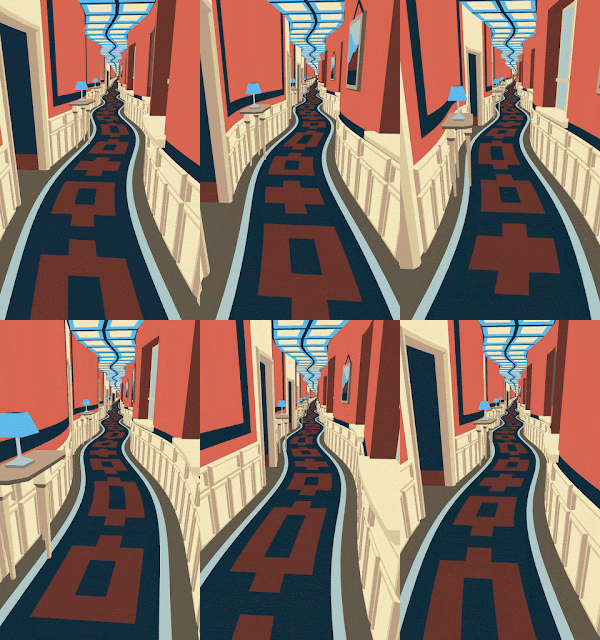
It's called "morphing" and its all the GIF rage right now.
Of course, even as GIFs grew in size and dazzling complexity, such artwork became tiresome as an attention getting device. They were, by their very nature, repetitious and boring after the first couple minutes (are you bored with the dancing toddler yet?) Worse, once they started, there was no way to stop them. However, it was about this time that the Internet porn industry latched on to video GIFs where boredom was seldom a problem and repetitious movements were assets. Since then, video-based GIFs have become something of a cottage industry for video hobbyists and artists alike (above).


Giphey. Don't stare too long, it might be hypnotic.
When math, science, and art meet...
For Op (optical) artists, the very fact that it's "hard to stop a GIF" was like someone having invented for them a perpetual motion machine. No longer did they have to rely on the optical phenomenon of retinal fatigue to make their images move. GIFs did it for them...and did it longer and better. The word, mesmerizing, comes to mind as the only term appropriate. Surrealists also noticed the new art medium and latched onto its conflicting realities in creating a whole new hybrid era of dreamlike digital creations (below).


Think what Edvard Munch
could have done with GIFs
Peter Pan with a hyperactive
shadow?


To my way of thinking, the greatest beauty of GIF technology is the relative simplicity and ease of use inherent in GIF creation software. Today I download a program called Blumenthal's Easy GIF Animator. I'm still using it in demonstration mode (free) but I plan to spend $29.95 for it, if for no other purpose than to create GIF animations for use here as the need arises to make some point regarding the artwork I feature. The word "Easy" in the name is, of course, relative. It's easy if you've had experience in editing photos, or in creating video productions. The little GIF video (below), which I made today (after two false starts) honors the memory of our dearly departed Pounci. And although it's not very sophisticated, once I got the knack, it took less than half an hour.


Not quite a cat, not quite a kitten...
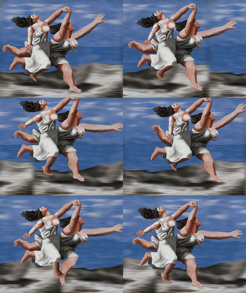
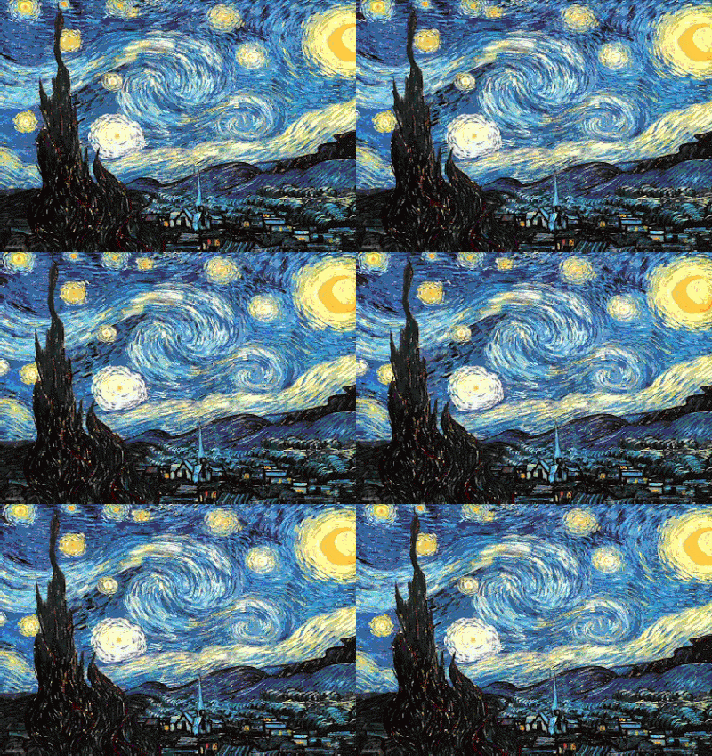
Perhaps one of the most valuable contributions GIF software may make is when its placed in the hands of educators. Not only is it capable of teaching an entire lesson (such as in art, top) with a single, well-planned image, but it's also possible to "retrofit" the GIF format to famous paintings from the past making it possible for Picasso's Two Women Running on the Beach (below), dating from 1922, to get some virtual exercise; or in the case of van Gogh's Starry Night, to come alive with simulated visual movement. Speaking of van Gogh, The GIF image also makes it possible to do a quick and easy study of van Gogh's many portraits, their similarities and differences (bottom).

Two Women Running on the Beach, 1922. Pablo Picasso
Starry Night, 1889, Vincent van Gogh
Would van Gogh love it or hate it.
I think he'd be "crazy" about it.