 |
If you can still do this after joint picture hanging session,
the marriage should be a long and happy one. |
In my book,
Art THINK (available at right), I talk briefly about displaying art, though mostly from the standpoint of
selling it. And, God knows, I've certainly hung a ton of it in my lifetime, both my own, and that of students, I don't think I've ever written about the rules and regulations governing the hanging of artwork in the home. I'm being facetious. There
are no rules except those related to your thumb and even those are so laden with exceptions as to be all but worthless. I guess I should begin by saying that picture hanging is
not an exact science. Neither is it "rocket science." The best we can do is to begin each sentence having to do with the art of hanging art with the words, "In general." That is,
in general, the center of a work of art (or picture grouping)should be at average eye-level, some sixty inches from the floor. Now, if you want to pursue a more definitive number than that, you'll encounter everything from fifty-seven inches to
sixty-seven inches. So, there are virtually
no rules, only suggestions, generalities, and tips...oh yeah...lots and lots of tips. And if you're not real handy with a hammer, maybe
fingertips as well.
 |
A full-scale mockup, and
probably too much of a
good thing. |
The first of these tips applies as much to
hanging art as to creating art--
plan ahead. Don't grab a hammer and start pounding nails, hoping to hit the "nail on the head' in getting it in the right place. There are several ways to avoid this. A sheet of quarter-inch grid graph paper is a good place to start. Draw the wall, to scale along with window opening and any furniture placed against it or nearby. Then measure the art work and start sketching it to scale. Once you've worn down your eraser by at least half, you're probably ready to start measuring for nail holes. There's a lot to be said for trial and error in art (and in displaying it) but not if you don't own the wall. If you can't handle all that drawing, cut sheets of brown paper or leftover giftwrap the size of your artwork and tape it (lightly) to the wall in various configurations. Then stand back and contem-plate the results. In most cases, framed work should be hung no less than two inches apart and seldom more than six. Remember that the more pieces in a grouping, the greater the complexity of the hanging task.
 |
| Any of these are better than a simple nail driven into drywall. |
 |
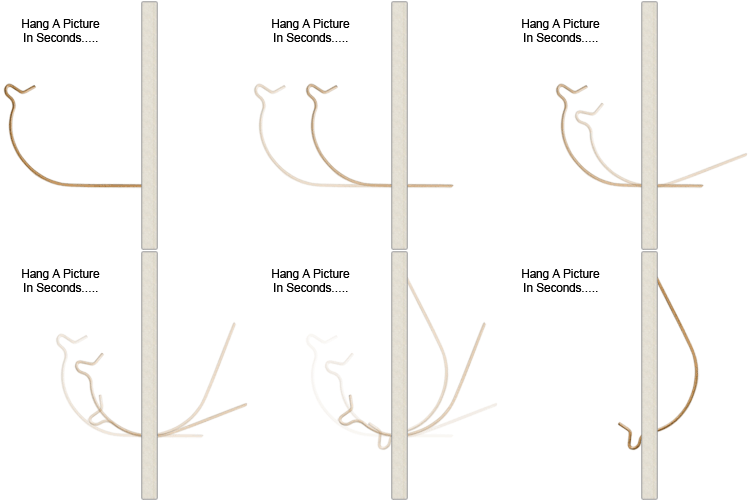
| If simplicity is your "thing"... |
Hanging a single painting juxtaposed with furniture, windows, light fixtures, etc. is usually a relatively simple task. It's best to get someone to help you though, if for no other reason than to hold the artwork against the wall so you can confirm your planning decision. So, you're then ready to start pounding nails, right? WRONG! In the first place, don't use nails at all unless they have a hook attached. There are several excellent hardware items which work much better (above). The "fishhook" hanger at right, though quite simple in design, is much stronger than it looks, leaving only the tiniest of holes in the wall. Even relatively small pieces will eventually fall when drywall ceases to embrace a nail, assuming you aren't lucky enough to have a well-place stud exactly where you need it.
 |
Be prepared for sore fingers or needle-nose plyers when using the tiny nail mounted sawtooth bracket. I prefer the brackets at the
bottom with their own "nails" attached. |
 |
| Use two strands of wire for heavy work. |
Insofar as hardware is con-cerned, that which protrudes from the wall is only half the story. The hanging hardware on the
back of the artwork is just as important. Traditionally, a flexible woven wire between two "D" rings has been the hanging method of choice (right). However, in more re-cent years, various other de-vices have become common-place, such as sawtooth hang-ers (above), each with their strengths and weaknes-ses. The ones not requiring nails or screws are my favorites, but they're not suitable for large frames or thin pmes. They're ideal for canvas stretchers, though.
 |
Artwork must be hung in relationship to other items placed
against the same wall to create a unified presentation. Here
the works are not only too high, but too far apart as well. |
 |
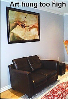
| This painting is hung about a foot too high. |
By far the most common error in hanging artwork is the matter I alluded to in the beginning, finding the right height. The tendency, as seen above, is to hang works too high and without regard to other items on or near the same walls (above). The same problem presents itself with a single painting as well as with groupings (left). Given the subject matter, (Michelangelo's Creation of Adam, below) maybe the owner was hoping to get as close to the ceiling as possible. By the same token, paintings should never be hung so low that they fall behind furniture, or even visually touch such items (below). Usually about six inches is the recommended space between a piece of furniture and its accompanying wall art. The two smaller pieces (below), hung side by side and about a foot higher, would have been quite attractive.
Even to the untrained eye, this looks bad.
So long as you have an idea of where you’d like the artwork to be placed, it is just a matter of finding the right height above something else (chest, bench, credenza, piano, etc.). Equally important is finding a center for your placement. Often there are many factors as to how to “center” your art. You may have your couch situated against a wall with a side table to its side and the couch may not be centered. You will need to decide if you must have the art centered on the wall regardless of the couch, or use the couch as a centering tool. It may be tricky because you may have beams in your ceiling that throw the placement off. Once again, that is a judgment call. One decorated suggests taking a photo of the hanging. Pretend its not your house and that you have no emotional connection to it. Look at the photo and ask yourself, if I passed this picture in a magazine would I consider the art too low or too high?
 |
| Some of about a zillion possibilities. |
Probably the most difficult problem in hanging art is the art of hanging them in a pleasing arrangement. I won't go so far as to say there's no "right" or "wrong" way to do it, only lots of reasonable possibilities (above). Fortunately, artists tend to have instincts as to such things. Others don't. In any case, not only should the various works be arranged by size and shape (something like a jigsaw puzzle), but each grouping should relate as to content and style. Otherwise one or two items will invariably be more eye-catching than the others, causing the entire grouping to "fall apart." Moreover, today people often consider items associated with hobbies or collections to be art objects, and find the means to hang them on a wall. If you think a grouping of rectangular art is hard to unify, try working with odd shaped items such as masks, hats, plates, and sports memorabilia.
 |
Ideal for an ever-changing display of children's art--thus freeing
up the refrigerator door for shopping lists and phone messages. |
In the realm of advanced picture placement artists are continually coming up with creations to challenge even the most experienced decorator. How do you handle, for instance, a single painting spanning four or more canvases? If the artist is really being difficult, he or she may even utilize canvases of different sizes and shapes as a means to explore various compositional elements in their work. One example is the quadriptych image of the bicycle built for two (below). The owner is presented with questions, as to how far apart should the works be displayed? Should they be framed? Are they a single painting or three?
 |
Dining room art is often displayed at
the eye-level of seated viewers. |
The most important tip is to have fun when hanging art, and not to worry too much about getting things perfect. You're not doing anything structural to your walls, and your house isn't going to fall down if you don't hang the pictures right. If you hang something up and want to move it, it's really easy to fix the problem with a little spackle. In fact, I like changing displays of art every once in a while. I think a lot of people like moving pictures around, just as they move furniture around to freshen things up."
 |
Wallpaper, especially that bearing strong
geometric patterning, should be left unadorned.
Why hang one work of art in front of another? |
 |
| Not a display grouping, but visual clutter. |


No comments:
Post a Comment